London hoteliers offer a quirky online experience
London's Hoxton may be synonymous with 'hipsters', but this beautiful site is for everyone.
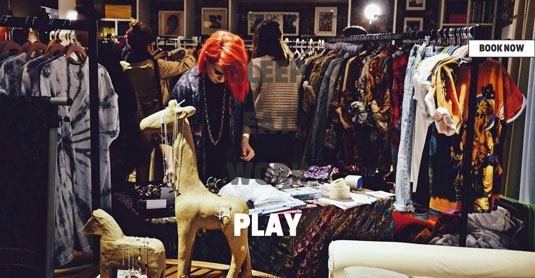
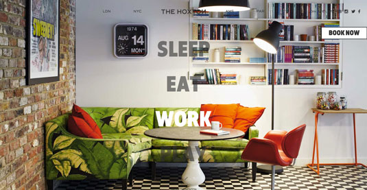
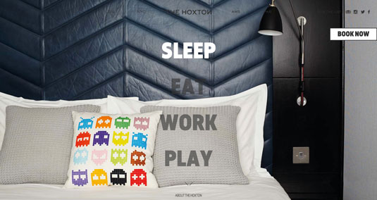
The Hoxton is a chain of hotels based in London, with further establishments opening in New York, Paris and Amsterdam in 2016. Its website does a great job of communicating the fun and quirky nature of the hotels through the use of beautiful lifestyle photography, video, bold typography and a vibrant, energetic colour palette.
Within the overarching branding, each hotel is allowed to have its own personality. The Holborn is presented in greyscale, while Shoreditch is shown in muted hues.
How it was made
The site was designed by in-house designer Alex Prior, while Ketchup Digital in Glasgow took care of development. "At The Hoxton, we always like to do things a little differently, that goes for the website too," says Prior.
"We wanted an accessible and happy design that gave people the same feeling they have when they enter our hotels: open and honest."
Prior goes on to emphasise that the team was keen to integrate video into the site (with more to come), as well as tools such as Google Maps Business view. Integrated into the site is a very clear, concise and simple booking form – it has to be one of the easiest I've ever used. The structure hierarchy works well as a responsive system, and is equally comfortable to use on handheld devices.
Nav as feature
Another great aspect is how the main navigation for the site has been used as the main homepage feature. The user is presented with the words 'Sleep, Eat, Work, Play', and hovering over one will trigger a full-page image.
These page titles are large, clickable areas, making it easy for users to find what they need without sacrificing the beauty of the site.


Words: Chris Allwood
Chris is a digital designer and co-organiser of grassroots event Second Wednesday. He works at Studio Output in Nottingham, UK
Like this? Read these!
- 5 design tips for creating travel websites
- Brilliant Wordpress tutorial selection
- The ultimate guide to logo design

Thank you for reading 5 articles this month* Join now for unlimited access
Enjoy your first month for just £1 / $1 / €1
*Read 5 free articles per month without a subscription

Join now for unlimited access
Try first month for just £1 / $1 / €1
Get the Creative Bloq Newsletter
Daily design news, reviews, how-tos and more, as picked by the editors.

The Creative Bloq team is made up of a group of art and design enthusiasts, and has changed and evolved since Creative Bloq began back in 2012. The current website team consists of eight full-time members of staff: Editor Georgia Coggan, Deputy Editor Rosie Hilder, Ecommerce Editor Beren Neale, Senior News Editor Daniel Piper, Editor, Digital Art and 3D Ian Dean, Tech Reviews Editor Erlingur Einarsson, Ecommerce Writer Beth Nicholls and Staff Writer Natalie Fear, as well as a roster of freelancers from around the world. The ImagineFX magazine team also pitch in, ensuring that content from leading digital art publication ImagineFX is represented on Creative Bloq.
