5 things web designers can learn from Brutalism
The Brutalist school disputed the distinction between art and design. Justin Reynolds argues it has a lot to teach today's web designers.
As every designer knows, design is not art. Designers don't create for the sake of creating: they seek to solve communications problems for their clients, drawing upon a toolkit of proven, sober, hard-won design methodologies and techniques.
In short, design is an objective, not a subjective process. Before putting pen to paper, cursor to pixel, designers undertake pragmatic, hard-headed research: they analyse target audiences, develop user personas and study the work of their client's competitors.
Their findings inform project objectives that set strict parameters for the application of the designer's imagination and creativity regarding choice of imagery, typography, colours and layout.
This understanding of design as method, as process, provides the philosophical underpinning for the curricula of all contemporary design schools, and is set down as an indicator of professional competence on the 'how we work' page of every design agency website.
But we haven't always done things this way.
Once, design equalled art
Today's design orthodoxies are less than a century old, evolving from the modernist design movements of the early 20th century. Before then designers were indeed considered artists, of a sort.
Consider, for example, the illustrative style of Victorian design, or craftsman-as-artist aesthetic of the Arts and Crafts movement. And it would be wrong to think that 20th century design modernism proceeded on a straight path, leading us from the murk of subjectivity to the clear, cool light of rationalist design methodology.
Get the Creative Bloq Newsletter
Daily design news, reviews, how-tos and more, as picked by the editors.
In his recent BBC series Bunkers, Brutalism and Bloodymindedness: Concrete Poetry the acerbic cultural commentator Jonathan Meades reminded us - in typically uncompromising terms - that the history of 20th century design was the story not of modernism, but of modernisms, with very different understandings of the purpose and nature of design.
Modern relevance
Meades' focus was architecture, but the ideas he discussed are relevant to any field of design including, I will argue, web design. (If you didn't catch the TV series see his accompanying piece in The Guardian: The incredible hulks: Jonathan Meades' A-Z of brutalism.)
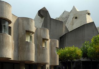
As one might have expected from Meades, the argument was brilliant, extraordinarily wide ranging, amusing, and designed to offend. For Meades the most vital design movement of the last century was arguably the most despised: Brutalism, the architecture of radically abstract structures commonly referred to as 'concrete monstrosities'. Think of city centre bus stations, housing estates, shopping centres, and public libraries.
The International School
Brutalism emerged as a reaction to the calm International Style that took hold of western architecture from the 1930s. Inspired by the work of Le Corbusier, Mies van der Rohe, and others, the International school celebrated order, modularity, the grid, Euclidean geometry.
In Meades' words: "International modernism strove for standardisation, for production line architecture, for collective anonymity and personal self-effacement: the ideal building was not only a machine, it appeared to be designed by a machine."
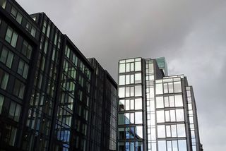
Process was prioritised over expression, the use of pre-fabricated, standardised components over customised detail. The result was that everything started to look the same: "The same few devices were endlessly employed: most had flat roofs, most had white walls, most had abundant glass, most shunned ornament, which as every junior draughtsman knew was 'crime', because a dotty Austrian Adolf Loos had said so."
Restoring what was lost
The reinvention of the designer as engineer was divesting architecture of its soul. Brutalism sought to revitalise architecture by restoring what had been lost: subjectivity, novelty, wildness.
Flourishing through the 1950s, '60s and '70s, Brutalist architecture took modernism on a new, radical path. At surface level the difference was material: Brutalism made extensive use of concrete - the Béton brut that gave the style its name - rather than steel and glass.
But the deeper differences were philosophical. Where the cool Platonism of the International Style prized order and rationality, Brutalism celebrated pure expression: "The expressionist instinct was entirely contrary, undisguisedly individualistic, the artist is omnipresent, pulling the strings, performing, failing to be modest, asserting him or herself."
Form over function
Brutalist architects desired the new, sought to make each new design a departure from all that had come before. They shunned use of pre-fabricated, standardised components, and prioritised form over function, developing alien geometries comprised of an extraordinary range of shapes: "Inverted pyramids, allusive shapes, reckless cantilevers, toppling ziggurats, vertiginous theatre, imitations of pyrites, the defiance of gravity: always a sign that a demigod is at work. The architectural imagination was flying."
Brutalism sought sublimity rather than beauty, to shock rather than reassure: "These structures challenge the gods. They're monuments to mankind's supremacy. They're supremely optimistic, supremely confident, supremely hubristic."
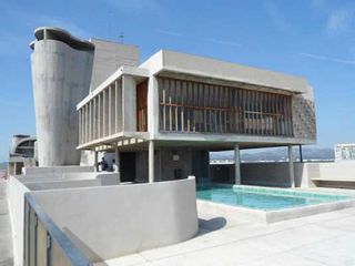
Le Corbusier's work is illustrative of the shift in sensibilities. Compare his Villa Savoye of the 1930s to the Unité d'Habitation and chapel of Notre Dame du Haut of the 1950s. In Meades' words: "He had, so to speak, abandoned the prose of a technical manual in favour of the poetry of the sublime."
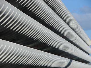
By the 1980s it was all over. Brutalism had proved too radical for the public and architectural commissioners, and, though there are signs of revival, a more conservative architectural age followed.
Meades is withering: "It's the revenge of a mediocre age on an age of epic grandeur. It's the cutting down to size of a culture which committed the cardinal sin of getting above its station, pushing god aside and challenging nature."
Relevance outside architecture
Though the battle between the International and Brutalist styles was fought in the field of architecture, it has relevance to all fields of design, including web design. It symbolises the elemental, eternal struggle between the poles of order and free expression.
The rational principles of the International Style have been dominant throughout web design's short history: our designs tend to make use of disciplined grid systems, modular typographic scales, sharp vectors, simple colour schemes and crisp photography. Indeed, in this era of flat design Internationalism is more dominant than ever.
But there is, and has always been, a rebellious undercurrent, a desire for greater personal expression, for the breaking of conventions, for the radically new.
Modern rebellions
Recall, for example, the trend for grunge of five or six years ago, a style based on the collage organic elements: scans of torn paper, stencil and spray-paint typography, impressionistic, urban photography.
A few years before that avant-garde web design was dominated by Flash, which allowed for wide ranging experimentation with navigation styles, animations and page transitions. Indeed, going further back still, one might say that web interface design was born as an act of rebellion, when designers started to use tables to facilitate print style layouts, breaking the semantic bonds between content and structure that it took the web standards movement years to restore.
All that notwithstanding, however, I don't think it unfair to observe that as regards aesthetics, web design is a conservative field. The back end technologies that power website functionality might be in a permanent state of revolution, but at surface level the shining rationalist interfaces of the web exude a pacific, timeless calm.
All of which gives rise to the persistent, rumbling complaint: everything looks rather similar. This tendency towards sameness has intensified recently through wider use of design frameworks that make it easy to snap together a website from pre-fabricated design patterns, building blocks that can be pieced together like Lego: consider the proliferation of frameworks, pre-processor libraries, jQuery plug-ins and content management themes.
Five principles
So, let's undertake a brief thought experiment: what might be the core principles of a Brutalist web design manifesto? To what extent - if at all - is the Brutalist aesthetic applicable to the web? I offer five principles for consideration, spiced with some of Meades' inimitable commentary.
01. Celebrate the new
Web design should celebrate the new, the original, the transgressive. Each project should be considered an opportunity to break new ground, to transcend what has gone before. We should seek originality as a matter of moral urgency, as a means to moving design forward into new aesthetic territories. Meades: "Progress explicitly connotes movement, change, perpetual experiment. Equally explicitly it precludes stasis."
02. Be subjective
Design should be unashamed in its pursuit of subjective expression, for the realisation of the singular vision of the designer. The designer/artist leads the creative process, shaping it in accord with their experience, vision and imagination. That is precisely what the client is paying them to do.
Meades says of Brutalist architects: "They have both been habitually regarded as transgressive, for they show the architect not as a servile technician or social worker, but as a maker, an artist. An artist creates what he regards as necessary, he creates in order to achieve something which did not previously exist. What an artist does is not pander to his patron's taste; rather he flatters the patron into believing that it is he, the patron, who is the creator of the scheme which the architect has proposed."
03. Celebrate intuition
Design should celebrate intuition, spontaneity, mysticism: there should less concern with user research, personas, and audience expectation. Designers should seek to overwhelm, to shock, to challenge, break and reset expectations. That might sound outrageously indulgent, and from a commercial point of view, downright irresponsible.
But consider the example of Apple, famous for its shunning of customer research. Meades is scathing about design by consensus: "It's evident, that if an audience is asked what form a new housing development should take, it will reply like 'A' or like 'B', something with which it is already familiar, something it understands, not something new, not something which is yet uninvented. The consensual cannot help but be feeble."
04. Seek impact
Web design should seek impact, prioritise sublimity over ordered beauty. Designers set out to make an impression. Designs should favour striking imagery, bold typography, elemental colour schemes, and sharp, concise content. To borrow the title of a recent book by Maurice Saatchi, web design should be characterised by a Brutal Simplicity of Thought.
05. Organic unity
A web interface should be an organic unity, the design of each component consistent with and reinforcing of the guiding aesthetic. Each new design should have its own visual grammar: sites should never be constructed from a patchwork of pre-fabricated elements.
Application to web design
Bracing stuff. But how many of these principles make any sense when applied to web design?
I think we can agree that originality of vision and freshness of imagination are good things, even applied to most pedestrian design project. And that it is the designer's prerogative to lead, if not dictate: clients do look to designers to present new perspective, to look aslant at a project brief and inspire through force of imagination and clarity of vision.
We might also acknowledge the design of an uncluttered, direct and unambiguous visual message as being especially important for web design. And we can agree that each website should have its own character, comprising unique visual elements: if we are going to use a framework as a basis for design let us at least apply our own styles to the building blocks.
The challenge of Brutalism
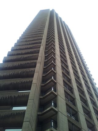
But a Brutalist web, like a Brutalist city, would be a somewhat exhausting place. How would one navigate an environment in which every building clamours for attention, seeks to proclaim its absolute difference from its neighbours, its own unique genius?
How would we cope with a web with no commonalities as we move from site to site, with no shared conventions or wayfinding devices to help us to find our way round?
And exciting as the idea is, especially when expressed forcefully by a critic of Meades' eloquence, can designers really be considered artists? Or artists designers?
Objectives vs creative freedom
Design by its very nature has a conditioned aspect that is not true of art. Designers have an objective, a problem to solve, a client to please, an audience to satisfy.
Artists, under true conditions of creative freedom, need not consider any of that: they create for its own sake, for no particular audience, with no particular purpose other than to illuminate and bring into sharper focus an aspect of existence - just for the sake of doing so. Design is, unavoidably, a public activity, with public obligations. Art has no obligations.
But whatever we might ultimately make of Meades' argument, he makes us think. We might find the Brutalist aesthetic offensive, but that, he insists, is the whole point: it sets out to challenge, to uproot, to undermine, to question, to force us to consider why we prefer the status quo, why we resist change.
Any form of design, be it architecture or web design, can only move forward if subjected to continual challenge, from the most severe and passionate of critics. By holding our cherished design principles up to the light for examination we affirm their worth - or otherwise.
Jonathan Meades' new book, An Encyclopedia of Myself, will be published in May by Fourth Estate. You can read an extract here.
Words: Justin Reynolds
Justin Reynolds is a web designer, blogger and copywriter based in Edinburgh, Scotland. Follow him on Twitter.

Thank you for reading 5 articles this month* Join now for unlimited access
Enjoy your first month for just £1 / $1 / €1
*Read 5 free articles per month without a subscription

Join now for unlimited access
Try first month for just £1 / $1 / €1
The Creative Bloq team is made up of a group of design fans, and has changed and evolved since Creative Bloq began back in 2012. The current website team consists of eight full-time members of staff: Editor Georgia Coggan, Deputy Editor Rosie Hilder, Ecommerce Editor Beren Neale, Senior News Editor Daniel Piper, Editor, Digital Art and 3D Ian Dean, Tech Reviews Editor Erlingur Einarsson and Ecommerce Writer Beth Nicholls and Staff Writer Natalie Fear, as well as a roster of freelancers from around the world. The 3D World and ImagineFX magazine teams also pitch in, ensuring that content from 3D World and ImagineFX is represented on Creative Bloq.
