15 great landing page designs
Your landing page design is vital to your website's success. Here's how to get it right.
The right landing page design can make or break a website – as this is the first thing your visitors will see. If you get it wrong, most people won't hang about.
Landing page designs should clearly convey the unique selling point (USP) for the product or service, and focus on one call to action (CTA), such as getting the visitor to register their details or to make a purchase. Whatever the goal, it's up to the design of the page to channel the user towards it, whether through use of white space, contrasting colours or more explicit directional cues. (And having the best web design tools to hand will help you achieve this.)
Clear, succinct headers and sub-headers and punchy, easily scanned bullet points are the order of the day. The landing page should be prominently branded, often incorporate a hero image to communicate the product or service at a glance, and cut straight to the point to avoid users' attention drifting.
With all of that in mind, we've pulled together some particularly effective examples of landing page design from across the web.
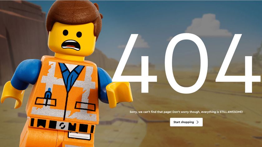
Looking for more design inspiration? Have a look at our pick of the best 404 error pages, and these perfect font pairings.
01. Angle2
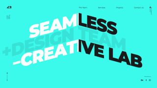
Angle2 is a Ukrainian digital design agency, with a team that believes wholeheartedly in the power of brand. Apparently nothing excites them more than crafting unique, bespoke experiences that "exude your brand's DNA" while pushing the UI envelope.
This new online home for its services certainly backs the claim, introducing not only some stellar work but also two awesome effects. Opening onto some massive Montserrat fonts drenched in #2AF8EB – or turquoise to humans – we get a typographic workout worth savouring. The trick becomes a feature throughout and conveys the 'angular' sentiment with a superb slanted text illusion.
Get the Creative Bloq Newsletter
Daily design news, reviews, how-tos and more, as picked by the editors.
This essentially uses left and right <div> elements to form a 50/50 split down the middle of the viewport. From here a series of tilted text lines wrapped in <span> tags have translate3d CSS functions applied and animated with TweenMax on hover. By applying contrasting colours to each side, it achieves a 45-degree folded aesthetic that defines the overall design.
Injecting the vivid blue accent colour into a largely black and white palette shows tasteful execution too, with further fun reserved for 'The Team' section of smiley people portraits. Here, while transitioning between each photograph, you'll spot a fabulous fragmented filter that works a treat.
02. MADCLEM
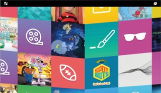
Since the web's inception, developers and designers have pushed and shoved at the outer edges of what's possible, seeking to do something new or interesting and pushing back on expectations for what a website is and how it works. This free-spirited experimentation is a hallmark of the weird, wild web.
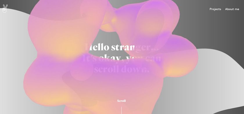
Clément Chenebault's portfolio site, MADCLEM, follows in that storied tradition of pushing boundaries, turning a simple grid of colourful squares into a fluid, malleable mass of liquid blobbery. The whole site bends and bulges with every movement you make, expanding and contracting to show little glimpses of portfolio pieces as you find your way through the gelatinous mass. The site is a fun, wavy island among an often monotonous sea of same-y looking designer and developer portfolios.
03. IBM Plex
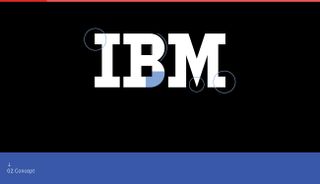
IBM recently released its own custom font, IBM Plex; this is the first refresh of its corporate typeface since 1956 so it's a big deal. To help introduce the typeface to the world, IBM asked studio XXIX to design and build a website to show it off. The thinking behind the design was to use images, animation and photography to tell Plex‘s story while showcasing the font in exciting ways.
What's great is that a lot of the site serves as a way to test out the font and explore the multiple styles available to use. So you can really see it in context before you decide to start using it in projects. The site is definitely one for graphic designers and is somewhat reminiscent of a portfolio page. Especially because, despite the dense information displayed, you can continuously scroll through the different sections, as you are greeted by some inventive scroll-triggered animation.
04. Cowboy
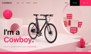
Cowboy is a new generation of electric bikes, targeted at city dwellers in the US. As a result, its website had to be slick in order to communicate the value of a product that is looking to revolutionise a market known for churning out unattractive, clunky bikes.
Created by Ueno, the site uses bold typography, strong colours, great photography and is built really well, offering a first class experience to users. The bike itself takes centre stage and immediately draws the eyes of the user.
The transitions and magnification of bike features, as the user scrolls down, are kept subtle so the bike remains central. The focus on content and not over-engineering the experience also means the site loads quickly across all devices and is very responsive. The app for the bike has its own page and parallaxes between features and the performance data offered reveals the connected nature of the product and parallax within the boundaries of the device beautifully.
05. Interface Lovers
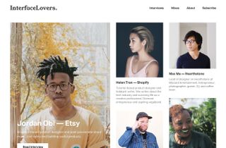
Designing a landing page for a site dedicated to 'interface lovers' is no mean feat, but Timothy Achumba – a designer for Facebook – has nailed it here. The site aims to inspire people, provide practical advice on the craft of UI design, and celebrate different designers' unique experiences.
The design places the focus firmly on content, and uses a balanced layout inspired by Achumba's first love: print. “The design for Interface Lovers, based on a simple three-column grid taken from a newspaper layout, is uncomplicated and clean,” he says. Beautiful portrait photography draws visitors in and emphasises the site's interest in individual stories.
To build the site, developer Iheanyi Ekechukwu took advantage of Tachyons, a functional CSS framework that allows for granular control over the design. The result is a gorgeous, minimal design, without any bells and whistles getting in the way.
06. Google Fonts
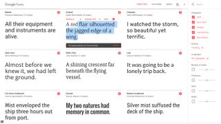
Originally launched in 2010, Google fonts are now viewed on the web over 15 billion times a day, in over 135 languages worldwide. The Google Fonts site is clean and fully responsive, using Material Design for its grid and styling.
In her blog post about the project, designer Yuin Chien explains that "by building in the ability to play with scale, colour and font pairings, we invite everyone to discover and seamlessly use typefaces in their projects." And she's right; the interface is inviting and beautiful. It's also intuitive and fun to explore.
Crucially it doesn't force you to jump through hoops to get to the fonts; they're right there at the top of the landing page, ready for you to play with. You can type straight into the page's text fields to test them out. And if you're overwhelmed by choice, Google makes it easy to narrow things down with tick boxes for font categories and handy sliders for number of styles, thickness, slant and width.
07. MIT Technology Review
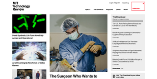
So many sites go out of their way to reel in those page views with fancy tricks, it's a relief to find a site that keeps things nice and simple. MIT's Technology Review, first published at the end of the 18th century, has a long and proud heritage, and its site has been tailored to showcase excellent art and be a delight to read.
The landing page is a joy to behold, starting you off with a bold cover story, three secondary stories, and a roundup list of the day's top stories called 'The Download'. This enables visitors to quickly get to what matters in a no-nonsense way.
A large red Subscribe CTA in the top-right also immediately draws your eye, channelling visitors to the paid website options without impeding their enjoyment of the free content available.
08. Resn
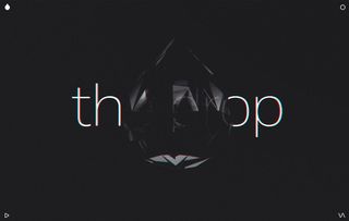
Now let's look at a page that disregards most of the rules of landing page design, yet succeeds anyway. Never one to fall in line and use a standard UI pattern, design agency Resn has built a landing page centred around 'The Drop', an enigmatic, shimmering teardrop-shaped polygon that acts as a portal into the Resn psyche.
Click and hold your mouse and you get to be, variously, a greyscale, apple-themed kaleidoscope; a bat with a ouija board that uses its x-ray laser beams to strip the flesh from people in old paintings; a fun tube; a psychedelic Yakult that dispenses bizarre clipart; and goodness knows what else.
Resn has broken many of the usual rules for creating a landing page, but the result is compelling enough that you're likely to keep digging around if this kind of thing floats your boat, and refrain from wasting their time if not. 'The Drop' probably works as a perfect filter for attracting the kinds of clients the company wants to work with, and it is a truly magnificent landing page that you'll probably never forget.
09. Present & Correct
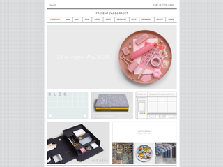
With its neatly laid-out grid of glorious imagery, the Present & Correct site reaches out to what is surely its core audience: people who fetishise stationery.
A graph paper background, pale grey colouring and classic font channel a school exercise book vibe and each panel displays a beautiful product. Stock is meticulously arranged into categories displayed in the top menu bar, and it's tempting to click through the whole lot, starting with the intriguingly-titled 'Ephemera' section.
10. Monotype
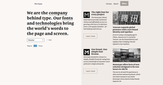
"We are the company behind type," states Monotype's landing page, and its understated yet smart design goes hand-in-hand with this confident statement. The entire left half of the landing page design is dedicated to the company's mission statement, and there's a clever twist: through a dropdown you can view the text in an assortment of fonts, and in various weights and styles, to get a taste of what Monotype does.
The right-hand side of the page is given over to a link to the Monotype library, enterprise licence, and company news, with large 'M' icons in different fonts, acting like drop caps. A muted sepia colour palette keeps the focus firmly on the fonts.
11. LS Productions
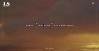
LS Productions – a stills and motion service production company based in Scotland – knows what its biggest asset is, and that's what you're presented with when you go to its site. A window-filling looping video showcases a selection of the company's work, all set in beautiful locations. Scroll down and you'll learn of its three main services: motion, stills and locations.
By this point the landing page has already done its job. Everything below – the gorgeous location of the week, the 'meet the team' section – is just window dressing. If you're looking to hire LS Productions then you'll have already moved on to one of the main service pages, where you'll find a wealth of relevant, well-presented information convincing you of the company's suitability.
12. O'Neill
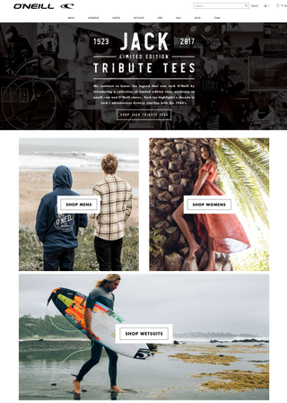
American lifestyle brand O'Neill is largely focused on two things: surf and snow. And its US site makes that perfectly clear with an image-led landing page that sells you its clothing ranges and sports gear through stunning photography of big waves and snow-covered mountains.
A set of drop-down links at the top of the landing page can take you straight to what you want if you know what you're after, but beneath that the landing page sets out to seduce you, with several large, image-led section links and Instagram galleries. It's all quite enough to get you dashing to the beach – or the top of the nearest mountain – but not before stocking up on O'Neill gear first.
13. Hipstamatic
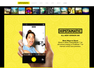
For retro analogue photography app Hipstamatic, it's all about demonstrating the cool features, as well as the look, feel and intuitive navigation of the app, in as engaging a fashion as possible to draw users in.
At the top of the page, a scrolling gallery strip showcases the 'Hipstamatic aesthetic' in practice, while an enormous iPhone showcases the latest version of the app, with its old-school ClassicMode and new ProMode, with more up-to-date features. Beneath that a new strapline sums up what Hipstamatic is now all about: "Make beautiful photography", with a big CTA directing you to the App Store.
14. Apple
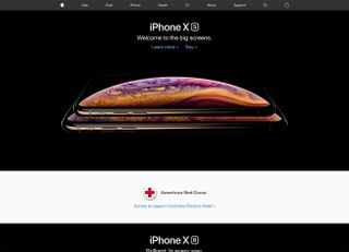
It's no surprise that the undisputed masters of industrial design can knock together a decent website, and the effortless simplicity of Apple.com has even won it a D&AD Black Pencil.
The homepage slices through the company's extensive product range and zeroes in on just one hot product of the moment. Besides the simple navigation bar across the top, it's just beautifully shot product photography, the product name and its slogan. There isn't even a CTA here – Apple sensibly assumed its tech-savvy audience will know the image and text is hyperlinked to more information. It's a true masterclass in restraint.
15. Pinterest
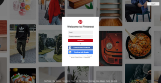
Pinterest knows what it wants, and is in no mood to beat about the bush: it's sign up or nothing. The popular online scrapbook is confident enough in its brand and burgeoning reputation not to worry too hard about selling itself, or giving users an opportunity to browse around some boards and risk getting sidetracked.
Behind the signup card, one of Pinterest's scrapbooks of glorious photography scrolls tantalisingly upwards, giving a taste of what's on offer for users. This is a stripped-back and beautified version of what you actually get – no wordy descriptions, ads or repin info clutters up this version of the homepage.
Related articles:

Thank you for reading 5 articles this month* Join now for unlimited access
Enjoy your first month for just £1 / $1 / €1
*Read 5 free articles per month without a subscription

Join now for unlimited access
Try first month for just £1 / $1 / €1
The Creative Bloq team is made up of a group of design fans, and has changed and evolved since Creative Bloq began back in 2012. The current website team consists of eight full-time members of staff: Editor Georgia Coggan, Deputy Editor Rosie Hilder, Ecommerce Editor Beren Neale, Senior News Editor Daniel Piper, Editor, Digital Art and 3D Ian Dean, Tech Reviews Editor Erlingur Einarsson and Ecommerce Writer Beth Nicholls and Staff Writer Natalie Fear, as well as a roster of freelancers from around the world. The 3D World and ImagineFX magazine teams also pitch in, ensuring that content from 3D World and ImagineFX is represented on Creative Bloq.
