How to redesign an outdated website
Lots of B2B company websites are stuck in a pre-social, pre-mobile and static past, says marketing director Isobel Pearce. Here, she explains how to save your website...

"A website can be a powerful tool for a business as the first port of call for its customers," says marekting director for The Inviqa Group Isobel Pearce. "However, many websites are stuck in a pre-social and pre-mobile past where users battle with outdated styles and interfaces that are difficult to navigate.
"There are certain industries that are particularly guilty of letting their online customers down, so let’s see what they’re doing wrong and how they can progress. Like a lot of service-oriented websites, car dealership sites sit at various positions on the user-friendly spectrum. Car dealers need to provide plenty of information if they’re going to convince customers to part with thousands of pounds.
"However, these sites don’t always provide key information in an accessible way. Visit any car dealer website at random and you’ll encounter some or all of the following:
- Broken navigation that makes finding a relevant page difficult and time consuming
- A lack of online booking options for a test drive, or information on the location of service centres
- Pop-up advertisements and Flash banners
- Video or audio on autoplay
- Little effort to link the site to social media networks that give users access to feedback from previous customers
- Confusing or absent call to action buttons
- An absence of customer testimonials in general
User-friendly development
"Many B2B websites also remain in the past when it comes to user-friendly development, delivering outdated and old-fashioned aesthetics and design. Unlike consumer sales, B2B sales cycles are long and involve a number of stakeholders.
"B2B buyers have evolved tremendously in the last few years and will extensively research online and offline before making buying decisions, consuming large amounts of content in various formats including videos, whitepapers, case studies, blogs, reviews and social media analysis.
"Instead of making this preferred content available on websites, most B2B companies still use an outdated brochure format with a largely static website. Failure to update their websites means B2B companies are failing to maximise the return on their investment. These companies could develop their sites by following some of these basic tips:
- Redesign the site so it’s engaging and fresh on whatever platform or device it’s viewed on
- Shun outdated proprietary technologies in favour of open source technologies
- Develop the homepage, particularly around the headline and call to action
- Make the navigation user-friendly, especially for a website with multiple product or service categories. Consider a text sitemap in the footer
- Highlight quality content on the homepage. Case studies and whitepapers are particularly effective for conversion
- Use short videos, especially for product demos
The financial sector
"The final sector that risks alienating its customers is the banking and finance industry. Although nearly every bank offers online banking services, the majority are facing significant problems that could let down their users and customers.
"The greatest point of weakness for banks’ websites is security holes. From simple SQL injection attacks in the frontend to sophisticated assaults on the backend infrastructure, banks all over the world face daily threats.
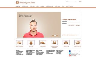
"The examples are numerous: one incident last November saw the deletion of the entire Bank of Jerusalem database after it was hacked by Anonymous. The danger here is far greater than the banks losing money as customer data is at stake. Therefore, banks have much to lose in terms of reputation and customer confidence. Banks need to ensure the frontend and backend provide bulletproof security.

"Websites are the first, and in many cases, the last place where impressions will be made. If users don’t know the business, they will judge it by the state of its website. It’s important that businesses ensure their websites are up to a high standard or they face losing conversion, customers and, ultimately, sales and reputation."
Also read:
- How to stop your client ruining your design!
- Why real book covers still resonate
- Things you should never ask a designer

Thank you for reading 5 articles this month* Join now for unlimited access
Enjoy your first month for just £1 / $1 / €1
*Read 5 free articles per month without a subscription

Join now for unlimited access
Try first month for just £1 / $1 / €1
Get the Creative Bloq Newsletter
Daily design news, reviews, how-tos and more, as picked by the editors.
The Creative Bloq team is made up of a group of design fans, and has changed and evolved since Creative Bloq began back in 2012. The current website team consists of eight full-time members of staff: Editor Georgia Coggan, Deputy Editor Rosie Hilder, Ecommerce Editor Beren Neale, Senior News Editor Daniel Piper, Editor, Digital Art and 3D Ian Dean, Tech Reviews Editor Erlingur Einarsson, Ecommerce Writer Beth Nicholls and Staff Writer Natalie Fear, as well as a roster of freelancers from around the world. The ImagineFX magazine team also pitch in, ensuring that content from leading digital art publication ImagineFX is represented on Creative Bloq.
