How Innocent Drinks remade its campaign website
Innocent Drinks launches a brand new website to encourage people to knit little hats to raise money for the elderly. We find out how it was made.
Back in 2003, Innocent Drinks launched a campaign called the Big Knit, in which people would knit little hats of all designs to sit on top of Innocent products. And for every one sold, 25p was donated to Age UK, to help keep older people warm in winter.
Still going strong, the year marks the 10th anniversary of Innocent's Big Knit campaign, for which it's launched a brand, spanking new website to help people get involved and raise even more money. We spoke to Innocent's digital manager Lois Hinx about how the new site was developed...
Q: What was your design approach to the new site?
"The design for the Big Knit site is inspired by our on-pack campaign designs. It has a playful and inviting feel to it with a bold, impactful colour palette.
"It was important that the site design and content made people feel excited and inspired to join in with the campaign – initially knitting and sending us a hat and then creating and sharing personalised content in the form of a 'virtual hat'.
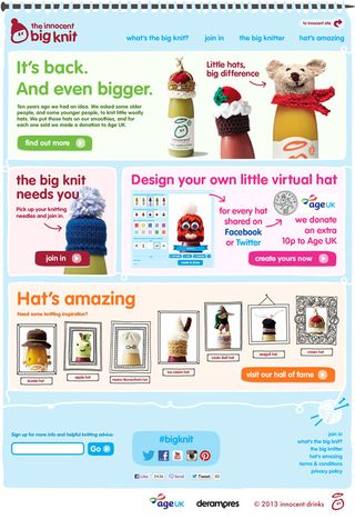
"The homepage is flexible and modular in design – allowing us to respond and evolve the content over the course of the campaign. With over a quarter of visitors coming to our main innocent drinks site on a mobile and tablet, responsiveness was, of course, fundamental to the design. Since it launched, we've noted that almost half the visitors to the Big Knit site are mobile and tablet users and with a very low bounce rate, we're confident this is down to our device-sympathetic design.
The Big Knit site has a playful and inviting feel to it, with a bold, impactful colour palette
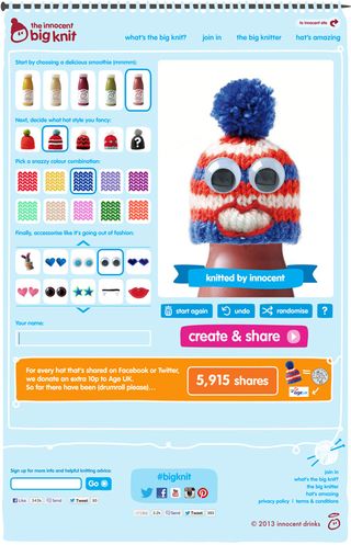
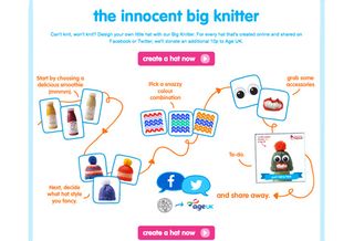
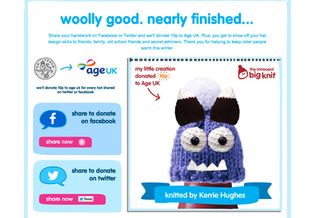
"The 'innocent big knitter' provides a fun, interactive way for people who can't knit to still get involved with The Big Knit. By 'knitting' a personalised virtual hat and sharing their creation to raise 10p, they'll directly be helping Age UK keep older people warm this winter.
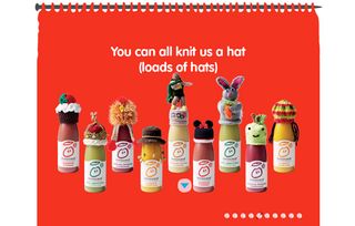
"Our 'about us' page tells the innocent Big Knit story and echoes the key messages of our TV advert (the first Big Knit TV ad we’ve ever made). The Big Knit is a simple idea and we wanted to articulate it in a simple but charming way so we used parallax scrolling to give an animated feel to it."
Q: What did you use to develop the site?
"We built the site in HTML5 using media queries for device responsiveness. Our ‘about us’ section was built with parallax scrolling for subtle browser-friendly animation. The 'innocent big knitter' uses JavaScript for its functionality.
"All of these languages and markups work seamlessly on mobile and tablet devices and this was key to our development."
Q: Did you use any new or notable techniques on this project?
"We built the site with mobile and tablet in mind from the very start. We stayed very agile throughout the process working in short sprints and generating design assets alongside the front and back end development.
"It meant that we were flexible to ideas both from the design and development sides and were able to adapt plans and designs as we worked through the process. The software Dropbox was a vital part of our method – allowing both front end developers and designers access to design files as they were updated and added to."
Want to get involved? There's still time to knit a hat of your own or raise money by creating a virtual hat and sharing it online. Don't forget to tweet us @Creativebloq with your designs. Here's one we made earlier...
Liked this? Read these!
- Create a perfect mood board with these pro tips
- How to build an app: try these great tutorials
- The best 3D movies of 2013
Have you seen any cool web design projects recently? Let us know in the comments...

Thank you for reading 5 articles this month* Join now for unlimited access
Enjoy your first month for just £1 / $1 / €1
*Read 5 free articles per month without a subscription

Join now for unlimited access
Try first month for just £1 / $1 / €1
Get the Creative Bloq Newsletter
Daily design news, reviews, how-tos and more, as picked by the editors.
The Creative Bloq team is made up of a group of design fans, and has changed and evolved since Creative Bloq began back in 2012. The current website team consists of eight full-time members of staff: Editor Georgia Coggan, Deputy Editor Rosie Hilder, Ecommerce Editor Beren Neale, Senior News Editor Daniel Piper, Editor, Digital Art and 3D Ian Dean, Tech Reviews Editor Erlingur Einarsson and Ecommerce Writer Beth Nicholls and Staff Writer Natalie Fear, as well as a roster of freelancers from around the world. The 3D World and ImagineFX magazine teams also pitch in, ensuring that content from 3D World and ImagineFX is represented on Creative Bloq.
