Improve accessibility with smarter flagging
The convention for flagging up current pages is far from accessible. Heydon Pickering discusses his search for a suitable alternative.
Sign up to Creative Bloq's daily newsletter, which brings you the latest news and inspiration from the worlds of art, design and technology.
You are now subscribed
Your newsletter sign-up was successful
Want to add more newsletters?
Five times a week
CreativeBloq
Sign up to Creative Bloq's daily newsletter, which brings you the latest news and inspiration from the worlds of art, design and technology.
Once a week
By Design
Sign up to Creative Bloq's daily newsletter, which brings you the latest news and inspiration from the worlds of art, design and technology.
Once a week
State of the Art
Sign up to Creative Bloq's daily newsletter, which brings you the latest news and inspiration from the worlds of art, design and technology.
Seasonal (around events)
Brand Impact Awards
Sign up to Creative Bloq's daily newsletter, which brings you the latest news and inspiration from the worlds of art, design and technology.
For as long as anyone can remember, we've had a convention whereby the navigation link corresponding to the current page (that's the web page the visitor's on at the time) is highlighted. Whether by text-decoration, background-color or font-size , the link is picked out as a 'You Are Here' sign, helping to contextualise the visitor's location within the site.
In both WordPress and Drupal, a class is the cipher by which 'You Are Here' is indicated. The problem is, classes are not interoperable: they do not communicate anything to assistive technologies (AT) via the browser's accessibility API. Classes are not semantic. So, all this time, AT users have lacked this contextualising information.
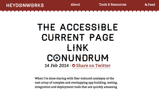
In a bid to find an accessible alternative to 'current page' links, I did some research and presented my findings in a blog article entitled The Accessible Current Page Link Conundrum. My interest was in any markup that could provide an accessible name (text readable by AT) and double as the basis for a styling hook. Hence, one proposed method was to harness aria-label="current page" and add the visual highlight via the [aria-label] attribute selector.
The aria-label method, which replaces the link's text node (for example, 'about' for 'current page') was superseded by aria-describedby which rather more helpfully appends the accessible text ('about… current page'). However, it was a solution offered by Daniel Göransson in the comments that I’m most fond of.
A different approach
Göransson suggested replacing the href value with a link to the main content of the page; #main. By taking this approach we satisfy a number of criteria. Firstly, we are harnessing the well-supported behaviour of screen readers to announce 'same page link' for links to page fragments.
Semantically this can be comprehended as 'link to somewhere in this page' as well as 'link to this page'. Or both. Secondly, it can be styled dependably using [href="#main"] – the style follows the function. Finally, it gives screen reader and keyboard users a helpful shortcut to the landmark, much like a skip link.
At the risk of current page links becoming a personal obsession, when Léonie Watson asked me to speak at Inclusive Design 24 , I decided it was the collected findings on this subject that I wanted to present.
Sign up to Creative Bloq's daily newsletter, which brings you the latest news and inspiration from the worlds of art, design and technology.
Many of the original commenters turned up to keep me in check, including Göransson, whose name I recognised in the chat stream. It was like a flame war – if flame wars pertained to helping rather than heckling other web users. A lot of fun.
Words: Heydon Pickering
Heydon Pickering is a UX designer, illustrator and accessibility evangelist. This article originally appeared in net magazine issue 257.

The Creative Bloq team is made up of a group of art and design enthusiasts, and has changed and evolved since Creative Bloq began back in 2012. The current website team consists of eight full-time members of staff: Editor Georgia Coggan, Deputy Editor Rosie Hilder, Ecommerce Editor Beren Neale, Senior News Editor Daniel Piper, Editor, Digital Art and 3D Ian Dean, Tech Reviews Editor Erlingur Einarsson, Ecommerce Writer Beth Nicholls and Staff Writer Natalie Fear, as well as a roster of freelancers from around the world. The ImagineFX magazine team also pitch in, ensuring that content from leading digital art publication ImagineFX is represented on Creative Bloq.
