'I can't tell you how scary it is designing for designers': Why Figma's new UI is a big deal
UI3 is designed to bring cohesion to the Figma ecosystem.

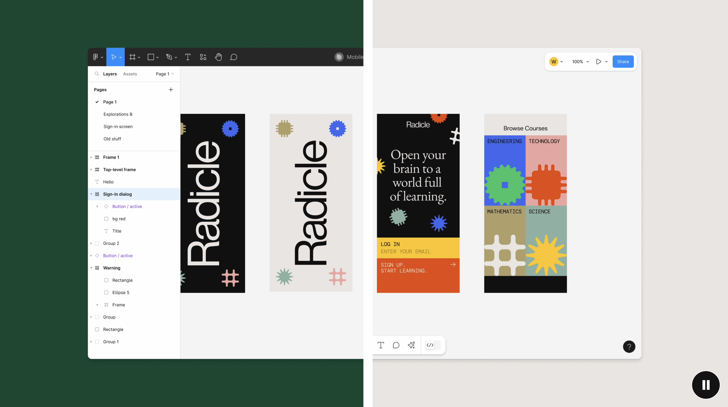
We're back in San Francisco for Config, Figma's annual conference "for people who build products". As always, the company has announced a bunch of new tools and features for Figma itself, including a slew of AI features, and Figma Slides, a brand new tool for creating presentation decks. But perhaps the most daunting announcement for the company came in the form of UI3, the third significant redesign of Figma since the product began.
Designed to offer "a more streamlined and adaptable interface," UI3 includes resizable panels, optional labels in the properties panel and clearer iconography. And, unsurprisingly given the simultaneous announcement of Figma's first native AI features, these feature prominently in the new UI. (If you're just getting started with web design, take a look at our Figma review.)

"I can’t tell you how scary it is designing a new UI for Figma for designers," said CEO Dylan Field, acknowledging the irony of redesigning the UI of the tool used to build UI itself. But the irony didn't end there. "I also can't tell you how meta it is designing a new Figma editor inside the old Figma editor.” (During the gradual roll-out of UI3, UI2 will continue to be usable.)
With the announcement of Figma Slides, and last year's addition of Dev Mode, Figma is arguably inching towards 'suite' territory – and the new UI is designed to create more cohesion across the expanding Figma ecosystem. "Whether you’re brainstorming in FigJam, refining in Figma Design, or presenting with Figma Slides, we wanted the experience to feel fluid and familiar. Consistent patterns like the slim toolbar and floating collapsible panels create a through line."

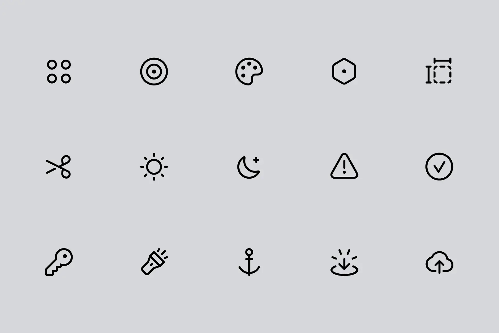
The new iconography includes 200 expressive icons hand-drawn by designer Tim Van Damme. Among them is a new 'sparkle' icon in the toolbar brings up Figma AI. Features include the ability to create mobile and web UI mocks with via a text prompt, and an impressive visual search system, letting users search for an exact piece of design using a frame, image or screenshot.
Field admitted that, for designers, the new design may take some getting used to. "We’re going to roll it out slowly and listen to your feedback," he said. UI3 will be available as a limited beta from June 26, 2024. Users can join a waitlist in-product to request access.
Get the Creative Bloq Newsletter
Daily design news, reviews, how-tos and more, as picked by the editors.

Thank you for reading 5 articles this month* Join now for unlimited access
Enjoy your first month for just £1 / $1 / €1
*Read 5 free articles per month without a subscription

Join now for unlimited access
Try first month for just £1 / $1 / €1

Daniel John is Design Editor at Creative Bloq. He reports on the worlds of design, branding and lifestyle tech, and has covered several industry events including Milan Design Week, OFFF Barcelona and Adobe Max in Los Angeles. He has interviewed leaders and designers at brands including Apple, Microsoft and Adobe. Daniel's debut book of short stories and poems was published in 2018, and his comedy newsletter is a Substack Bestseller.
