Font shop created by a designer, for designers
After almost two years in development, designer Alex Haigh unveils the revamped version of his font shop HypeForType.
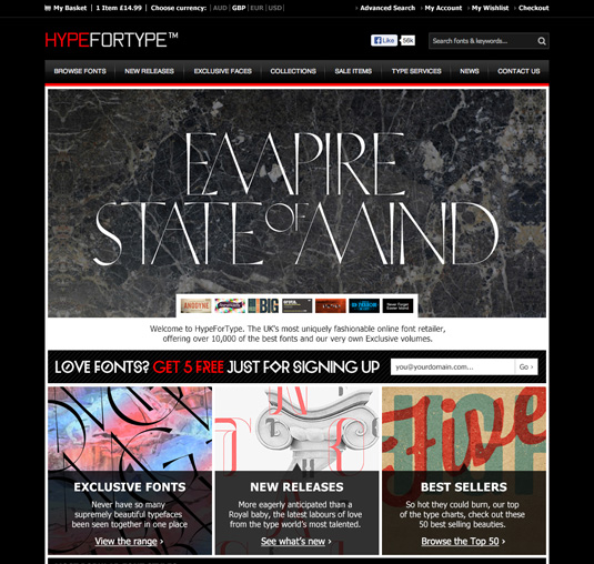
Alex Haigh is the man behind HypeForType, the online foundry featuring a growing hotbed of top typographic talent. Initally built back in 2009, Haigh has spent the last 18 months redesigning his beloved site to make it one of the best font shops on the web.
We spoke to him about his love for type and the site redesign...
Q: When did your obsession with type begin?
"It began when I was at college, where I first discovered the graphic design studio The Designers Republic. After that I was hooked. I even got to a point where its founder Ian Anderson was considering taking me on.
"However, because I was slowly building up my own catalogue of work separately, he told me he was concerned I'd be using TDR as a stepping stone, and would eventually leave to do something myself which so many others had done before. Truth be told, and as much as I loved TDR, he was right - that was the one of the main reasons I initially wanted to get in."
Q: What prompted you to develop your own font shop?
"At the same, as a designer, I wasn't satisfied with what some of the other font retailers were offering, it felt as if they just stocked any old type for the sake of it. What I really needed was a place to inspire me as a designer, and I quickly found that didn't exist.
As a designer, I wasn't satisfied with what some of the other font retailers were offering
"What originally started off as just an idea soon turned into a passion, and a few months on it became evident that this could also be a business for me. So I spent every spare hour working on HypeForType, whilst staying in hotels and freelancing in London agencies. It became a little bit too much at times and I'd find myself sleeping four hours a night because I had been so engrossed in building HFT on the sidelines."
Q: What prompted the redesign?
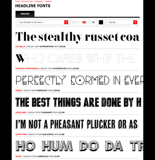
"I guess time and feedback. The old site was OK but it lacked quite a few things, both technically and visually. Coming from a design background, I was confident I could make something attractive - it was just a case of fine tuning the technicalities in a way that worked for people, and the information architecture side of the site was probably the hardest part.
"When it comes to the actual font pages you've got so much information that it's completely overwhelming when it comes to thinking about how to show that. What takes pride of place over the rest? And how you can create all of this in an understanding, enjoyable, attractive, and easy to use method - that was very, very difficult."
Q: What was your design approach to the project?
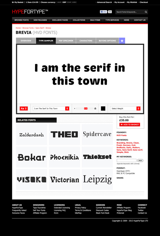
"It's quite funny really when I look back at some of my original takes on the redesign as they were extremely poor. I've probably spent hundreds of hours constantly trying to improve the designs, getting the functionality to look right and work right, and all in an understandable functional aesthetic manner.
"I think the main thing with the original pages was what they were not dynamic, so I knew I had to create something that would look after the content itself, always show the user something fresh and be inspiring, I'm hoping I have got there with this design and I'm incredibly excited about it.
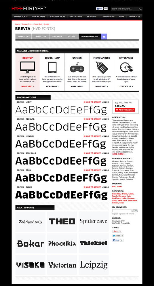
"Originally when I first sat down to do this I honestly did not know where to start - it was like finding a 100 pieces of a puzzle and trying to put them together without any instructions. So my first port of call was competition.
"I printed out every single font retailer large or small and put their sites on my wall. I then spent weeks analysing and scrutinising every aspect working out what was good, what was bad, beneficial, unnecessary, just every aspect of what a page needed for a font or font family and then how I can go about organising all of that information in a neat, concise, attractive, and - most of all - understandable way.
I spent weeks analysing and scrutinising the competition
"Overall the goal was to have the functionality of the major online font shops, but produce a look and feel that would be a lot stronger. It was obvious what I needed to do, and that was to create something for a designer, by a designer, and only a designer would understand that. No type gridnick or corporate investor in a sharp suit would know what designers really want, especially when they are hunting for type."
Q: What did you use to build the site?
"It was originally built using Magento which is a pretty extensive ecommerce platform. Magento just gives you more flexibility than most other programs and also allows for upgrades and other features, it's heavily customised to the sense where the actual site itself and its sections have in total taken over a year to complete."
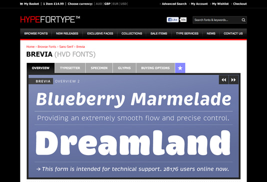
Q: You've worked closely with the likes of Alex Trochut and Vault49 for this redesign. Did you the collaborations come about?
"I worked with Alex years ago when HypeForType first begun, he designed a typeface for me called Neo Deco which went on to win a D&AD accommodation and also became on of my early best selling typefaces. This pattern of working with famous designers has carried on throughout the years and has over time turned into 6 individual volumes of exclusives fonts on the site, known as exclusive faces.
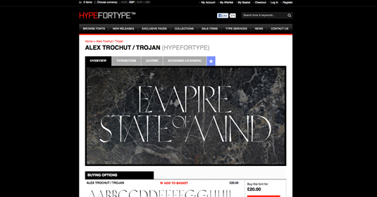
"Now HypeForType is a bit more well known it's easier to collaborate with artists and given what other designers and studios have done in the past the majority of the time they're very interested - it's just a case of finding someone who I think can really create something amazing for designers."
Q: What has been the hardest part of this redesign?
"It's just time, I guess. It's literally taken a year to produce designs that I am happy will work for the next 5-10 years and at a level to compete with the big boys."
Liked this? Read these!
- How to use the PHP command line
- 7 ways towards better APIs
- Improve your websites with microinteractions
- Our favourite web fonts - and they don't cost a penny

Thank you for reading 5 articles this month* Join now for unlimited access
Enjoy your first month for just £1 / $1 / €1
*Read 5 free articles per month without a subscription

Join now for unlimited access
Try first month for just £1 / $1 / €1
Get the Creative Bloq Newsletter
Daily design news, reviews, how-tos and more, as picked by the editors.

The Creative Bloq team is made up of a group of art and design enthusiasts, and has changed and evolved since Creative Bloq began back in 2012. The current website team consists of eight full-time members of staff: Editor Georgia Coggan, Deputy Editor Rosie Hilder, Ecommerce Editor Beren Neale, Senior News Editor Daniel Piper, Editor, Digital Art and 3D Ian Dean, Tech Reviews Editor Erlingur Einarsson, Ecommerce Writer Beth Nicholls and Staff Writer Natalie Fear, as well as a roster of freelancers from around the world. The ImagineFX magazine team also pitch in, ensuring that content from leading digital art publication ImagineFX is represented on Creative Bloq.
