How to use numerals on a website - 5 top examples
When done right, well-styled figures can add weight to a list or dramatic potency to data, says Matthew Smith.
As with any design tool, numerals should be used as part of a conceptual whole -- they connote meaning through quantity or sequence. You can use them to lead people through a list, draw users into a calendar or sequence your navigation.
Know your definitions
It doesn't hurt to know that numerals are the typographic symbols of numbers. So, for example, '5' is the numeral of the number 'five'.
Numerals in navigation
Numerals can be used in short navigation schemes. More than two sections, but fewer than seven, is usually best. A long list can feel overwhelming. Try to use numerals to make your lists feel concise and easily scannable.
Numerals in calendars
The most important dates in calendars are determined by content and context. If you're reviewing ancient wars then the year is probably the most important number. However, if you're producing a calendar design for a present-day scenario, or marking a blog post, the focus should be on a specific day's date, rather than the year.
Numerals in data
Information is increasingly available in metric form in web design, and this can produce some stunning results. Data numerals should be distinguishable and easy to read. Size can be a great way to draw attention to figures, but it's important to retain a visual reference to a label or information source so that numbers remain useful.
Five examples to check out
01. GeckoBoard
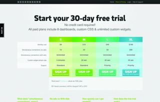
One of the best data designs I've seen this year is for the business status board application GeckoBoard. These guys use great stats and layouts, clearly labelled, with meaningful use of numerals.
02. Imaginista
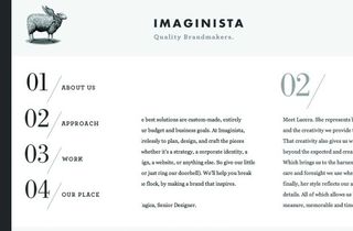
Elegant numerals stack in a short navigation for the design shop Imaginista. The developers have repeated the numbers throughout the horizontal site.
03. Solo
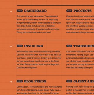
Solo, a freelance project management application, uses numerals throughout its interface, with a great example of decimals on its homepage.
04. Summer in Tennessee
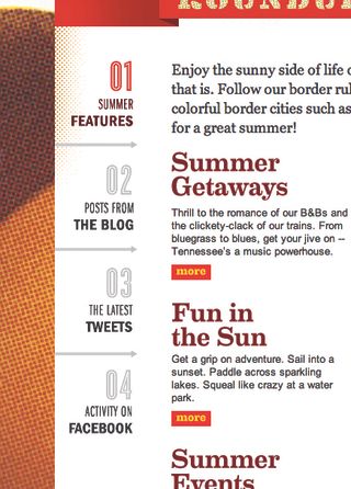
Summer in Tennessee is an awesome tourism site, but I like the numbered subnavigation system most. Numerals stacked with titles and subtitles make for a gorgeous approach.
05. Autostrada Pedemontana Lombarda
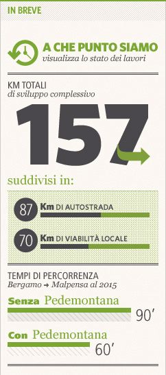
Using data to draw people into your site can serve as a kind of internal ad, pulling them deeper into your domain. The site for Italian road network Autostrada Pedemontana Lombarda uses numerals in this way, along with chart data.
If you've seen any examples of sites using numerals to great effect, why not mention them in the comments?

Thank you for reading 5 articles this month* Join now for unlimited access
Enjoy your first month for just £1 / $1 / €1
*Read 5 free articles per month without a subscription

Join now for unlimited access
Try first month for just £1 / $1 / €1
Get the Creative Bloq Newsletter
Daily design news, reviews, how-tos and more, as picked by the editors.
The Creative Bloq team is made up of a group of design fans, and has changed and evolved since Creative Bloq began back in 2012. The current website team consists of eight full-time members of staff: Editor Georgia Coggan, Deputy Editor Rosie Hilder, Ecommerce Editor Beren Neale, Senior News Editor Daniel Piper, Editor, Digital Art and 3D Ian Dean, Tech Reviews Editor Erlingur Einarsson and Ecommerce Writer Beth Nicholls and Staff Writer Natalie Fear, as well as a roster of freelancers from around the world. The 3D World and ImagineFX magazine teams also pitch in, ensuring that content from 3D World and ImagineFX is represented on Creative Bloq.
