How the role of the homepage has changed
We explore how our design approach needs to evolve with the homepage's changing role.

Could your website survive without a homepage? Based on today's user behaviour, I'd venture to guess the answer is yes. Over the years, how we use websites has evolved. We need to start designing homepages that work for our product and its users, rather than simply copying trends. It's easy to follow the same homepage design pattern as the latest hot, new startup. It's also lazy.
In 2015, we saw the prevalence of responsive web design and its impact: large hero areas above the fold, with single calls to action, rows of three words or phrases explaining the product, a full-bleed value proposition, and then a grid of interchangeable media or products. Change the logos on these homepage designs and I'd bet users would barely notice that the exact same website was being used for a different product.
Until the early 2000s, homepages largely functioned as a signal to users that the brand had an online presence. The pages didn't need to function much beyond displaying this presence and contact information. As more companies and people came online, homepages evolved into brand salesmen, trying to prove that the product was worthy of users by presenting as much content up-front as possible.
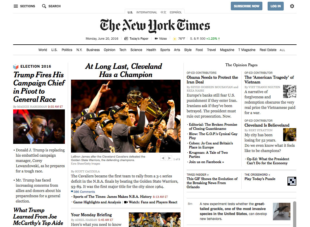
This approach worked... until users stopped coming directly to the homepage. We're now seeing search, social media and email driving traffic directly into product or article detail pages, completely bypassing the homepage. For example, in 2014 The New York Times reported its homepage visits were down 40 per cent even though its online readership was unchanged. It still receives homepage visits, but they no longer form the majority of its traffic.
A different approach
The most important part of designing a homepage that meets your users' needs is asking the simple question: Who is currently visiting the homepage? Look at your analytics and try to understand where the user is coming from and what their internal path is after the homepage.
The New York Times found its homepage traffic was coming from power users: those who were loyal, frequent and knowledgeable about the product. It didn't need value propositions or an explanation of the brand; it needed tools and content personalised to these users' interests.
On a different type of website, these loyal users might immediately funnel into a logged-in state or purchase flow. In that case, the homepage should be designed with that flow front-and-centre, rather than making users search in the top-right corner for the correct button.
The way navigation functions is also changing. When a user comes to a site, however they may have got there, they need context. Design for a user that has zero knowledge about your brand and product. Clear navigation is crucial. Prioritise site content and embrace tiered navigation when necessary – the best navigation acts as a kind of table of contents for the site. Try not to resort to hamburger menus, which can easily end up being the equivalent of a junk drawer.
If your users are bypassing the homepage, your content pages must work extra-hard to give users all the information they might be missing – every content page should be viewed as an entry point to your brand and product.
We need to start designing homepages that work for our product and its users, rather than simply copying trends
Make sure the content on the page answers the following questions: What else can I find here? What value is this offering me? Why should I care about this?
The first question can be addressed with navigational elements or breadcrumbs. Some brands find that reiterating their mission statement below the page content helps anchor and guide the user. Providing context about the brand or product can help users in exploring other content.
The key is this: at any point on the website, the user should be able to identify that it's the same experience. When they bypass the homepage, consistency is key. Elements like navigation, branding and UI should remain the same throughout the ecosystem, even (or especially) if it's a large one. That way, no matter how or where a user arrives on your site, they'll be greeted with the information and encouragement they need to take the next steps.
It's not all about the homepage any more. But that doesn't mean that homepages don't serve an important – if evolving – purpose to those that do use them.
This article originally appeared in issue 280 of net magazine; buy it now!

Thank you for reading 5 articles this month* Join now for unlimited access
Enjoy your first month for just £1 / $1 / €1
*Read 5 free articles per month without a subscription

Join now for unlimited access
Try first month for just £1 / $1 / €1
Get the Creative Bloq Newsletter
Daily design news, reviews, how-tos and more, as picked by the editors.
