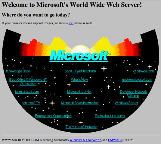
How Paravel rebuilt Microsoft's original 1994 homepage
The team chat about the Microsoft project that saw them mining the archives of web history.
The year is 1994. CSS has yet to be invented, <font> tags were a thing of the future and browsers ran on steam and coal. It's into this world that Microsoft launched its first homepage.
In the intervening years Microsoft has redesign its homepage many times. Paravel, responsible for the software giant's most recent reworking, also turned its attention to the 1994 relic, hoping to recreate it.
"I got really into this project, " wrote Parvavel's Dave Rupert. "In a lot of ways, replicating the original Microsoft.com homepage after helping redesign its modern counterpart felt like restoring an old Mustang."
Brilliant Wordpress tutorial selection
We love the project – as we do all pieces of web archeology. Here, the Paravel team – Trent Walton, Dave Rupert and Reagan Ray – discuss the Microsoft project.
Why don't you introduce yourselves and the Microsoft project?
TW: Dave Rupert, Reagan Ray and I work together at a web shop called Paravel. We teamed up with Microsoft to build the current responsive version of its homepage.
Microsoft reached out to us again for a really fun project – to recreate the original Microsoft homepage, 20 years after its 1994 launch.
What motivated this digital archaeology?
DR: Microsoft's Chris Balt came to us with the idea, thinking it'd be appropriate to recreate the page on the 20th anniversary of its launch.
To us, the 1994 homepage represents a key piece of the web's history and captures the innovative spirit that so many who work on the web possess. Needless to say, we approached the project with reverence mixed with giddy enthusiasm.

Was the job a complete rebuild or did you use pieces of existing code?
RR: It had to be a complete rebuild because the original code was nowhere to be found. We briefly considered 'modernising' it with RWD, animations and so on, but realised that we'd be doing the page (and those who worked on it) a disservice. A faithful restoration was the only way to go about things.
Is the rebuild really running NT Server 3.5?
TW: Ha! Nope, but we wanted to recreate everything (including the text) just as it was.
What were the biggest technological challenges of the project?
DR: The site build was straightforward, aside from the image map. Once we had a recreation of the star map graphic – thanks to Microsoft's Dan Schlitzkus – we had to figure out how Microsoft would have built the image map navigation given the technology available in 1993-1994.
What can today's web-makers learn from vintage sites?
TW: I'm delighted by the fact that very little seems to have changed in regards to the way innovation happens on the web. We've never been content with current technologies, and have always found new ways to push the web further. Without this aspect, I don't think I'd love web design in the same way.
How do you think today's sites will be remembered in 20 years?
DR: I have no idea, but I think if they are still online they will have a better chance of being remembered at all. It’d be a privilege to inspect the code on Microsoft's original 1994 homepage, or even the 2002 Wired redesign that demonstrated the power of web standards and CSS.
Sites like these are valuable learning tools, they help tell the story of how the web was formed and represent key turning points in how we build. The more of the web we can preserve the better. Sites like Space Jam () shouldn't be the exception, they should be the rule.
Are there any other 1994 sites you'd like to revisit, and possibly re-imagine?
TW: Regardless of the year the site was launched, I'd love to see companies, organisations and individuals bring older sites back. Maybe that involves a recreation, but maybe it simply requires a permanent URL and the will to keep older work archived and online.
I'm finally realising that if we think our work is significant in any way, we should be good stewards of that work. We should be keeping it online.
Words: Martin Cooper
This article originally appeared in net magazine issue 261.
Like this? Read this!
- Google releases 1,000th Chrome Experiment
- The designer's guide to working from home
- How to build an app: try these great tutorials

Thank you for reading 5 articles this month* Join now for unlimited access
Enjoy your first month for just £1 / $1 / €1
*Read 5 free articles per month without a subscription

Join now for unlimited access
Try first month for just £1 / $1 / €1
Get the Creative Bloq Newsletter
Daily design news, reviews, how-tos and more, as picked by the editors.

The Creative Bloq team is made up of a group of art and design enthusiasts, and has changed and evolved since Creative Bloq began back in 2012. The current website team consists of eight full-time members of staff: Editor Georgia Coggan, Deputy Editor Rosie Hilder, Ecommerce Editor Beren Neale, Senior News Editor Daniel Piper, Editor, Digital Art and 3D Ian Dean, Tech Reviews Editor Erlingur Einarsson, Ecommerce Writer Beth Nicholls and Staff Writer Natalie Fear, as well as a roster of freelancers from around the world. The ImagineFX magazine team also pitch in, ensuring that content from leading digital art publication ImagineFX is represented on Creative Bloq.
