How to learn what users expect from your design
Users have expectations about your site you probably don't know about. Here's how to find out what they are, and make sure they're fulfilled.

As information-age artists, designers enjoy their creative freedom. But concepts like "consistency" and "following patterns" don't necessarily restrict this freedom. Instead, they provide a foundation of familiarity upon which to layer creative nuances.
Originality helps you cross the chasm into emotional design, but that will all be meaningless unless your design works the way users expect.
In this article, we'll talk about how to approach user expectations in terms of consistency, how usability testing can reveal what your users think, and how the use of patterns and clear labels can give your user that feeling of satisfaction.
Think about consistency first
Why is it so important that you think about user expectations – and therefore consistency – before even creating a single mockup? Because otherwise you're going to be biased.
If you've already envisioned an interface by the time you start asking yourself, "what does the user expect?" then it's going to be harder to correct your mistakes – if you're even able to notice them.
By that point, you'll already have a rough idea of the visual design patterns, so it'll be harder to look at them from a fresh perspective. You'll be desensitized to what a new user might think about during the first interaction with your design.
Empathizing with your user is at the heart of interaction design, and this is a more difficult task with an existing design than one still being formulated.
Get the Creative Bloq Newsletter
Daily design news, reviews, how-tos and more, as picked by the editors.
Sure, you could track the behavioral patterns and modify your UI based on user interactions. But even so, you're better off putting thought into it beforehand so that the later modifications are less extreme.

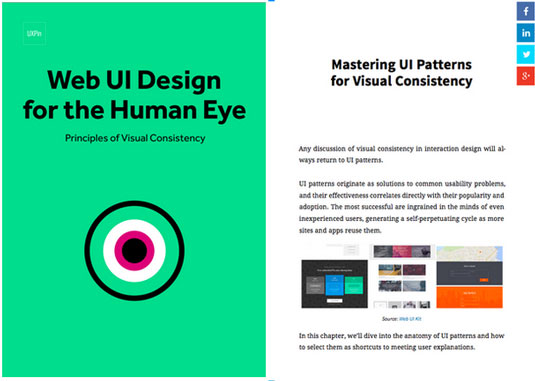
As recommended in the ebook Principles of Visual Consistency, the time to consider user expectations and consistency is right at the start, when you're working with the team on the rough feature set. At that time, you're closest to the user's mindsets: the design is new to you both.
This applies to both external and internal consistency. Since user expectations carry over from previous experiences, even new designs must follow standard conventions (external consistency). But you also need to keep internal pages consistent with each other, because your users will develop new expectations as they use your site or app.
While intuition might get you part of the way, it's best to build your designs on solid, concrete evidence.
Testing before design
Usability testing helps you understand user expectations and validate your assumptions. To ensure consistency in your design, we recommend running usability tests both before and during the design process.
We'll focus here on the tests that you'd want to run before designing, since these can be a little lesser known. Below, we'll talk about the three most helpful pre-design tests: card sorting, user interviews, and heuristics reviews.
01. Card sorting
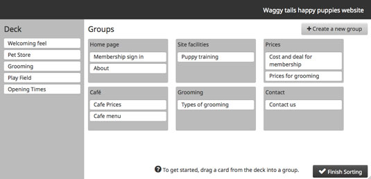
Because navigation is a crucial element in user interaction, you'll want to create the information architecture that feels the most natural to your user. The beauty of card sorting is that it helps you design your information architecture according to natural thought patterns.

There are two types of card sorts:
- Open sorting: Users are provided only with the labels, and are left to group them however they see fit. Once grouped, users are asked to give names to the groups themselves. This is recommended for generating new ideas since you can work backwards from users' natural thought processes.
- Closed sorting: As with open sorting, users are given the labels; however, they are asked to categorize them into existing groups. This is recommended if you're updating a finalized website structure.
We found closed card sorting to be extremely helpful when redesigning Yelp (as an exercise) to better match user expectations. After we ran the test, we learned that important search filters weren't immediately available, which of course increased friction.
For example, users determined that filtering for meals (like "Serves Dinner") should be immediately available, yet the current design buried it under another layer of filters.
02. User interviews
User interviews can be as elaborate or cost-effective as you'd like, whether they come to you, you go to them (or you simply talk through Skype).
Before transitioning UXPin from a paper notepad to a cloud design app, we actually interviewed more than 50 designers.
Because the design market is such a saturated space, we wanted to speak with as many designers as possible so that we could learn about their workflow, processes, inspirations, and expectations from good design tools.

Once we started designing the current UXPin, we frequently referred back to the notes from our interviews to make sure our concepts and mockups aligned with the expectations our users developed from other tools.
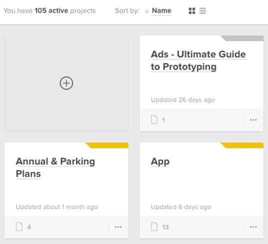
For example, in order to satisfy differing expectations, our project layout allows users to choose either a grid or list view – designers had varying preferences based on whether they used Trello, Asana, or other tools to manage projects. We learned that specifically through user interviews.

When conducting the actual interviews, remember that you aren't asking users specific design questions like "Do you prefer an infinite scroll or tabs?" You want to ask deeper questions about their habits, behaviors, and needs so that your design takes the path of least resistance.
Let's say you're designing a new blog CMS. By asking something like, "What do you like about your current blog CMS?" you might learn that users enjoy how Wordpress's "distraction free" mode because it helps them better focus on writing.
You can then infer, for the design of your own blog CMS, that you should give users an option to toggle the appearance of the interface. The interview has therefore revealed that users really enjoy how a current design works, so you should keep that preference in mind when designing for consistency.
There are a lot of different strategies to consider for user interviews that we don't have space to cover here, but if you're interested, take a look at these excellent resources:
- User Interview Techniques, Liz Danzico
- 15 Interview Questions for Creating Personas, Steve Mulder
- Ask and Ask Again: Critical Interviewing Is an Essential Component of Usability Testing, Kate Lawrence
- Getting Better Data from User Studies, Michael Margolis
For some low-cost approaches to user research, we recommend reading Patrick Neeman's advice on creating lightweight personas. All of the tactics he lists will help you uncover the insights you need to deduce the expectations of users.
03. Heuristic evaluation
Heuristic evaluations are great for ensuring external consistency since you're focusing on competitor designs. While traditionally heuristic evaluations are used to test usability problems or feature audits, before the design they can outline the current state of the market you're getting into. The process just needs to be modified slightly.
a. Determine what fields to evaluate
In other words, in what fields will you be competing with your rivals, or in which areas is it possible to excel compared to them? These could be ease of use, how you satisfy user goals, the visual style and atmosphere, and the target users themselves.
You might include the following areas for critique:
- Visual hierarchy
- Visual impact
- Effectiveness of system feedback
- Clarity of copy
- Ease of navigation
- Simplicity of user input
b. Conduct the evaluation with the above criteria.
If you can spare the manpower, try to get 5 people to go through your competitor's interface and assign them scores in the fields you previously listed. Sometimes it helps to have your evaluators complete the same tasks to keep them focused. If conducting actual moderated tests is outside your means, you can also draw up simple questionnaires or – as a last resort – go through your competitor's sites yourself and give them your own ratings.
c. Diagram the results.
The clearest way to understand the results of the evaluation is to see them. Plotting them out of a graph is the most efficient way to organize the data. Michael Hawley uses a very effective "spider-web" method, as you can see in this post. We recommend his method because it's conducive to the final step: comparing.
d. Compare the results for consistencies and inconsistencies.
Looking at your top competitors' scores side-by-side – or even better, overlapping – will give you a solid understanding of your space and what your users may come to expect. You could create them according to this overlapping format created by designer Leigh Howells.
But remember the most important thing: the heuristic evaluations will reveal the consistencies and inconsistencies in your niche, but it's up to you to know when to break away from the norm, and when to fall in line.
For example, let's say none of your competitors use ads. If you choose to break the external consistency and feature ads on your site, this may irritate users. They are expecting an ad-free experience when using sites or apps of your genre, and not meeting this expectation may worsen their experience.

On the other hand, let's say almost all of your competitors only offer one way to complete a given task. This is the status quo, and what your users would expect… but if you choose to break this consistency and offer multiple ways to complete a given task, you might impress some users and win them over.
In this way, the heuristic review comparison can show you possibilities for getting the better of your competitors, and not simply meeting user expectations, but exceeding them.
Takeaway
Consistency isn't something you add once the design is finished, it's something you incorporate on the ground level and build around. Consistency will always be tied to user expectations, which is the core to all aspects of design.
Remember that usability tests can help you pinpoint exactly what kind of consistencies your users want and expect most. Scope out the competition, listen to your users, then test early and often.
To learn more about balancing originality with familiarity in web design, download the free ebook Web Design for the Human Eye: Principles of Visual Consistency. Written for real-world applications, the book teaches through analysis of visual examples from companies like Squarespace, Jukely, Wunderlist, and others.
Words: Jerry Cao
Jerry Cao is a UX content strategist at the wireframing and prototyping app UXPin. To learn more about balancing originality with familiarity in web design, download the free e-book Web Design for the Human Eye: Principles of Visual Consistency.
Like this? Read these!
- Free ebook on design collaboration
- The ultimate guide to logo design
- Useful and inspiring flyer templates

Thank you for reading 5 articles this month* Join now for unlimited access
Enjoy your first month for just £1 / $1 / €1
*Read 5 free articles per month without a subscription

Join now for unlimited access
Try first month for just £1 / $1 / €1

The Creative Bloq team is made up of a group of art and design enthusiasts, and has changed and evolved since Creative Bloq began back in 2012. The current website team consists of eight full-time members of staff: Editor Georgia Coggan, Deputy Editor Rosie Hilder, Ecommerce Editor Beren Neale, Senior News Editor Daniel Piper, Editor, Digital Art and 3D Ian Dean, Tech Reviews Editor Erlingur Einarsson, Ecommerce Writer Beth Nicholls and Staff Writer Natalie Fear, as well as a roster of freelancers from around the world. The ImagineFX magazine team also pitch in, ensuring that content from leading digital art publication ImagineFX is represented on Creative Bloq.
