Design sticky headers that will delight users
Love them or hate them, it looks like sticky headers are here to stay. Gene Crawford explores the best ways to use them.
Sign up to Creative Bloq's daily newsletter, which brings you the latest news and inspiration from the worlds of art, design and technology.
You are now subscribed
Your newsletter sign-up was successful
Want to add more newsletters?
The sticky header: you either like it or you hate it. It's also a pretty commonly used design pattern now, and it's here to stay for a while. There are arguments, like most things in our industry, that point out its merits and the problems it causes.
Using a sticky header can reduce the user's need to scroll around as they navigate your website. It's also a visually interactive way to make the user take note of the site's navigation scheme. However, a sticky header can take up valuable screen space which can be frustrating if the page is mostly for reading – like with news articles or blog posts. The list of pros and cons can go on, so I'll let you decide for yourself.
Using a sticky header can reduce the user’s need to scroll around as they navigate your website.
While sticky headers are a common design pattern, like all patterns I’ve seen a significant number of tweaks and improvements in its usage as it’s matured. For example, you can use a sticky header but have it slide out of view as you begin to scroll a set distance, only to have it reappear when you start to scroll back up the page.
Another good implementation is to have the header area change to shrink in height to accommodate more screen real estate as you make your way down the page. I don't like to fall in for absolutes when designing things, so the pattern of the sticky header itself isn't bad in my opinion, it just needs context when you apply it. Make sure it serves a purpose beyond just looking cool, and make sure your implementation is solid. Like all things, make sure it's the right fit.
Here are three examples of how to deploy sticky headers in your design work...
01. Visage

The stats visualisation app Visage has a sticky header that gets smaller in height as you scroll past the initial hero image area, and there’s a side menu that opens for deeper navigation options.
02. Kin

The HR web app Kin employs a large hero image, and then has the main nav slide up into position as a sticky header. The header is minimal in height but stays with you as you scroll down.
Sign up to Creative Bloq's daily newsletter, which brings you the latest news and inspiration from the worlds of art, design and technology.
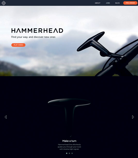
03. Hammerhead

The compass-like device Hammerhead has a sticky header but it fades away as you scroll, only to reappear when your scrolling remains static on the page after a moment or two.
Words: Gene Crawford
This article originally appeared in net magazine issue 257.

The Creative Bloq team is made up of a group of art and design enthusiasts, and has changed and evolved since Creative Bloq began back in 2012. The current website team consists of eight full-time members of staff: Editor Georgia Coggan, Deputy Editor Rosie Hilder, Ecommerce Editor Beren Neale, Senior News Editor Daniel Piper, Editor, Digital Art and 3D Ian Dean, Tech Reviews Editor Erlingur Einarsson, Ecommerce Writer Beth Nicholls and Staff Writer Natalie Fear, as well as a roster of freelancers from around the world. The ImagineFX magazine team also pitch in, ensuring that content from leading digital art publication ImagineFX is represented on Creative Bloq.
