How to design sites that match user expectations
Good web design starts with external consistency (being consistent with what users expect), explains Jerry Cao of UXPin.
Using UI patterns
UI patterns are design solutions to common usability problems. Patterns benefit everyone – users already recognize how to use them from previous exposure, and designers don't need to reinvent the wheel.
Our free ebooks Web UI Design Patterns 2014 and Mobile UI Design Patterns 2014 cover the most conventional and useful patterns available, but for now all we'll say is that they're the simplest way to incorporate external consistency.
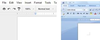
But external consistency isn't limited just to sites or apps with visually rich designs. For example, users of Google Docs will find the top menu bars fairly familiar since we've all used Microsoft Word before.
The menu options for Word are so firmly ingrained in frequent users of text editors, it just seems natural to see them again. It gets to the point where we take them for granted – we only notice when they're not there.

External consistency can be taken a step further to apply to human perceptions. For example, as Quora's design director David Cole suggests, think about how most volume controls are presented as sliders.
The slider is popular because it matches how people perceive volume. With the exception of specialists like sound technicians, we don't think of it on a scale of 0 to 100, it's purely relative to us.
We either want sound to be louder, or quieter, not to go from 30% to 28%. The slider format became popular (and thus a standard of external consistency) because it matches our mental models.
Get the Creative Bloq Newsletter
Daily design news, reviews, how-tos and more, as picked by the editors.

So after all this talk about doing what everyone else is doing, what does that say about being different, standing out, and setting yourself apart from the competition?
These are all fine things – in fact, they're even recommended strategies – but you must be smart about where and how you stand out. Offering a new design solution that your competitors haven't thought of will get you far. As we warned in the ebook Consistency in UI Design, going against a tried-and-true convention (that's actually useful) for the sake of being clever will only damage your design.
Things to avoid
A word to the wise for those of you fervent nonconformists: user expectations aren't merely preferences, sometimes they're habits.
Take for example, the stand signup form. We're all aware of the UI pattern of the asterisk in form fields. Almost every user knows that an asterisk next to a field means that it's required before proceeding.

But for a lot of signup forms, the necessary fields outnumber the optional ones. Wouldn't it be simpler, then, to mark the optional fields with the asterisk?
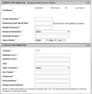
That was the thinking Avis had a few years ago when they deviated from external consistency (as Jared Spool points out UIE.com). You can see in this screenshot how they broke from convention. The only way you'd know the asterisks denoted optional fields was by reading the microcopy at the top of the form.
Never underestimate the laziness of users. When most people are faced with a form field, they start pumping out the information right away. The result is a design that essentially forces users to relearn how to read a form.
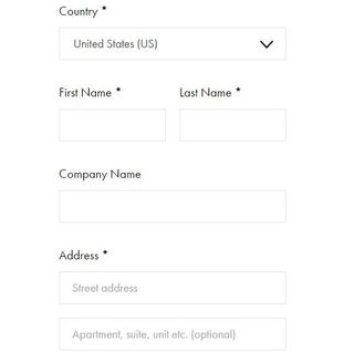
You can see in the new design that they've resigned themselves to using asterisks to indicate mandatory fields. It's more externally consistent than their previous design, but it's still incredibly visually obstructive. Now, it's externally consistent almost to a fault.

At first glance, the strongest impression is that everything is mandatory. The bright red asterisks instantly tells the user that a ton of work lies ahead. If asterisks are to be used, they could instead make them black instead of red – the meaning is retained, minus the visual overload.
Alternatively, they could also label which fields are optional with an "(Optional)" tag. Such a treatment removes the need for asterisks, and the user could still understand that a lack of "(Optional)" implies that it's mandatory. This design strays a bit from users may expect, but still feels more natural than putting asterisks next to optional fields.
It's true that the old and new form present only a minor setback. But a few milliseconds of confusion increases cognitive load, which forces the user to think. Remember that digital time is not human time. When visual interactions happen in the blink of an eye, your interface can't hold the user back by a couple milliseconds.
Going further
Now that you have a basic overview of external consistency, you can learn more about other types of consistency (along with visual examples) in the free ebook Consistency in UI Design: Creativity Without Confusion. The book is written in a straightforward and practical format that teaches through examples from Amazon, Jawbone, Dolce & Gabbana, and other companies.
Words: Jerry Cao
Jerry Cao is a UX content strategist at UXPin — the wireframing and prototyping app. To learn more about balancing consistency and inconsistency to create visually exciting designs, download the free ebook Consistency in UI Design.
Like this? Read these!
- 3 free photo search tools that make finding images easy
- Brilliant Wordpress tutorial selection
- Has your website survived mobilegeddon?

Thank you for reading 5 articles this month* Join now for unlimited access
Enjoy your first month for just £1 / $1 / €1
*Read 5 free articles per month without a subscription

Join now for unlimited access
Try first month for just £1 / $1 / €1
The Creative Bloq team is made up of a group of design fans, and has changed and evolved since Creative Bloq began back in 2012. The current website team consists of eight full-time members of staff: Editor Georgia Coggan, Deputy Editor Rosie Hilder, Ecommerce Editor Beren Neale, Senior News Editor Daniel Piper, Editor, Digital Art and 3D Ian Dean, Tech Reviews Editor Erlingur Einarsson, Ecommerce Writer Beth Nicholls and Staff Writer Natalie Fear, as well as a roster of freelancers from around the world. The ImagineFX magazine team also pitch in, ensuring that content from leading digital art publication ImagineFX is represented on Creative Bloq.
