How to design effective UX mockups in a hurry
Short of time? Ben Gremillion explains how to create a quick UX mockup without storing up problems in the long term.
You're on deadline. We hear you. But saving time now might cost you later if your work includes workflow gotchas or assumptions on the requirements.
Before you code or get into Photoshop/Sketch, you need to know what you're doing. You should avoid wasting type by creating quick mockups to convey ideas and encourage iteration.

Bear in mind that a fast UX mockup will need to be lo-fi. But that's not a bad thing.
As described in The Guide to Mockups by UXPin, lo-fi lets you test concepts without diving headfirst into visual minutiae. At this point we care more about the structure of content and the information architecture. And, of course, beating the deadline.
01. Sketch the user flow by hand
The fastest way to get where you're going is with good ol' pen and paper. Hand-drawn sketches are easy to make and easy to discard if an idea doesn't work out.
Hand-drawn sketches are also great references when you go to your wireframing tool.
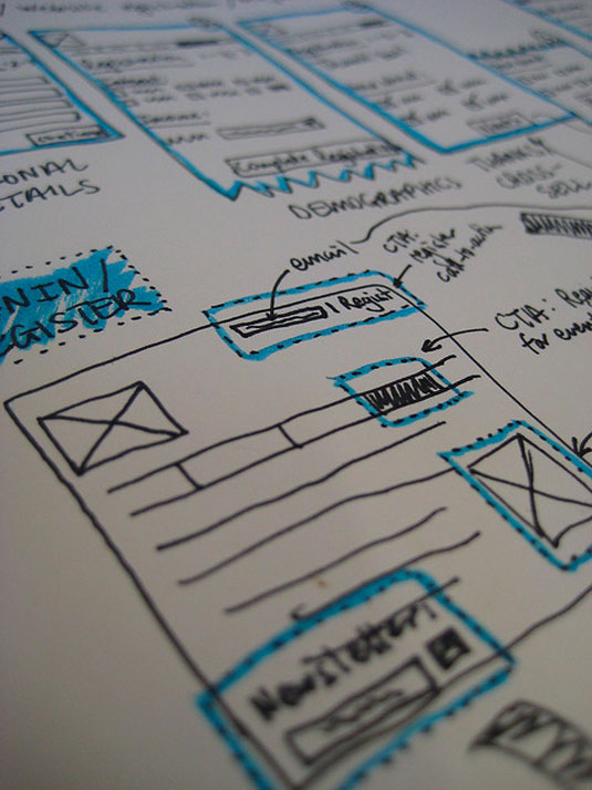
You can sketch out user flows in many ways, depending on your needs and personal style. For example, if you're focused on mobile-first design, you should start small and work your way to larger viewports. A few common-sense tips to get you going:
Get the Creative Bloq Newsletter
Daily design news, reviews, how-tos and more, as picked by the editors.
- Draw straight lines to make your work look more professional. You're presenting to stakeholders, after all.
- Use pens, not pencils, to encourage fast designs instead of editing on the fly.
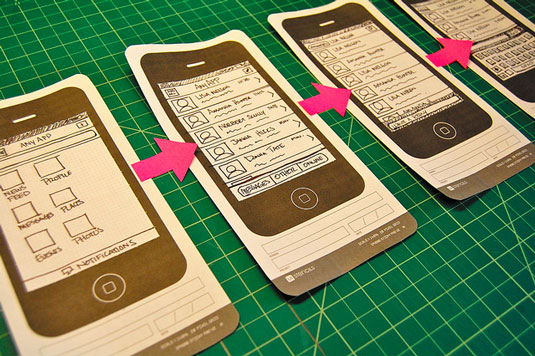
- To keep things in context, use a bezel (see below).
- In our experience, ALL CAPS are easier to read…but that depends on your handwriting.
- Don't forget to write down the title or purpose of each page/view as you go. Annotations save you time in answering repetitive questions about functionality.
- Use one piece of paper per page/view so you can rearrange them with stakeholders on the fly.
02. Use plain boxes
Fast, flexible and convenient, grey boxes help you rough out the broad strokes of pages as you face a ticking clock. They can represent images, sections and even text — with a little explanation and a dash of imagination. As a bonus, grey boxes imply to stakeholders "this is a rough draft."
Once you've sketched out the flow, we recommend moving to a digital tool because it's just much easier to get feedback. At a bare minimum, you can email PSDs or Sketch files (or use a tool like Slack where you drop files into team chat rooms). I personally use UXPin because it's still fast in lo-fidelity, has enough power for hi-fi, and is naturally collaborative so feedback is simpler.
In UXPin, creating boxes is easy. They're pre-set as a neutral shade of grey, so you can quickly drag and drop for the library and resize as needed.
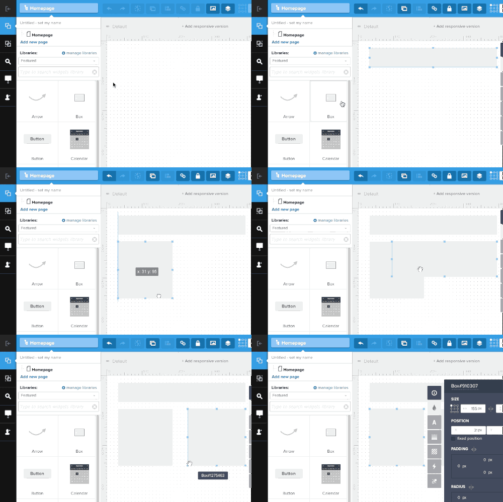
A few tips, regardless of what tool you use:
- Align blocks to a grid. Designers often want your prototypes to look great, no matter how much time pressure they face. For a more planned, professional look, align your boxes to a regular grid both horizontally and vertically. Even if the grid changes later, or you opt to not use one at all, grids will give your design a sense of order.
- Use no more than two shades. Save yourself some time and hassle by keeping your color palette consistent. Too many shades of grey create a surprising amount of visual noise. If you need to create a hierarchy that space and size don't convey, or if you need to color-code different types of elements, then use shades that contrast well — don't be subtle.
03. Label everything
Save your stakeholders and your future self some grief and take good notes. Some things are obvious, like headers and footers. Others, like form fields and the point of each page, need annotations.
What's the point of each page? The reason that users should visit: what they learn that they didn't know before, or what they accomplish that they can't do anywhere else. Describing a page's intention helps everyone give feedback on how well it achieves its goals, not just vague notions on "what do you think?"
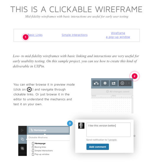
This step may take precious minutes to accomplish up front, but will give each page focus that saves time in the future. In fact, adding questions to your notes is a good way to guide the feedback conversation.
If you're working in Photoshop, you'll also find a handy notes tool in the toolbar specifically for that purpose.
04. Avoid lorem ipsum
You'd think that a little greeked text would facilitate designs, but often placeholder content leads to time-consuming trouble later. As with the previous point, this is about expediting work in the long run.
Lorem ipsum, or greeked text, is a handy way to simulate content when design comes before what it's intended to communicate.
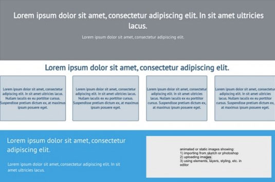
- Lorem ipsum is inaccurate. Using blocks of a certain size is deceiving because real content may not — in fact, it likely won't — occupy the same space. Whenever possible, measure your blocks based on real content.
- Lorem ipsum is fixed; websites are not. Sites change over time. Text gets updated. Images get replaced. And over time, people edit sites to fit their immediate needs. Give each block that represents content a little extra space, and consider what happens if it falls short. And again, if you have even content that even approximates the final draft, use it. Rough content is fine.
- People assume lorem ipsum is final. This is getting more rare as stakeholders become more design-savvy, but the occasional person will misunderstand that greeked text is fine to push live (we still see unfortunate examples more often than we should).
05. Present your mockup well
You've done the work, met (or come close to) deadline, and now it's time to show your work and get feedback for the next iteration. That's best accomplished with a little preparation.
Begin by inviting the right people to the meeting. You'll find best results if you ask people with diverse interests in the project. Marketers, for example, focus on design viability while developers focus on feasibility. Remember not to invite too many people to avoid the design-by-committee problem discussed in the free ebook Web UI Best Practices.
Focused feedback is a tool. Too much feedback risks contradictions that consume precious time.
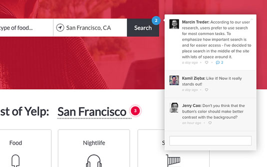
Whenever possible, meet in person. Tools like Slack and Google Hangouts have come a long way, but — as of today — nothing beats the ability to "read the room" and get a sense of who's engaged, who's frustrated, and who keeps checking their watch.
Start off a presentation by stating goals. For example, "today we're going to look at _____." Follow up by stating what kind of feedback you're looking for, such as: "we need your input on how well the site flows, not the visuals."
During the conversation, keep people focused on the product. The best feedback comes when people critique the project, not the medium of delivery. "I think we need to eliminate that step" is much more valuable than "I'm not a big fan of grey."
Finally, make sure you come away with actionable feedback. "We don't need this step" is better than "I don't like the way it flows." Likewise, "the headers overwhelm every page" defines the problem at hand, while "work on the hierarchy" could mean anything.
When stakeholders discuss problems, pay close attention. When they prescribe solutions, ask follow-up questions to identify the real problem.
Don't overthink it
Hand-drawn sketches. Grey boxes. Quick notes. These tips aim not just to get you through a quick prototype in a hurry, but to save you trouble when you iterate. Ironically, you should focus on getting through work, rather than rushing ahead on all fronts, or you'll pay for it later.
Start with the built-in UI libraries since quick mockups should communicate structure and flow above anything else. It's more important that the visual hierarchy is accurate, so treat your elements as bricks instead of fine marble. Once you've built out a strong foundation, then you can start refining visual details like typography and rich colors.
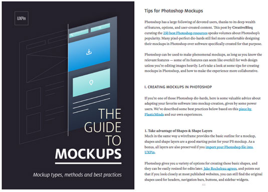
If you'd like more advice on creating UX mockups, check out the free 100+ page Guide to Mockups. You'll get tips on techniques, methods, processes, and best practices for Photoshop and Sketch.
Words: Ben Gremillion
Ben Gremillion is a content designer at the wireframing and prototyping app UXPin where he contributes his knowledge to the free ebook library. He's been designing and coding for the web for nearly 20 years. He also builds and maintains a CMS for webcomic artists.
Like this? Read these...
- 3 ways to create website mockups
- How to start a blog
- Download the best free fonts

Thank you for reading 5 articles this month* Join now for unlimited access
Enjoy your first month for just £1 / $1 / €1
*Read 5 free articles per month without a subscription

Join now for unlimited access
Try first month for just £1 / $1 / €1
The Creative Bloq team is made up of a group of design fans, and has changed and evolved since Creative Bloq began back in 2012. The current website team consists of eight full-time members of staff: Editor Georgia Coggan, Deputy Editor Rosie Hilder, Ecommerce Editor Beren Neale, Senior News Editor Daniel Piper, Editor, Digital Art and 3D Ian Dean, Tech Reviews Editor Erlingur Einarsson, Ecommerce Writer Beth Nicholls and Staff Writer Natalie Fear, as well as a roster of freelancers from around the world. The ImagineFX magazine team also pitch in, ensuring that content from leading digital art publication ImagineFX is represented on Creative Bloq.
