How to create hierarchy in design using contrast
It’s one of the oldest tricks in the book, but using contrast is a very effective way to create hierarchy in your designs, says Gene Crawford.
One way to draw attention to something specific on a web page is to employ contrast. Visual contrast happens when two elements on the page are different. For example, a bright red button placed on a page where all the other elements are neutral or grey-coloured would stand out very clearly. Employing contrast in your design is a fairly straightforward way to guide a visitor's attention through a web page.
Furthering the example of the red button on a grey website – let's say the purpose of the button is to guide visitors to a sign-up page. All the other elements and text on the page can support that one element, which stands out thanks to the use of contrast, and thus creates more signups for the service. This is sort of the archetypal explanation of using contrast.
Contrast isn't just to do with colour. It can be differentiation due to any number of graphical elements
Contrast isn't just to do with colour. It can be differentiation due to shape, size, pattern or any number of other graphical elements. Even letterforms in varying typefaces can create contrast that viewers will notice. Think about a bullet-pointed list in the middle of a long page of copy; it will really stand out. You can also use contrast in the opposite way, to hide something or make it less noticeable – for example, a byline or legal disclaimer.
Contrast is one of the basic design fundamentals we learn early on in an art class but like all basic principles I find I forget about it from time to time. Returning to the basics is always helpful when we want to get the job done.
Here are three examples of how to use contrast in your designs...
01. Invision

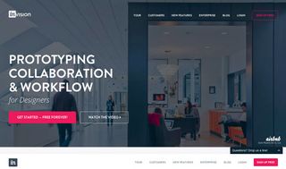
The UX prototyping app Invision uses a bright pink highlight to make the sign-up button stand out boldly on the home page.
02. Harvest

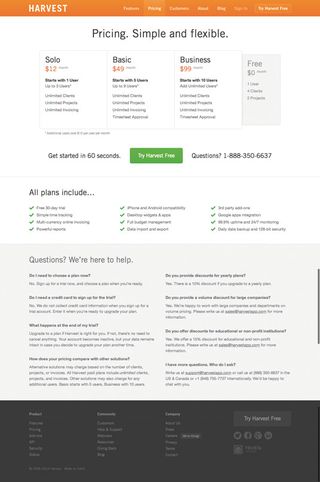
The pricing page on the time-tracking app Harvest uses contrast to make the different product plans stand out. Also, can you spot the 'Free' plan? Contrast is used to ensure it's almost hidden.
03. Hacker News

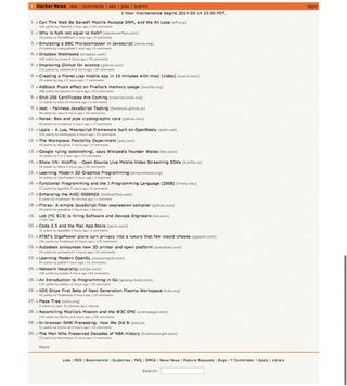
The web industry news website Hacker News does not employ a good use of contrast. Generally speaking, it is rather difficult to scan the headlines, even though that is all there is to look at on the page.
Words: Gene Crawford
This article originally appeared in net magazine issue 260.

Thank you for reading 5 articles this month* Join now for unlimited access
Enjoy your first month for just £1 / $1 / €1
*Read 5 free articles per month without a subscription

Join now for unlimited access
Try first month for just £1 / $1 / €1
Get the Creative Bloq Newsletter
Daily design news, reviews, how-tos and more, as picked by the editors.
The Creative Bloq team is made up of a group of design fans, and has changed and evolved since Creative Bloq began back in 2012. The current website team consists of eight full-time members of staff: Editor Georgia Coggan, Deputy Editor Rosie Hilder, Ecommerce Editor Beren Neale, Senior News Editor Daniel Piper, Editor, Digital Art and 3D Ian Dean, Tech Reviews Editor Erlingur Einarsson, Ecommerce Writer Beth Nicholls and Staff Writer Natalie Fear, as well as a roster of freelancers from around the world. The ImagineFX magazine team also pitch in, ensuring that content from leading digital art publication ImagineFX is represented on Creative Bloq.
