How to create distraction-free reading on the web
Although most sites, including this one, make their money from ads, you may instead wish to create a clutter-free environment for readers. And so, with a sense of ironic detachment, Jesse Friedman explains how to go about it.
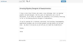
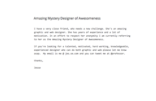
It's somewhat ironic that right now I am writing this article in a distraction free environment called Editorially, because right now you're reading it on Creative Bloq. And like many great design blogs, from Smashing Magazine to Web Designer Depot, Creative Bloq makes its money from advertising - far from distraction free.
There's nothing wrong with that. But your website, or your client's, may have a different business model, or no business model at all (sometimes - whisper it - we web designers do work for other reasons than money). In which case, this article is for you.
When creating clutter-free reading, the obvious inspiration to draw on is printed and bound books. There's a reason this medium has existed for hundreds of years. The technology behind creating a book has changed drastically but the final product isn't really all that different. Why? Because it works.

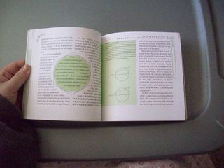
The advantage? Paper is static! That's it. Once it's printed you're not erasing it and putting something else in its place. It also has intrinsic value, so it's easy to require payment in exchange for ownership.
It is so easy to become immersed in a great tale of adventure or learn something new about a programming language when you’re reading from a book. Technology like Kindle and iBook work so hard to mimic the printed book, and it's a major reason for their success.
In other words, holding a book in your hands is the true form of distraction free reading. There are no ads, links, pop ups, alarms or chat bubbles to pull you away from what you're reading. Books have done well in their form and even their digital counterparts honour the elements of this perfect user experience the best they can.
When to go distraction free
At the end of the day, we all have to keep the lights on. Paying the bills is probably the number one reason a website goes from clean and minimal to cluttered and bogged down. It takes a lot of thought and creativity to build a content driven website that requires ROI through paid advertising. Before we answer when to go distraction free let's look at some sites that do it really well.
Get the Creative Bloq Newsletter
Daily design news, reviews, how-tos and more, as picked by the editors.
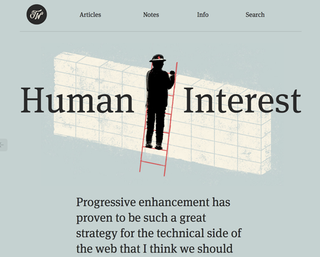
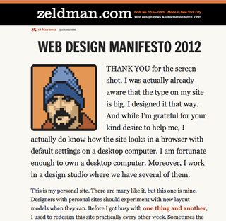
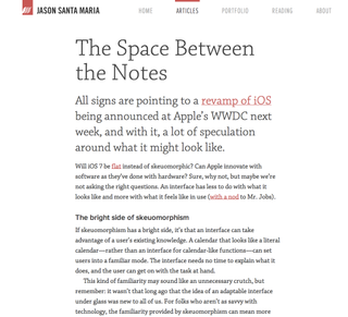
These are some of the best examples of sites I could find that truly exemplify distraction-free reading. None of them are have advertisements in or around the content. Sometimes it's just really easy to focus on one factor. If you can eliminate or limit your advertising, the rest will follow.
Of course, ads aren't the only thing that distract. Social media buttons, comments and related-post-links can all find a home somewhere away from your article. You don't need to hover icons alongside content.
Comments are always in the same place, it's a design pattern we can all rely on. And a clear cut easy navigation will help me to find other relevant content on your site.
Start simple, keep it about great content. I feel like all these distractions are really about one thing; getting me to move on to the next 'thing' before I've had a chance to finish what I started. If I'm eating at a restaurant, the only reason I want to move on to desert before I'm done with my steak, is because you overcooked the steak.
Don't overcook your steak! Focus on writing amazing content, deliver that content in an easily consumable format and I'll order dessert (or in this case leave a comment, share an article or browse your site).
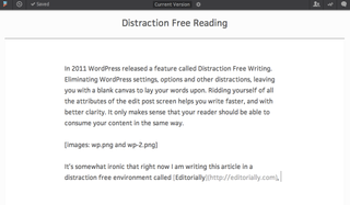
In 2011 WordPress released a feature called Distraction Free Writing. Eliminating WordPress settings, options and other distractions, leaving you with a blank canvas to lay your words upon. Ridding yourself of all the attributes of the edit post screen helps you write faster, and with better clarity. It only makes sense that your reader should be able to consume your content in the same way.
Great WordPress themes for distraction-free reading
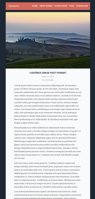
You didn't really expect me to write an article without leaving you some examples of WordPress themes that will help you get started did you? Here are some great themes that I think come really close to truly distraction free writing environments for your readers. Enjoy!
01. Thoughts by WP Explorer
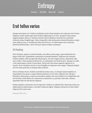
02. Entropy by Timothy Long
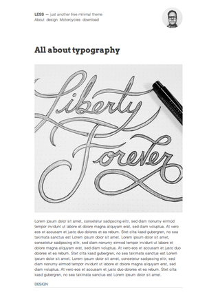
03. LESS by Jared Erickson
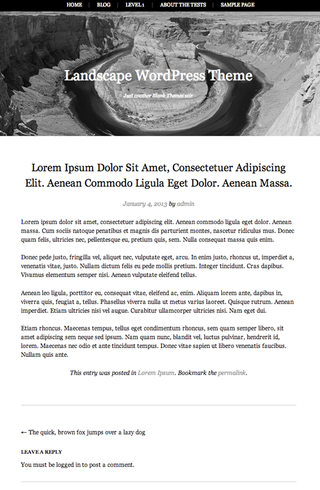
04. Landscape by Blank Themes
Words: Jesse Friedman
Jesse Friedman is a veteran WordPress developer. In 2012 he wrote the Web Designer's Guide to WordPress. Currently the director of web interface and development at premier digital marketing Astonish, Jesse co-organises the local WordPress meetup and is very active in the community.
Liked this? Read these!
- Brilliant Wordpress tutorial selection
- Top-quality Wordpress portfolio themes
- The best Wordpress themes available for free
- The best WordPress plugins for designers

Thank you for reading 5 articles this month* Join now for unlimited access
Enjoy your first month for just £1 / $1 / €1
*Read 5 free articles per month without a subscription

Join now for unlimited access
Try first month for just £1 / $1 / €1
The Creative Bloq team is made up of a group of design fans, and has changed and evolved since Creative Bloq began back in 2012. The current website team consists of eight full-time members of staff: Editor Georgia Coggan, Deputy Editor Rosie Hilder, Ecommerce Editor Beren Neale, Senior News Editor Daniel Piper, Editor, Digital Art and 3D Ian Dean, Tech Reviews Editor Erlingur Einarsson and Ecommerce Writer Beth Nicholls and Staff Writer Natalie Fear, as well as a roster of freelancers from around the world. The 3D World and ImagineFX magazine teams also pitch in, ensuring that content from 3D World and ImagineFX is represented on Creative Bloq.
