How to choose the right fonts for small screens
You need to ensure your typography choices meet the needs of your mobile audience, says Webydo’s Nurit Bahat.
Attractive and effective typography is a key component in a successful website design. This is especially true in the context of mobile, where the margin for error is as small as the screens being used to view those websites.
If your font choices work well for desktop, is it safe to assume that they will be fine for mobile? Many typographic styles and practices that are perfectly acceptable for larger screens break down and cause problems on smaller, mobile screens.
This means that to deliver the best possible experience to mobile visitors, we must consider a website's mobile typography and ensure that no matter which kind of device people use to visit our site, they are presented with an attractive design that is easy to use and enjoyable to read.
In short, typography must be considered as an important element in the context of making a site responsive. To accomplish this, we should better understand how people read on mobile devices as we adhere to the best practices in mobile typography.
How users read on mobile

Go to your local coffee shop or restaurant or pretty much anywhere that is frequented by a wide variety of people using mobile devices and laptops. Observe them in action. You will notice a significant difference in distance between the user and device across the two types.
Looking a little closer, one of the first things you will notice when observing mobile readers is their proximity to the screen. People have a much more intimate relationship with their mobile devices than they do with their office or home computer – a relationship that takes place at 12.6 inches rather than 20 to 23 inches from their screen.
Because a mobile device's screen is smaller, it needs to be held closer in order to effectively read the words on that screen. This means that mobile users are getting physically closer to their device and to your website design. The key to mobile typography is readability - if the user cannot read it, your design isn't working.
Lighting and movement
Another factor you should observe when watching people read on mobile is the external conditions in which they do so. Lighting, movement and internet connection are all variables. Lighting, in particular, is a tough variable to crack and directly relates to how easily a viewer is able to read the screen.
With regard to movement, think about driving on the freeway and going past billboards. A although you are moving and the typography is still, the concept is the same: catch and hold the reader's attention.
More interesting is taking into the equation physical barriers that people must contend with when using mobile device, namely their hands and the edges of the screen itself. When people use a desktop computer to read online content, they navigate using a mouse or scroll pad. On mobile touchscreens, a finger acts as the navigation necessarily blocking a portion of the screen.
Hidden from view
Aside from navigating, even the way in which users hold the device has the propensity to cover prime real estate from their view. Speaking of that screen's view, because it is so small, it can only display so much content at one time.
This means that large blocks of content which would easily display on larger screened devices are cut off on mobile, appearing beyond the boundaries of the device's screen.
When it comes to reading on mobile devices, there is no shortage of issues that readers must contend with. Considering these challenges in our design work is the first step better mobile typography.
The basics of responsive web typography

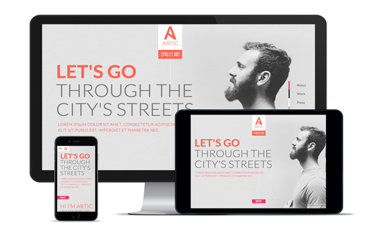
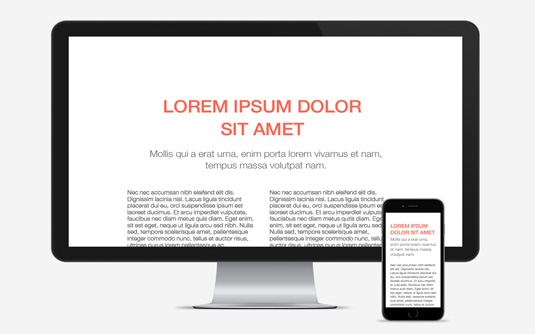
Website typography does not need to be a "one size fits all" situation thanks to the practices of responsive web design. With a responsive website, CSS media queries can be used to change the visual styles of a webpage based on a visitor's screen size. This means that you can set a site to use one set of typographic styles for larger screens and then adjust those styles as appropriate for smaller screens.
Unlike typefaces designed for print or desktops, mobile and responsive typography is not measured using a point system, rather designed using pixels, ems or rems. Why? Because these units are more flexible with their percentage-based structure and more adaptable to use across multiple devices. The goal here is not to create a consistent look across all screen sizes, but rather to design a consistently positive reading experience, regardless of the screen size.
When developing responsive web typography, there are some key areas that you must look at to ensure readability:
- Typeface
- CSS Styles (alignment, size, line length, etc.)
- Load Time
Preferred mobile typefaces
The fonts that you use in your design will play an important role in how easy that site will be to read on mobile devices.
Letterforms that are too intricate and thin are not only hard to read, especially for those with dyslexia or visual disabilities but also tend to break down at smaller sizes. This means that when fonts are scaled for mobile screens, readability challenges arise, especially on devices without Retina screens.
To avoid this problem, many designers have opted to use sans-serif fonts for mobile websites and applications. The simple, straightforward letterforms of sans-serifs tend to scale better and make for a more readable presentation across a wider range of screen sizes and resolutions.
Different fonts for different screens?
When deciding on the fonts to use in your site, consider whether you want your site to use the same fonts across all screen sizes or if you are comfortable changing the font for different screens.
If you want to go with the same fonts, you should look for ones that scale both big and small.
If you are willing to adjust the font choices as needed, you can use serifs or more involved fonts for larger displays and then change them to simpler fonts for smaller screens (always make sure to test your choice with real users).
Typographic styles

With a few lines of CSS, you can dramatically change the overall look of a site's text content, including the size, line height, line length and more. All of these styles play a role in a site's readability and are important for mobile screens.
That being said, two of the most critical considerations when choosing the right mobile typeface is size and space.
Size
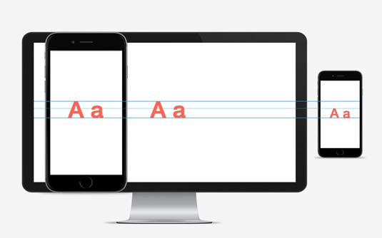
Since different fonts render at different sizes, there is no default font size that must be used for mobile screens, although anything smaller than 16 pixels becomes challenging to read for any screen, not to mention will add confusion as to where the beginning and end of lines of text are located.
On the flip side, text that is too large will create awkward breaks (same goes for hyphens which us web designers rarely use.) For mobile layouts, font sizes are typically set in EMs rather than pixels so that the font size is relative, ready to respond to different screen parameters
Space
When it comes to smaller screens – especially on vertical devices – space is extremely important. Think about the conditions mentioned in the introduction that users struggle with: lighting, screen obscurement by fingers or cases etc. Adding extra space between and around text is critical.
The small screens of mobile devices already make it difficult to read lines of text that are set too closely together. In fact, a line height that works for desktop screens may be much more challenging to read for mobile.
A good place to start might be in the range of 10 to 20 percent but something like this is very dynamic as different fonts will require different settings. Line height of at least 1.5 is a good place to start as it will give readers the perception of airy, yet readable text
Layout
Not only size and space, but also layout can make a huge impact on the overall reading experience on mobile. The challenge with mobile when it comes to line length are lines that are too short in length. Text with very small line lengths throws off the normal flow of reading.
Ideally, line lengths for larger screens should be about 65 words or so. For small screen devices, that number should be much smaller. Newspapers have long strived for line lengths of about 39 words for narrow columns of content. This is a good guide for narrow website columns on mobile devices.
Alignment

By default, webpage text is left aligned. Many designers like to adjust this alignment to either center justified or even fully justified for certain parts of their designs. In some cases, those styles may work very well, but they often break down on mobile.
For mobile screens, that default left justified is often the best choice. Left justified text – aside from being the general direction in which people read – makes it easier to follow as the left side of the text is always consistent and easy to track.
Justified text also isn't a great option. The left side may be consistent, but because of the small width of most columns of text on mobile devices, fully justified text can create unusual gaps or rivers in the content as the page struggles to fit long words into lines of text.
Even if you use different justifications in your design for larger displays, you might want to revert back to left justified for mobile screens to improve readability.
Performance and functionality
One final factor to consider in your site's mobile typography is the overall performance and functionality of that site, meaning how quickly does it load for visitors and how it actually works.
In respect to performance, mobile users on networks with unreliable connections will experience slower loading times than someone sitting at home with a dedicated, high bandwidth Internet connection. If your site uses lots of web fonts with @font-face, you may be negatively impacting the download performance of that site.
Whether you include font files along with your other site files or if you use a third party web font service, the result is the same; fonts need to be download to be used on the site.
Web safe fonts
Contrast this to "web safe fonts" which are loaded directly from a user's device and which load immediately.
Web-safe fonts may not be as sexy as many of the web font choices available today, but the performance improvements those font choices can give us should not be discounted, especially for mobile sites.
Taking into consideration functionality, think about all of the capabilities that text on a mobile device can perform, not available on a desktop: call, link, buy, text, etc. It is essential to take special considerations such as enlarging or separating text when designing words to carry out certain functions.
Takeaway: design to touch
Many of the principals of good typography that apply to all design mediums also apply to mobile typography. Using typefaces that are easy to read with proper spacing and clear letterforms is a must for any screen. With mobile websites, however, you must also consider the unique characteristics of those devices, how people interact with them and the diverse environments in which they are being used.
When considering typography on mobile, realize that users will touch this text with their fingers instead of being at an arm's length away from their screens. Another actionable tip would be to take your designs out of Photoshop and see how your typography stands up to multiple views.
Further, most web platforms for designers, such as Webydo or Abobe Muse, give their users the option of responsive breakpoints and corresponding previews so that you make sure the typography holds up one actual devices. In the end, there is no real substitute for viewing your design on a range of mobile devices to read and see how it reacts to a smaller screen in real-world conditions. Thus, the old-fashioned notion of look and feel might just be the best gauge for successful mobile typography.
Words: Nurit Bahat
Nurit Bahat is a designer with over 10 years of experience in the field of web design. As Webydo's art director, Nurit designed the UI/UX of the platform. She is the essence of Webydo's visual impact and always on the hunt for inspiration to bring amazing new themes to the Webydo community.
Liked this? Try these...
- 90 top-quality typography tutorials
- Typography rules and terms
- Download the best free fonts

Thank you for reading 5 articles this month* Join now for unlimited access
Enjoy your first month for just £1 / $1 / €1
*Read 5 free articles per month without a subscription

Join now for unlimited access
Try first month for just £1 / $1 / €1
Get the Creative Bloq Newsletter
Daily design news, reviews, how-tos and more, as picked by the editors.

The Creative Bloq team is made up of a group of design fans, and has changed and evolved since Creative Bloq began back in 2012. The current website team consists of eight full-time members of staff: Editor Georgia Coggan, Deputy Editor Rosie Hilder, Ecommerce Editor Beren Neale, Senior News Editor Daniel Piper, Editor, Digital Art and 3D Ian Dean, Tech Reviews Editor Erlingur Einarsson, Ecommerce Writer Beth Nicholls and Staff Writer Natalie Fear, as well as a roster of freelancers from around the world. The ImagineFX magazine team also pitch in, ensuring that content from leading digital art publication ImagineFX is represented on Creative Bloq.
