How build the perfect responsive portfolio site
Gene Crawford explores the best way to balance images and information on a portfolio website.
Lately, I've been thinking a lot about the best way to show off my own web design firm's work to potential clients, both on our website and in person.
Check out these 15 top-quality WordPress portfolio themes
In person it's pretty easy to simply show off websites on my laptop and iPhone or iPad while we're talking, so the potential client gets to see things nice and quickly. But what happens when I'm not there to reinforce the big picture, like when they visit our website?
Showing and telling are two different things. However, putting your work in context is paramount to getting not only the visual outcome across, but also your approach.
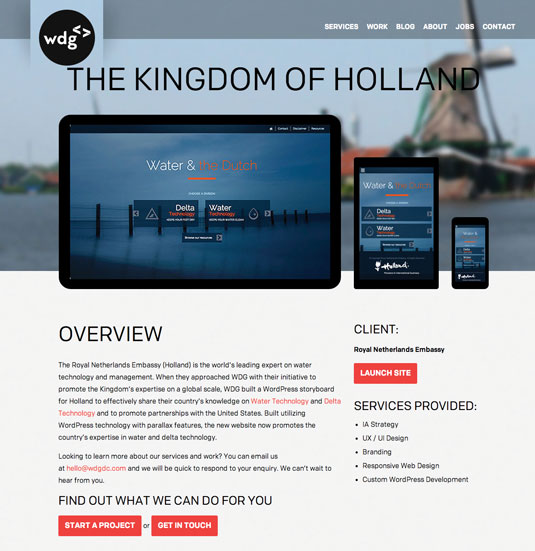
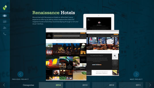
There are portfolio websites that literally place a screenshot of the website on the screen of an image of a device like a laptop, iPhone or iPad. Sometimes all three are shown side by side to drive home the concept of a responsive website for the uninformed.

Other times there are websites for design companies that go into a richer explanation, offering up a full case study with client quotes and so on. These can also be great sales tools for when you're not there, or when you're working on selling to a new client remotely, via email.
For me the most successful portfolio sites mix these approaches. Ideally you would want to have some deep explanation of a project via a case study, and some pieces of your portfolio that can simply be skimmed or viewed quickly as screenshots, but with enough detail to satisfy the curious new prospect.

Words: Gene Crawford
Gene’s Crawfords mission is to work tirelessly to provide inspiration and insight for developers. Follow him on Twitter at @Genecrawford. This article appeared first in issue 262 of net magazine.
Like this? Read these...
- The designer's guide to working from home
- The best photo apps for iPhone, iPad and Android
- Free graphic design software available to you right now!

Thank you for reading 5 articles this month* Join now for unlimited access
Enjoy your first month for just £1 / $1 / €1
*Read 5 free articles per month without a subscription

Join now for unlimited access
Try first month for just £1 / $1 / €1
Get the Creative Bloq Newsletter
Daily design news, reviews, how-tos and more, as picked by the editors.

The Creative Bloq team is made up of a group of art and design enthusiasts, and has changed and evolved since Creative Bloq began back in 2012. The current website team consists of eight full-time members of staff: Editor Georgia Coggan, Deputy Editor Rosie Hilder, Ecommerce Editor Beren Neale, Senior News Editor Daniel Piper, Editor, Digital Art and 3D Ian Dean, Tech Reviews Editor Erlingur Einarsson, Ecommerce Writer Beth Nicholls and Staff Writer Natalie Fear, as well as a roster of freelancers from around the world. The ImagineFX magazine team also pitch in, ensuring that content from leading digital art publication ImagineFX is represented on Creative Bloq.
