How to build a beautiful web design portfolio
Introducing Semplice, a fully customisable case study portfolio system based on WordPress.
For a very long time the way we, as creative professionals, have presented our work hasn't changed at all. We know how important a great portfolio can be for our careers and especially for how we position and present ourselves in the industry.
Still, most of us struggle with the very time-consuming task of creating an outstanding online portfolio. This can be for a number of reasons. In most cases it's either a lack of technical skills that hinders us on the road to bringing our vision to life, or simply that the available tools aren't delivering the results we have in mind.
With Semplice, we aimed to create the new portfolio tool we designers have been looking for. Created by designers for designers, Semplice enables you to create beautiful branded pages that tell the stories of your project the way it should be told. What's more, you can achieve all of this without using HTML or any programming languages.
Semplice is built on top of WordPress, which means all your projects are together in one place. Everything created with the Semplice content editor is easy to edit from anywhere, which makes updating your portfolio as easy as creating it. On top of that, everything is automatically responsive, making browsing through your work on any device a joy. You focus on creating beautiful work, Semplice takes care of the rest.
Step 01
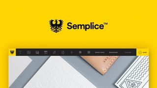
While Semplice is built on top of WordPress (which gives you plenty of freedom if you do want to jump into code), everything has been created with a completely custom interface on top of the usual WordPress backend. For this example project, I will walk you through some of the basic functionality that will enable you to create a simple branded page that shows off a project case study.
Semplice was built as a tool for translating your ideas into reality, so we recommend having a layout concept already planned out in your mind, and then using Semplice to bring it into reality.
Step 02
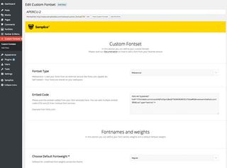
Each project or page is built up in a modular way, which makes the process of building your portfolio more efficient, and ensures it's easy to maintain. Let's start by adding our custom font sets. You can add as many of these as you like, from any font service you choose. For example, to achieve a fully branded effect, each project page could have its very own font set.
Get the Creative Bloq Newsletter
Daily design news, reviews, how-tos and more, as picked by the editors.
To add a new font set, click on FontSets > Add New. All you have to do is paste the JavaScript or CSS code from TypeKit, Fonts.com or whichever font hosting service you have selected. Once you're done, just save your custom font set. We will assign it to a specific project later.
Step 03
Our next step is to add a custom navigation. Think of the navigation of a global element that you could assign to as many projects as you like. Semplice gives you the option to create fully custom navigations, which you can then assign to a specific project page or pages. Click on Navigations > Create New to create a new navigation and customise it in any way you want. You can add your logo, change the colours, font choice and so on. Once you're done, save your navigation – we will assign it to your project later.
Step 04
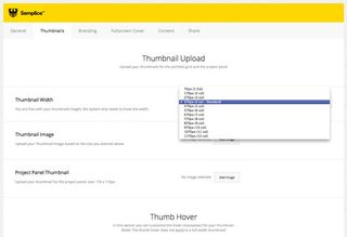
Now we have our basic elements in place – the navigation and font sets – we can create a new project page by clicking on Portfolio > Add new work, and start creating our special project page. We begin by adding basic information about the project, followed by our custom thumbnail for the homepage grid. The great thing about Semplice is that you're not limited to a thumbnail grid template as in most portfolio systems – each thumbnail item can have its own size, as long as you stick to the basic grid.
Step 05
Now we can add some custom branding to our project page. This helps make each case study a complete, immersive experience. Click on the Branding tab at the top, where we now can select the navigation style we created earlier. As everything is modular, you could use the same navigation style for multiple different projects.
Step 06
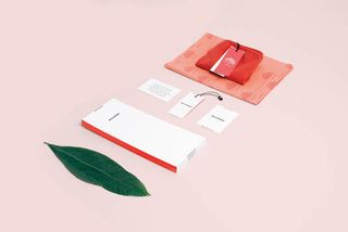
Our fullscreen cover gives you a great opportunity to welcome the viewer with a beautiful fullscreen video or immersive fullscreen imagery – simply click Fullscreen Cover in the top bar when creating a new project or page in WordPress. This feature is completely optional, but it might be the perfect thing to set the tone for your cast study.
Step 07
We're now entering the core part of the experience: the Semplice content editor. By clicking on the Content Editor tab (which you'll find in the top bar after creating a new project or page), you enter a fully customised content editor on top of WordPress.
You'll will see a blank canvas, giving you complete freedom to start creating your custom portfolio. You can create any layout you want, using the tools available at the top of the page. These range from images and paragraphs to galleries and multi-column modules.
Step 08
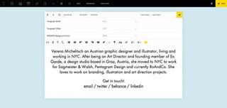
Let's start by adding an introduction using the paragraph module. Just click on the 'T' icon in the top-left corner (you can mouseover the different buttons to see which modules are available). We can customise the module's background image, colour, text alignment, width and padding.
Step 09
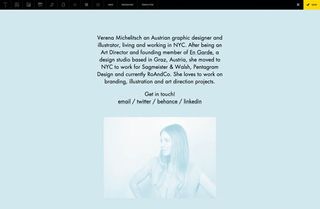
In the top navigation we can now select the font set we created earlier, and apply this to our paragraph layers. Once you're done, hit the checkmark icon in the top-right corner to save your layer and immediately go into preview mode.
Step 10
At this point, you can start to see how the website will end up looking. The Semplice content editor is completely visual and can be easily accessed a outlined in step 7. Everything can be edited by simply clicking on the layer you want to change. Let's add another layer right underneath the first. We can do this by choosing the Image tool in the top left.
Step 11
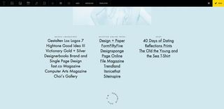
Every time you add a new piece of content, you can add a container around it which you can style in any way you like. Adding an image gives you many options – you can position and scale the image, or even define another background image to sit behind the image you just added. You can be as creative as you want to be, as Semplice keeps everything responsive and ensures your design works properly on mobile devices.
Step 12
Now we'll add a multi-column module. With this you can essentially create any editorial layout you can imagine. You can again insert paragraphs, images, videos and more. Think of the way you lay out elements in InDesign – except now you can do it while keeping everything responsive.
Step 13
Every module within the content editor can be combined with any other to create custom layouts. By entering the layer mode, you can re-order your content layers by just dragging them to a different position.
Step 14
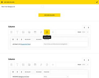
Let's add a video from Vimeo to the page, and place a description next to it. Our default grid is made up of 12 columns. We need to split it into two sections: one side for the video and another for the short description.
Step 15
In order to add the video to the first column, create a new column that's eight columns wide (leaving four columns for the description). The reason we do it this way is that the video will now automatically have the width of eight columns and will scale across any platform. Then we simply click on the oEmbed module for our first column and paste the Vimeo URL into the space.
Step 16
Create a second column inside the multi-column module, and give it the width of four columns. Click on the paragraph (text) icon to add the description. By approaching the process this way, you can now easily change the video or description width by optimising the width for the column it sits in.
Step 17
Creating with Semplice is addictive – once you've figured out all the possibilities, you can create any layout you can imagine. Semplice is more than just a tool. It's a way to make something better, to go the extra mile and tell the story of your work the way it should be told.
Words: Tobias van Schneider
This article originally appeared in issue 262 of net magazine.
Like this? Read these!
- 10 quick tips to improve your design portfolio
- Free graphic design software available to you right now!
- Download the best free fonts

Thank you for reading 5 articles this month* Join now for unlimited access
Enjoy your first month for just £1 / $1 / €1
*Read 5 free articles per month without a subscription

Join now for unlimited access
Try first month for just £1 / $1 / €1
The Creative Bloq team is made up of a group of design fans, and has changed and evolved since Creative Bloq began back in 2012. The current website team consists of eight full-time members of staff: Editor Georgia Coggan, Deputy Editor Rosie Hilder, Ecommerce Editor Beren Neale, Senior News Editor Daniel Piper, Editor, Digital Art and 3D Ian Dean, Tech Reviews Editor Erlingur Einarsson and Ecommerce Writer Beth Nicholls and Staff Writer Natalie Fear, as well as a roster of freelancers from around the world. The 3D World and ImagineFX magazine teams also pitch in, ensuring that content from 3D World and ImagineFX is represented on Creative Bloq.
