How to balance visual consistency with beauty on the web
Achieve visual consistency without creating cookie cutter sites.
03. Colour
Take great care in choosing your website's colours – each hue, where it appears, and the other colours it interacts with will all have a great emotional impact on your user.
We explain each colour and their psychological significance in Web Design for the Human Eye 1, but suffice to say, different colours evoke different emotions in your users (orange denotes playfulness, red aggression or energy, dark blue trust and reliability, etc.).
Select a fixed palette of colours for your site and stay consistent. Which colours you choose are up to you, based on the mood you'd like to set. Unless you're highlighting specific elements, the colours on each page should complement each other.

For an example of colour consistency, we'll look to the website for the art store Michael's.
Their creamy background accents the dominant black for their logo and menus – this repeated use of black itself adhering to colour consistency. The simple black-white(ish) colour scheme also causes their consistent use of green to really stand out, emphasizing their sales deals. Note that green is only used to showcase a deal. This consistency 'trains' users to identify other deals when they see green.
Reconstructing visual consistency
Now that we've taken visual consistency apart to see the roles of each component, let's put everything back together again to see how they work together.
With their fine eye for visuals, the landing page for the website-building firm Squarespace flaunts their skills on the very face of their site, with visual consistency in UI elements, playful typography, and rich colours.
Get the Creative Bloq Newsletter
Daily design news, reviews, how-tos and more, as picked by the editors.
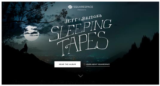
Let's start with the top of the page. They use only two typefaces: a decorative font for the header and sans-serif for the rest. To distinguish calls-to-action, all button typefaces are capitalized.
Notice how inconsistency is smartly applied to distinguish the two calls-to-action: the primary CTA is filled in white, while the secondary CTA (which redirects you) is muted, but underlined.
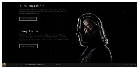
As you scroll down the page, secondary actions appear in the bottom-right corner, capitalized to signal interactivity, but more subdued in colour.
The generous line spacing and paragraph spacing create a nice vertical rhythm, while the white typeface accents the grayish outline of Jeff Bridges.
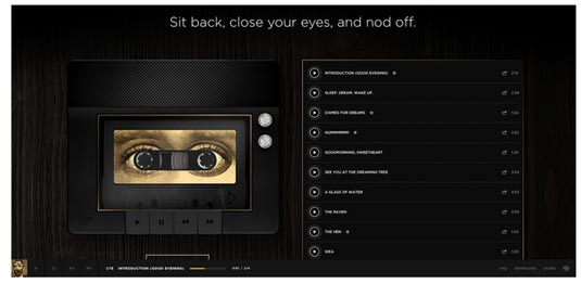
In the middle of the page, the design transitions to more of a skeuomorphic look to reflect a dark table. But it's applied tastefully, so the design still feels dark and bold without feeling tacky. We still feel a part of the nocturnal experience.
The play buttons are all the same, and the colour yellow is used consistently: the yellow border around the playlist complements the other yellow elements like the cassette border, play progress bar, and bottom-left logo.
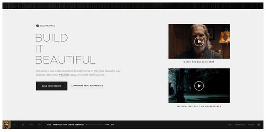
Once you scroll to the bottom, the transition to white immediately communicates this section is different from the rest – a strategic use of breaking the consistency. And for good reason: Squarespace is now providing their value propositions.
The background, however, is the only area of inconsistency. The video players are the same size, while the call-to-action treatment is the same as the rest of the site.
The shade of white is also the same as the white accents used in previous sections, making the design feel different yet still familiar. Instead of feeling out of place, this section feels more like a separate dimension of the same site thanks to the consistent elements.
Conclusion
Visual consistency is harder than it may seem, but it's worth the extra effort. Creating an interface that suggests familiarity, even on never-before-seen pages, is a great help to your user in comfortability and usability. Which of course goes a long way towards satisfying your user.
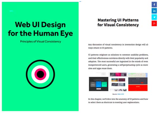
To learn more about balancing originality with familiarity in web design, download the free ebook Web Design for the Human Eye: Principles of Visual Consistency. Additional examples are analyzed from companies like Jukely, Wunderlist, and many others.
Words: Jerry Cao
Jerry Cao is a UX content strategist at the wireframing and prototyping app UXPin.
Like this? Read these!

Thank you for reading 5 articles this month* Join now for unlimited access
Enjoy your first month for just £1 / $1 / €1
*Read 5 free articles per month without a subscription

Join now for unlimited access
Try first month for just £1 / $1 / €1

The Creative Bloq team is made up of a group of design fans, and has changed and evolved since Creative Bloq began back in 2012. The current website team consists of eight full-time members of staff: Editor Georgia Coggan, Deputy Editor Rosie Hilder, Ecommerce Editor Beren Neale, Senior News Editor Daniel Piper, Editor, Digital Art and 3D Ian Dean, Tech Reviews Editor Erlingur Einarsson, Ecommerce Writer Beth Nicholls and Staff Writer Natalie Fear, as well as a roster of freelancers from around the world. The ImagineFX magazine team also pitch in, ensuring that content from leading digital art publication ImagineFX is represented on Creative Bloq.
