Here's what a portfolio website should look like
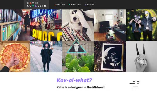
Leading web designer Katie Kovalcin has a portfolio that's infused with a clear sense of vision.
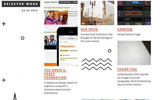
One of the best speakers at Generate New York 2015 last month is a designer at Sparkbox and net's Young Designer of the Year 2014, Katie Kovalcin. What makes her portfolio site so special are the little geometric patterns scattered around. The patterns glitch, they rotate, they animate their stroked lines … they are the detail that the whole site hangs upon, and they work exceptionally well. (Create an equally great site by using one of the best web hosting services and the best website builders around.)
"I was inspired by the bold, geometric textile patterns that Dusen Dusen creates," Katie says. "The exciting energy of their patterns and shapes is something that I wanted to capture for the web." Such is the energy of those shapes that when visiting the site on mobile, where the SVGs aren't present, the experience feels a little diminished.
The site was built by Chris Coyier of CSS-Tricks, using the increasingly popular static pages generator Jekyll. It's hosted on GitHub Pages, and has a custom Grunt set-up for creating web-ready SVGs from Illustrator exports, making it easy to update (be sure to save those files in cloud storage).
What I really appreciate about this site is the sense of personality, and the feeling that it's been designed by someone with a very clear vision of the end product.


Words: Peter Gasston
Peter Gasston is a veteran web developer who now works as a technologist and frontend lead at rehabstudio. He’s the author of The Book of CSS3 and The Modern Web.
Like this? Read these!
- 5 design tips for creating travel websites
- Brilliant Wordpress tutorial selection
- The ultimate guide to logo design

Thank you for reading 5 articles this month* Join now for unlimited access
Enjoy your first month for just £1 / $1 / €1
*Read 5 free articles per month without a subscription

Join now for unlimited access
Try first month for just £1 / $1 / €1
Get the Creative Bloq Newsletter
Daily design news, reviews, how-tos and more, as picked by the editors.

The Creative Bloq team is made up of a group of art and design enthusiasts, and has changed and evolved since Creative Bloq began back in 2012. The current website team consists of eight full-time members of staff: Editor Georgia Coggan, Deputy Editor Rosie Hilder, Ecommerce Editor Beren Neale, Senior News Editor Daniel Piper, Editor, Digital Art and 3D Ian Dean, Tech Reviews Editor Erlingur Einarsson, Ecommerce Writer Beth Nicholls and Staff Writer Natalie Fear, as well as a roster of freelancers from around the world. The ImagineFX magazine team also pitch in, ensuring that content from leading digital art publication ImagineFX is represented on Creative Bloq.
