This hairdressing site makes great use of sideways scrolling
A highly unusual and smooth design to complement unconventional hair styling.
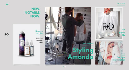
R+Co is a collective of hairstylists, and has a highly unconventional yet surprisingly slick website. Created by NYC-based digital agency Domani, the site breaks with convention by utilising sideways scrolling.
This works really well – primarily because the site doesn't hijack the scrolling. I also love the use of the grid and how content gracefully breaks out of it. Overlapping elements and a subtle parallax effect help create a sense of depth, as text and image sit over one another.
When the user initially accesses the site, device detection establishes whether it should deliver the mobile or desktop experience. While we are used to (and have come to expect) responsive websites now, in some cases serving separate experiences can still be the most pragmatic choice.
As the experience relies quite heavily on the grid and horizontal scroll, there would inevitably be issues with how it would work on mobile.
Product imagery
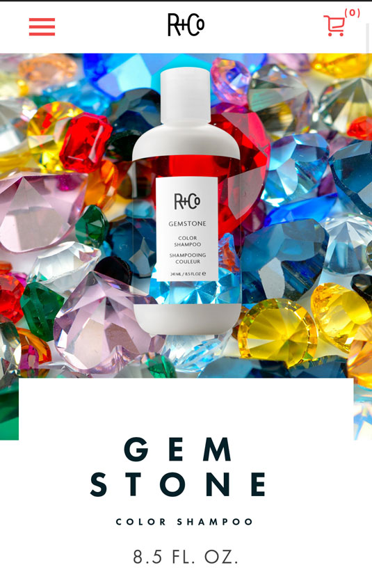
My favourite part of the site is the use of product images which have a 'masked' transparent body. This effectively creates an area that knocks through to the background content, allowing the site to run imagery, GIFs or video straight through the product.
The typography is also fantastic. The headings are set heavy and spaced out, to help maintain legibility against the strong background photography. Overall, the minimal use of colour, with emphasis on type and imagery gives a stunning, strongly art directed aesthetic.


Words: Chris Allwood
Chris Allwood is a digital designer and co-organiser of grassroots event Second Wednesday. He works at Studio Output in Nottingham, UK.
Like this? Read these!
- How to cut out hair in Photoshop
- Brilliant Wordpress tutorial selection
- The ultimate guide to logo design

Thank you for reading 5 articles this month* Join now for unlimited access
Enjoy your first month for just £1 / $1 / €1
*Read 5 free articles per month without a subscription

Join now for unlimited access
Try first month for just £1 / $1 / €1
Get the Creative Bloq Newsletter
Daily design news, reviews, how-tos and more, as picked by the editors.

The Creative Bloq team is made up of a group of art and design enthusiasts, and has changed and evolved since Creative Bloq began back in 2012. The current website team consists of eight full-time members of staff: Editor Georgia Coggan, Deputy Editor Rosie Hilder, Ecommerce Editor Beren Neale, Senior News Editor Daniel Piper, Editor, Digital Art and 3D Ian Dean, Tech Reviews Editor Erlingur Einarsson, Ecommerce Writer Beth Nicholls and Staff Writer Natalie Fear, as well as a roster of freelancers from around the world. The ImagineFX magazine team also pitch in, ensuring that content from leading digital art publication ImagineFX is represented on Creative Bloq.
