The Gruffalo gets a cracking new website from Aardman
Aardman's Jake Manion and George Rowe talk us through the challenges of creating the Gruffalo's vibrant new site.
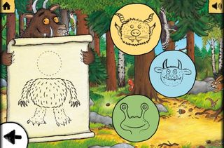
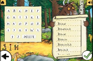
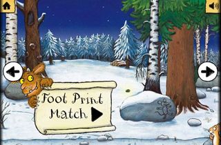
The 15th anniversary of smash hit kids' book The Gruffalo is fast approaching, and to celebrate Aardman has created a fantastic new website crammed with information and news about The Gruffalo and creator Julia Donaldson, plus the Deep Dark Woods, a rich parallax scrolling world that's packed with activities to keep young Gruffalo fans busy.
We spoke to creative lead Jake Manion and digital producer George Rowe about how the work that went into bringing the Gruffalo's world to the web.

How did the brief come about?
Jake Manion: Pan Macmillan wanted the Gruffalo.com to be the premier location for finding out about everything Gruffalo and Julia Donaldson, and to seize the opportunity to create a flagship digital entertainment content around the property.
What was your design approach to this project?
Jake Manion: The design approach was lead in two ways, one technical and one user centric. Technically, we designed everything from a 'tablet first' perspective; the iPad was our golden pixel width, and then we scaled up and down from there as appropriate.
From a user's point of view we knew there would be two primary visitor groups to the site: parents who wanted to find out about the Gruffalo, its back story and find other resources and information relating to it; and kids who didn't care about the info and just wanted to have fun in the Gruffalo world! That's why we signposted the site into two distinct parts; the content-driven website, and the interactive 'deep dark wood' area where all the games and toys lived.
What did you use to build the site?
George Rowe:
The deep dark wood interactive area which we built uses HTML, CSS and JavaScript so it works on any device a kid might take to bed with them! The website we designed was built by an agency called Distinction, because they specialise in Pan Macmillan's preferred Kentiko CMS.
Get the Creative Bloq Newsletter
Daily design news, reviews, how-tos and more, as picked by the editors.

What piece of software was most useful?
George Rowe: Photoshop was of course invaluable in creating the 'deep dark wood' and designing the site. One of our designers stitched Axel Scheffler's beautiful illustrations together into this rich, absorbing world of things to discover. The PSD got to about 2GB and was refusing to open on older Macs before we split it out into parts!
Our devs swear by the extensible Sublimecode editor; many invaluable plugins were used, not least the PlainTasks to do list.
What was the most technically challenging aspect?
Jake Manion: Making the 12000px wide 'deep dark wood' background, plus all the game image assets inside it, perform on mobile devices was quite a challenge and involved plenty of clever asset management, including chopping the world up into slices. Also getting our custom particle emitter for the falling leaves to perform well on mobile, and having all the games and world scaling tidily across all devices.

Did you use any new or notable techniques during production?
George Rowe: Jake's idea for using a sine-wave for our leaf particle emitter was, I thought, a pretty cool idea. All the animation is CSS and JavaScript, and the transit.js library was really great for creating smooth effects. We also used HTML5 local storage for storing the user's names in the deep dark wood, and hacked the iScroll library for the main interface. Basically, lots of nifty web techniques!
Words: Jim McCauley & Kerrie Hughes
Liked this? Read these!
- Check out these amazing HTML5 websites
- How to build an app: try these great tutorials
- Top tips for mobile website design
What do you think of the Gruffalo's new online world? Hit the comments!

Thank you for reading 5 articles this month* Join now for unlimited access
Enjoy your first month for just £1 / $1 / €1
*Read 5 free articles per month without a subscription

Join now for unlimited access
Try first month for just £1 / $1 / €1
The Creative Bloq team is made up of a group of design fans, and has changed and evolved since Creative Bloq began back in 2012. The current website team consists of eight full-time members of staff: Editor Georgia Coggan, Deputy Editor Rosie Hilder, Ecommerce Editor Beren Neale, Senior News Editor Daniel Piper, Editor, Digital Art and 3D Ian Dean, Tech Reviews Editor Erlingur Einarsson, Ecommerce Writer Beth Nicholls and Staff Writer Natalie Fear, as well as a roster of freelancers from around the world. The ImagineFX magazine team also pitch in, ensuring that content from leading digital art publication ImagineFX is represented on Creative Bloq.
