Grey: the secret colour trend in web design
Is grey the new black? Dan Slagen from Crayon shares his research into colours on the web.
It's easy to associate a company with one or two colours, as is often the goal of a brand (eg Coke = red). And there are many examples of brands that have successfully 'owned' a colour.
But right now, something strange is going on. In many cases, the colours brands actually use on their website are not the same as their official brand colours.
Take Facebook, for example. What colour do you associate Facebook with most often? Most likely, Facebook Blue which consists of R:59, G:89 and B:152 as pictured below (thanks to Brandcolours.net).

But what happens when you take a closer look at the user interface on Facebook.com?
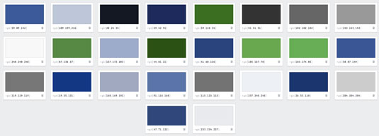
As represented above (thanks to Colourpeek), there are over 25 colours represented, which consist of the following RGB ratios:
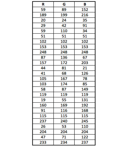
Now keep in mind that the colour that people associate most with Facebook is Facebook Blue. The overall average of all colours used by Facebook as represented in the excel chart above is actually:
- Average R:106
- Average G:126
- Average B:133

Look at the difference between the two colours. On the left is the colour that people most associate with Facebook. But the colour on the right is the colour that people are exposed to the most while using Facebook.
Get the Creative Bloq Newsletter
Daily design news, reviews, how-tos and more, as picked by the editors.
Psychological impact
So it's worth taking a look at the psychological impact each of these colours is supposed to have on people. For that, we'll consult the Colour Wheel of Emotion, courtesy of the Logo Company:
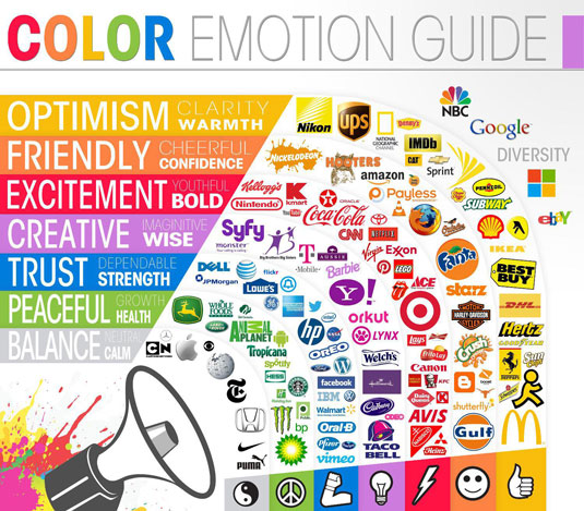
So according to this chart at least, it turns out Facebook wants people to associate their brand with 'trust' – which makes sense considering it's a social network where people are sharing intimate details of their life. But when on the site, Facebook wants users to have a sense of 'calm', which also makes sense considering the chaotic nature of the Newsfeed.
Even with new posts updating every minute, new videos, ads, updates, friend requests, event invites, messages from that person you don't really want to hear from (the worst)… you're subconsciously enveloped in a calming grey that will encourage you to endlessly scroll and stay on the site. Well played, Facebook.
This got our team here at Crayon thinking: is this trend happening all around us at a subconscious level without most people noticing? For further analysis, we also examined two of the web's other biggest sites, YouTube and Ebay, to find out. We list our findings below...
01. Facebook
Brand association colour:

Website experience colours:

- Average R:106
- Average G:126
- Average B:133
Conclusion: Facebook associates its brand with the colour Blue to represent 'trust,' but the most prevalent colour on the site is a shade of grey.
02. YouTube
Brand association colour:

Website experience colour:

- Average R:150
- Average G:141
- Average B:143
Conclusion: YouTube associates its brand with the colour red, to represent 'excitement', but the most prevalent colour on the site is a shade of grey.
03. Ebay
Brand association colours:

Website experience colour:

- Average R:153
- Average G:166
- Average B:177
Conclusion: Ebay associates its brand with the colours red/blue/yellow/green, representing 'excitement/trust/optimism/peaceful.' But the most prevalent colour on the site is a shade of grey.
So is grey the new black?
While Facebook, YouTube and Ebay don't speak for the entire web, they do rank numbers 2, 3 and 7 in U.S. web traffic respectively. And what's interesting to note here is that all of these websites thrive off of time on site, especially Facebook and YouTube. For them, the longer people stay on the site the better – so perhaps there's something to be learned from these titans.
However, a word of caution: two things about this experiment need to be taken into account.
First, analyzing RGB colour averages in order to find one dominant colour doesn't always work due to the percentage of screen space each colour represents. We ran tests on other sites including Amazon and Twitter that didn't return such conclusive results. (Although it's also worth noting that both LinkedIn and Pinterest use a shade of grey as their backgrounds, as does our own site, Crayon.co.)
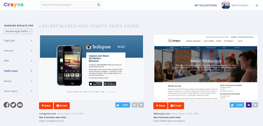
Second, not every site we examined uses grey as the most prevalent colour during the user experience because not every company has the same goal. Take Netflix for example.
We all know Netflix for their screaming red brand associated with 'excitement'. But the majority of the new user experience consists of black, representing a sense of mysteriousness, potential and possibility.
From a branding perspective this makes sense, because Netflix want to get people excited about the brand, visit the site, and then harness that momentum to put it towards discovery. In other words, their goal (which is not Facebook's goal) is to keep users engaged and motivated long enough to select a movie/show – and then they've succeeded.
Should you follow the trend?
As a marketer and/or designer, when was the last time you really sat back and thought about the goal of your company, and then ran a series of colour tests to impact that goal?
Too often, companies can get stuck in the chains of 'brand guidelines' and templates that might be acting as a hindrance to site performance.
With six months to go in 2015, there's still time to make a significant impact at your firm, but the time to get started is now.
Words: Dan Slagen
Dan Slagen is the VP of Marketing at Crayon. If you're interested in harnessing the power of design and creative, make sure to check out this site. Featuring more than 14 million designs, it aims to help you find your inspiration, collaborate with colleagues and save the best designs on the web.
Like this? Read these!
- The 28 best tools for choosing a colour scheme
- The best collage maker tools – and most are free!
- Free graphic design software available to you right now!

Thank you for reading 5 articles this month* Join now for unlimited access
Enjoy your first month for just £1 / $1 / €1
*Read 5 free articles per month without a subscription

Join now for unlimited access
Try first month for just £1 / $1 / €1

The Creative Bloq team is made up of a group of art and design enthusiasts, and has changed and evolved since Creative Bloq began back in 2012. The current website team consists of eight full-time members of staff: Editor Georgia Coggan, Deputy Editor Rosie Hilder, Ecommerce Editor Beren Neale, Senior News Editor Daniel Piper, Editor, Digital Art and 3D Ian Dean, Tech Reviews Editor Erlingur Einarsson, Ecommerce Writer Beth Nicholls and Staff Writer Natalie Fear, as well as a roster of freelancers from around the world. The ImagineFX magazine team also pitch in, ensuring that content from leading digital art publication ImagineFX is represented on Creative Bloq.
