Get better reviews for your mockups in 7 steps
Dreading criticism of your initial designs? Follow these tips and start setting yourself up for success.
Comp (aka mockup) reviews are a vital step in the design process, but they don't have to be so stressful.

Here we've compiled a practical list of best practices to follow before your next mockup review. You might be surprised by some of the simple tips that go a long ways towards setting yourself up for success.
Definitions
Before we dive into the tips, let's first agree on our definitions.
First, the term "mockup" refers to the visual representation of the final project, the deliverable that showcases what the completed site should look like. You might also know these by the term "comps."
Mockups are not wireframes. Wireframes are a completely different (and earlier) iteration, the barebones outline of a site to determine content placement on the page (and sometimes overall information architecture).
Wireframes and mockups aren't even the same fidelity – wireframes are very basic, little more than lines and some boxes, while mockups are the opposite, often (but not always) containing the graphical fine points.

Second, mockups aren't fixed at any one place in the design process. In rapid prototyping, they're most common near the end of the process, after several wireframing and low-fidelity prototypes give you some preliminary feedback to step off from.
But one could just as easily jump straight into a mockup at the beginning and move directly into coding an interactive prototype. Everyone's design process is different, and there's no right or wrong way.
Wherever mockups fit into your process, when it comes time for the review, you'll get the best results if you follow these six steps below.
01. Check your design against user data and personas
Make no mistake about it: you'll always encounter criticism during mockup reviews. That's not necessarily a bad thing, either; the whole point of the review process is to create a better product from fresh perspectives. The problem with criticism arises only when it's unwarranted.
You'll be in a much better position to defend your decisions (and guide others for their feedback) if you can back up your choices with actual data.
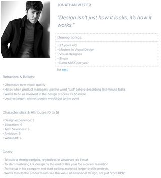
Personas exist for this reason, as a stand-in for your users, only as effective as the data they're built from. If you made your design decisions based on your persona data – and can prove it in a review meeting – you'll be on better ground to separate the valid critiques from personal opinion.

When presenting your mockup, discuss everything as it relates to user goals . This will keep the focus of the meeting where it belongs, and will even preempt some misguided comments.
Yes, your opinion as a designer is valuable since users aren't conscious of the intangibles influencing their experience (the ones that you deal with on a daily basis). But your knowledge, skill, and expertise are only sharpening the knife put forth by your users. Make sure you've designed for the right reasons before ever revealing your work to the outside world, otherwise you'll deserve whatever shredding you get.
If you're having trouble stepping away from your own ego, try asking yourself questions like:
- Would our target users find this interface intuitive? What difficulties or confusion might they run into?
- Does the learning curve match the context of use?
- How does the interface make the person feel? (For example, does the form completion process feel like a machine asking for data, or another human conversationally guiding you to better help yourself? The subtle details of microinteractions add up fast, so don't take anything on the page for granted.)
- Is the user overwhelmed with choices? Remember the principles of Hick's Law (e.g. limiting on-screen choices) which we described in Interaction Design Best Practices.
- Does the visual style match the appropriate mood for the users? What about the tone of the language?
A good mockup review session depends first and foremost on a good mockup design. If you're designed using the proper fundamentals, you'll be able to confidently defend your decisions.
02. Invite the right people
If the problem isn't your design, maybe it's your audience. Sometimes the wrong people can derail your mockup review, so take extra consideration when writing the guest list.

On the one hand, you don't want to invite too few people: some people might feel neglected, and equally risky is that you'll miss out valuable insight from a key player (which becomes more problematic when their advice comes up far later in the process).
On the other hand, you don't want to invite too many people: this leans too close to "design by committee" and may unleash some extraneous politics, not to mention be a waste of time for some people. It's a tricky balance to strike, but there are some helpful guidelines.
Start with your core players: invite at least one person from the following four groups:
- Marketing – having a marketer present will ensure none of the more tactical aspects of the project slipped by during the "creative" design process.
- Expert on the Subject – someone who has relevant expertise with the subject – for example, if you're designing a new employee portal for the company site, you might invite your own HR director.
- Product Management – you want someone there looking after the initial product requirements
- Developers – a developer will provide indispensable feedback on the logistics of turning the mockup fantasy into a reality.
After that, invite whomever is necessary for your specific project – and only who is necessary. For example, if your design is exceptionally complex, you may want to call in an additional developer. The key is to limit it to only those you need.
03. Use the right collaboration medium
You've got a solid design backed by research, and now a confirmed guest list. The next step is getting everyone together.
Ideally, this is not their first introduction to your design ideas. The best practice is to share any wireframes or prototypes when they're relevant, so feedback specific to them can be implemented as soon as possible. In that case, everyone's been primed and has an idea of what to expect.
Mockup reviews are best done in-person; conference rooms with projection capabilities are a good choice. Talking face-to-face lets you hash everything else quickly, and streamlines any debates, explanations, discussions, brainstorming – the entire process, in general.
While best, getting everyone in the same place at the same time is not always an option. When scheduling conflicts arise, you can fall back on any number of collaboration platforms, depending on your needs.

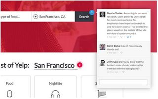
Obviously, we're most familiar with our own tool, UXPin. This works well for mockup reviews because video/audio capabilities allow for real-time, personal discussions while everyone has access to the mockup (or wireframe/prototype) on the screen – anyone can add comments or make quick edits to the actual document.
The bare minimum, though, is any tool that allows you to communicate. For instance, after distributing the file, you could simply start a Google Hangout, or use a broad collaboration tool like Slack (very smooth and simple to use). The main goal of the mockup review is, after all, sharing thoughts with one another.
04. Always set the context
This is good advice for any review meeting, beyond mockups, even beyond the web design industry. The thinking is, "an ounce of prevention is worth a pound of cure".
Before the review, explain the context to set the stage. Cite the research the design was based on, and how your ideas aim to meet certain goals. As recommended in The Guide to Mockups, tell them the level of fidelity and why so they aren't expecting something beyond the current phase. Acknowledge any shortcomings or "TBD" elements now, so your audience can move past them and onto more helpful critiques.
Then, during the actual presentation of the mockup, explain your own mindset behind your choices. Sometimes designers can forget that everyone else doesn't know as much as they do, so any background you give will help present a clearer view of your vision.
Next page: establish ground rules and look ahead...

Thank you for reading 5 articles this month* Join now for unlimited access
Enjoy your first month for just £1 / $1 / €1
*Read 5 free articles per month without a subscription

Join now for unlimited access
Try first month for just £1 / $1 / €1
Get the Creative Bloq Newsletter
Daily design news, reviews, how-tos and more, as picked by the editors.
The Creative Bloq team is made up of a group of design fans, and has changed and evolved since Creative Bloq began back in 2012. The current website team consists of eight full-time members of staff: Editor Georgia Coggan, Deputy Editor Rosie Hilder, Ecommerce Editor Beren Neale, Senior News Editor Daniel Piper, Editor, Digital Art and 3D Ian Dean, Tech Reviews Editor Erlingur Einarsson, Ecommerce Writer Beth Nicholls and Staff Writer Natalie Fear, as well as a roster of freelancers from around the world. The ImagineFX magazine team also pitch in, ensuring that content from leading digital art publication ImagineFX is represented on Creative Bloq.
