Why has FontShop released a half-finished website?
The type distributor wants its customers to test drive, debate and engage with its website redesign, as Ivo Gabrowitsch explains.
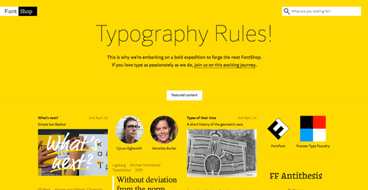
Last week, type distributor FontShop unveiled the starting ground of its brand new website. But this is no ordinary redesign, for FontShop has published the design in a raw state, inviting users to accompany it on 'its journey to completion in the coming months'.
Despite being incomplete, the site has already attracted the eye of various leading designers, including Jason Santa Maria and Elliot Jay Stocks, both of whom took to Twitter to express their delight at its development so far...
But what prompted the redesign? And where does the site go from here? We chatted to FontShop project manager Ivo Gabrowitsch to find out more.
What prompted the FontShop redesign?
It was about time to reconsider the entire process of searching fonts and switching into finding and discovering them, as we knew that the current way of selling fonts was not enough user-friendly anymore.
Although facing a massive project by doing so, it was the most obvious way as we had the chance to rethink everything - web technology, user experience, responsiveness, buying process, even our portfolio, plus we will even simplify licensing at a later stage of the relaunch process.
What was your design approach to the project?
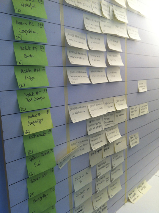
The purpose of the relaunch of FontShop.com was to strengthen the position of being the leading independent font distributor that provides fonts from expert-curated foundries. The design approach was to become the most simple, most user-friendly and most inspiring font distribution platform around.
We want people to discover fonts by helping them to find the perfect fit for their projects rather than just providing a good experience for those who already know what they want. Most customers don't know which particular typeface will fit their needs, so the site shall become a tool that manifests the typographic expertise FontShop is loved for.
This approach will be part of different parts of the site, for instance: we work on a highly advanced search, on playful features that guide you to the right typefaces, groundbreaking try-out options, as well as discovery tools that perfectly fit to the different users' needs.
Which fonts are you using for the site?
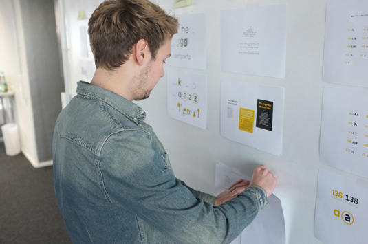
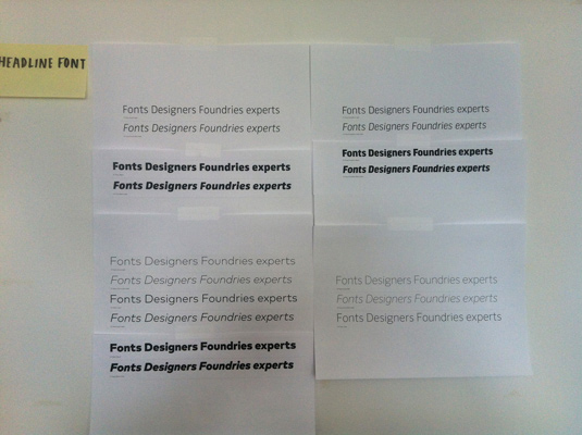
We plan to use different webfonts from time to time. At the moment, we use FF Sero for the subpages' headlines and FF Yoga Sans for body text and navigation. Furthermore, we use special headlines depending on the editorial content. So, for instance, if an article is dedicated to Stencil typefaces, then, of course, the headline is set in a stencil font.
We decided to use FF Sero Thin in 96px size for headlines as we want to push the boundaries of web typography a bit. It is still uncommon to see weights that thin and that big on the web and we thought that this is what a highly typographic website should do. It makes you aware of the endless possibilities you have on FontShop.
FF Sero, as such, combines the striking forms of an American Grotesque with the legibility of a Humanist sans serif typeface, so it's both a European and American typeface, which is a perfect synonym for FontShop in general. FF Yoga Sans for body text is a yet underrated sans serif with a strong personality and good legibility at any size. It's not always easy to combine two sans serif families, but FF Sero and FF Yoga Sans make for perfect companions.
Why was the decision taken to publish the site in its current raw state?
Our aim is to create a design that answers questions before they even come up. This is why we're already launching this framework of the next FontShop in its raw, unfinished state. It's more than just a space for people to play around, explore, discover and revisit.
Our aim is to create a design that answers questions before they even come up
It's also a real live invitation for our customers to test drive, debate and engage. So in a nutshell, we want to involve our customers to participate and want to be able to adjust the direction if necessary, as we are convinced that this is how ecommerce works today.
What has the reaction to the site been so far?
Our feedback page and through Twitter was amazingly positive. People seem to love our bold expedition, which motivates us even more to add more and more exciting features over time.
What do you think of the next FontShop? Let us know in the comments.

Thank you for reading 5 articles this month* Join now for unlimited access
Enjoy your first month for just £1 / $1 / €1
*Read 5 free articles per month without a subscription

Join now for unlimited access
Try first month for just £1 / $1 / €1
Get the Creative Bloq Newsletter
Daily design news, reviews, how-tos and more, as picked by the editors.

The Creative Bloq team is made up of a group of art and design enthusiasts, and has changed and evolved since Creative Bloq began back in 2012. The current website team consists of eight full-time members of staff: Editor Georgia Coggan, Deputy Editor Rosie Hilder, Ecommerce Editor Beren Neale, Senior News Editor Daniel Piper, Editor, Digital Art and 3D Ian Dean, Tech Reviews Editor Erlingur Einarsson, Ecommerce Writer Beth Nicholls and Staff Writer Natalie Fear, as well as a roster of freelancers from around the world. The ImagineFX magazine team also pitch in, ensuring that content from leading digital art publication ImagineFX is represented on Creative Bloq.
