How to create flexible layouts with Susy and Breakpoint
Discover how to use these Sass extensions to create flexible layouts.
Sign up to Creative Bloq's daily newsletter, which brings you the latest news and inspiration from the worlds of art, design and technology.
You are now subscribed
Your newsletter sign-up was successful
Want to add more newsletters?

Five times a week
CreativeBloq
Sign up to Creative Bloq's daily newsletter, which brings you the latest news and inspiration from the worlds of art, design and technology.

Once a week
By Design
Sign up to Creative Bloq's daily newsletter, which brings you the latest news and inspiration from the worlds of art, design and technology.

Once a week
State of the Art
Sign up to Creative Bloq's daily newsletter, which brings you the latest news and inspiration from the worlds of art, design and technology.

Seasonal (around events)
Brand Impact Awards
Sign up to Creative Bloq's daily newsletter, which brings you the latest news and inspiration from the worlds of art, design and technology.

Creating responsive layouts can be challenging because of the maths involved, so it's common for designers to turn to frameworks and/or Sass to simplify the process. A lot of frameworks are based on a 12-column grid, but a responsive site doesn't always fit into this structure. Here, I'll show you how to use two Sass extensions to create truly flexible layout that transcends the 12-column grid.
The problem
Designing responsive layouts can be tough, as it involves calculating the width of containers, rows, columns and gutters at different breakpoints. Frameworks can help by creating presets for common breakpoints. Bootstrap 3, for example, gives us a 12-column grid with four media query breakpoints. You then use classes that cause your content to take up a certain number of spots in the grid, and the gutters always take up 30px.

This works brilliantly most of the time, but there are two problems. First, adding these classes to your markup can get a little verbose. Say you want a layout that uses all the columns on mobile devices, six of the 12 columns on small devices, and four on medium devices. That markup might look something like this:
<h2>Services</h2>
<div class="row">
  <article class="service col-md-4 col-sm-6">
    <img class="icon" src="images/icon-exoticpets.svg" alt="Icon">
    <h3>Exotic Pets</h3>
<p>We offer specialized care for reptiles, rodents, birds, and other exotic pets.</p>
The second problem is that these classes add layout information to your HTML and make your code difficult to update, especially on a large installation. As your layouts get more complex, you might end up with some code that looks like this:
<div class="photo col-xs-6 col-xs-offset-3 col-sm-3 col-sm-offset-1 col-md-2 col-md-offset-2 col-lg-4 col-lg-offset-0">The larger issue is that you have little flexibility. Your framework should take care of the maths, because that's the hard part, but it shouldn't be dictating the metrics of your layout. Who made these frameworks the boss of you?
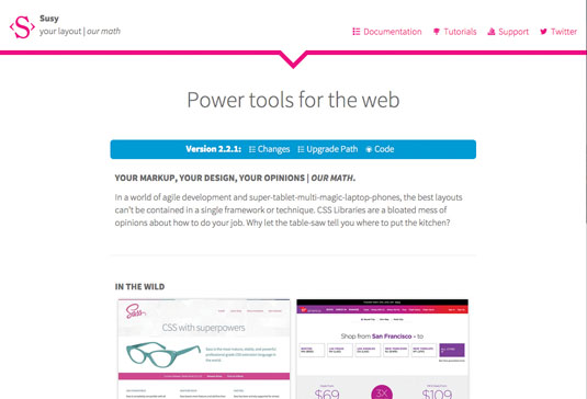
Susy
Susy's simple promise is to let you worry about the design while it takes care of the maths. At its core it's a set of Sass mixins for calculating widths in a completely flexible grid system.

Start off by importing the library into your project via an import command: @import "susy";. This gives you access to Susy's grid framework, which couldn't be simpler to implement. In its most basic form, there are just two mixins you'll need to learn. First is the container mixin.
Sign up to Creative Bloq's daily newsletter, which brings you the latest news and inspiration from the worlds of art, design and technology.
Containers
Containers help you control how the width of an element adjusts to different breakpoints. With Susy, we can redefine the containers inside any element at any time, without having to add any additional classes to our HMTL code.
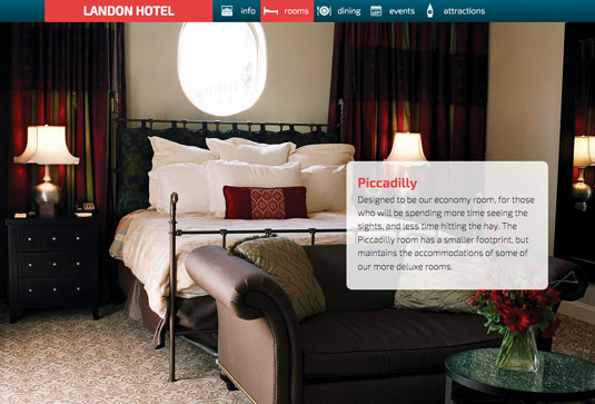
Let's say I'm laying out a different website. If I want to create a container within an HTML element, I can add an include within my declaration, like this:
#welcome {
  article {
    @include container(70%);
  } //article
}
This will make the item with a class of section work like a bootstrap container, without having to add a .container class into our HTML – meaning our HTML can be a lot more semantic.
<div class="scene" id="welcome">
  <article class="content">
    <h1>Welcome to the Landon Hotel</h1>
    <p>The original Landon perseveres after 50 years in the heart of West London. The West End neighborhood has something for everyone – from theater to dining to historic sights. And the not-to-miss Rooftop Cafe is a great place for travelers and locals to engage over drinks, food, and good conversation.</p>
  </article>
</div>
In addition to making my HTML a lot more readable, this makes things easier to update. When we use classes like content and scene, it's easy to redefine what those elements mean in terms of layout, instead of having to think about how many classes we'll need to add in order to make our content behave the way we want it to.

Spans
In Susy you create rows and columns using spans. To create an element that takes up one of three columns, you can write something like this.
#usefulinfo {
  section {
    @include span(1 of 3);
  }
}
What's really great about this is that we never have to conform to a specific number of columns and then adjust the elements accordingly. Any element in my layout can take up only the amount of space I need at that time.

This really changes the way you think about columns. If I was using Bootstrap, I would write the above code as .col-sm-4 since one third of 12 columns is four. With Susy, I don't have to think about how many units I want to span; I can simply specify the amount of space I need. When you're no longer thinking about the conversion to a specific number of columns, you can focus on what the layout should look like instead.
Setting up defaults
Of course, in any layout system it's good to have defaults, so we don't have to specify the size of our gutters in every instance. We do that by modifying a variable called $susy at the top of our Sass:
$susy: (
  columns: 12,
  container: 60em,
  gutters: 1/4,
  gutter-position: inside
);
Susy has a ton of defaults you can use to set up your default grid, but this basic set-up will take care of putting together a standard Bootstrap-like default. Don't forget, everything in Susy is customisable so you're never married to any of these, and can change them on a tag-by-tag basis.
The default grid will now have 12 columns when we use the @include command in the container mixin, and that container will lock on at 60em width, with gutters that are a quarter of the size of the columns. If we wanted to fit our earlier sections to this grid, we could write the declaration like this:
#usefulinfo {
  section {
    @include span(4);
  }
}
This means each section takes up four of the 12 columns. However, I think it makes more sense to be able to say that an element takes up 'one of three' columns. If you need to offset columns to a certain position, you can use this notation:
@include span(8 at 4 of 12);This lets an element take up eight columns, starting at the fourth position in a 12-column grid. So when you're creating a layout, you can focus on what your content needs to do instead of how the design fits into your existing grid.
Padding Columns
Another way to control the placement of your elements is by padding your columns. This adds a number of column spaces on either side of your columns. For example, you could move a column seven units to the right and pad it one unit from the left, like this:
@include pad(7,1);This means that in addition to laying things out by thinking about positive spaces (how many columns an element should take up), you can do the reverse and create designs based on the spacing on each side of your content.

Managing Media Queries
To make things truly responsive, you need to be able to combine column set-up and design with responsive breakpoints. To do this, we can use another set of mixins from a library called Breakpoint.
Breakpoint makes it easier to handle media queries in your layouts. It does so by simplifying the language you need to use to create media query breakpoints. Traditionally, you create these using a rule like this:
@media (min-width: 34em) and (max-width: 62em) {
  .container {
    ...
  }
}
This creates a range of widths in which the declarations have an impact on your layout. Breakpoint encapsulates the calls into a common-sense mixin that's much easier to write:
.container {
  @include breakpoint(34em 62em) {
        ...
  }
}
The call is different too, because we can easily assign this inside an existing class. The great thing about Breakpoint is that it makes assumptions based on common layout needs.
Breakpoint rules are easy to learn too. There are just three things you need to know:
- If you only include a single number in the breakpoint call, Breakpoint will assume a min-width media query call
- If you include two numbers, breakpoint will assume you want to specify a range between the two numbers (as in the previous example)
- If you include two values and one is a string, it assumes you are sending the mixin a feature value pair, so if you want you can still send in orientation or any other special media query rule
Breakpoint has been folded into Susy since version 2.2.1. The Susy version works just like the Breakpoint mixins, but instead of calling breakpoint, you use susy-breakpoint. The same call would be made like this:
.container {
  @include susy-breakpoint(34em 62em) {
    max-width: 50%;
    margin-left: auto;
   margin-right: auto;
  }
}
Breakpoint and Susy
When you combine Breakpoint with Susy you get a flexible grid that can easily adjust to different media query declarations. Let's take a look at the HTML for the information section on a site.
<div class="scene" id="hotelinfo">
  <article id="usefulinfo">
    <section id="arrivalinfo">
    </section>
    <section class="checklist" id="services">
    </section>
    <section class="checklist" id="accessibility">
    </section>
  </article>
  <article id="greenprogram"></article>
</div><!-- hotelinfo -->
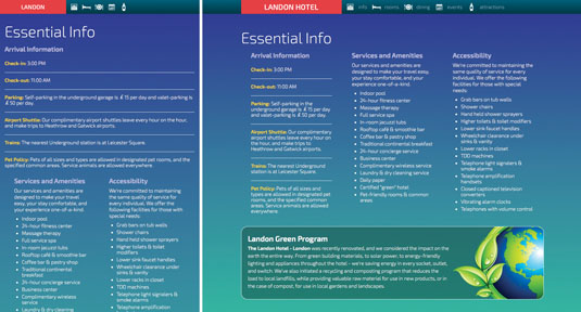
Combining Susy and Breakpoint, we can create media queries that contain different grid layouts. In my layout I have three different sections, but I want them to have different rules depending on the width of the viewport.

At these two different breakpoints, our layout behaves dramatically differently. In the larger breakpoint to the right, each section takes up three columns. In the smaller breakpoint, the first column takes up 100 per cent of the viewport, but the other two take up half of the viewport. This is what makes these mixins so powerful. The code for expressing these two layouts is concise:
section {
  @include susy-breakpoint(650px) {
    @include span(1 of 3);
  } //breakpoint
  @include susy-breakpoint(450px 650px) {
    &.checklist {
      @include span(1 of 2)
    } //checklist
  } //breakpoint
} //section
First, we set up defaults for any element in a section tag. If those elements reach a viewport that's greater than 650px, they will occupy a three-unit grid, with each taking up a single unit.
If the layout is between 450px and 650px, the elements with a class of .checklist (the service and accessibility sections) will fit into a completely new grid with only two columns, and each element will take up one of those units.
The arrival information takes up 100 per cent of the grid between these two breakpoints. Notice we didn't specify what happens below 450 pixels. This is taken care of by the defaults – each section will take up 100 per cent of the viewport.
Mastering Layouts with Mixins
What these two mixin frameworks give you goes beyond the code you use to create the layouts. The ability to express your layouts without having to worry about this grid or that grid changes the way your brain works when designing projects.
Don't get me wrong, I love frameworks. Bootstrap can help you create layouts with unprecedented speed. It offers a battle-tested grid that goes beyond layout to provide all kinds of CSS and JavaScript components to quickly handle common elements like tables, modals and forms.
What the system of design I've outlined does is change the language you use to describe a layout. It's a natural, backwards-compatible and easy to learn system that will change the way you think about designing websites.
Words: Ray Villalobos
Ray Villalobos is a staff author at Lynda.com specialising in full-stack design and development, frontend design, JS, AngularJS, Sass, Bootstrap. This article was originally published in issue 274 of net magazine.
Liked this? Read these!
- 20 steps to the perfect website layout
- Brilliant Wordpress tutorial selection
- Free tattoo fonts for designers

The Creative Bloq team is made up of a group of art and design enthusiasts, and has changed and evolved since Creative Bloq began back in 2012. The current website team consists of eight full-time members of staff: Editor Georgia Coggan, Deputy Editor Rosie Hilder, Ecommerce Editor Beren Neale, Senior News Editor Daniel Piper, Editor, Digital Art and 3D Ian Dean, Tech Reviews Editor Erlingur Einarsson, Ecommerce Writer Beth Nicholls and Staff Writer Natalie Fear, as well as a roster of freelancers from around the world. The ImagineFX magazine team also pitch in, ensuring that content from leading digital art publication ImagineFX is represented on Creative Bloq.
