This free Chrome extension will give you a flat Facebook redesign
Rof Tentik explains the thinking behind his Facebook-changing extension.
After 10 years, Facebook has become one of the most used sites in existence… so why does it still look 10 years old?
All other factors aside, the criticism for Facebook's outdated desktop design is well known. Some designers are asking "Why is the design of Facebook's desktop site so bad?" and arguing that looks-wise, Google+ and Flipboard are years ahead of Facebook – which, in this case, means 'current'.
For these reasons, I decided to give Facebook a facelift. What started as a fun side project eventually evolved into the free Facebook Flat Chrome extension I present below.
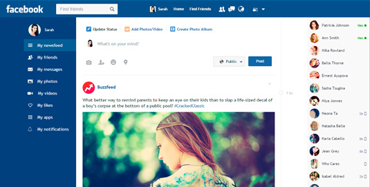
The goal was to modernize Facebook, and today flat design — or more accurately 'flat 2.0' — looks the part. As the free guide Web Design Trends 2015 & 2016 by the prototyping tool UXPin explains, flat design suits the current web landscape for several reasons, practical and aesthetic.
Flat gives an edge in performance. Its simple graphics make loading time a breeze on mobile and desktop, especially compared to its more visually complex competition.
This faster loading time combines with another advantage of flat design, its ease in adjusting for different screen sizes, to make the design style incredibly responsive-friendly. Ever since mobile users started outnumbering desktop users, flat design has been gaining momentum for its device-agnostic experience.
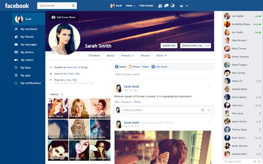
Finally, flat design can reduce the complex content of Facebook into a basic, easy-to-understand layout.
Get the Creative Bloq Newsletter
Daily design news, reviews, how-tos and more, as picked by the editors.
With a site like Facebook, there's a lot happening on the screen, so flat design seems the obvious choice for organizing this content in a way that doesn't seem overwhelming. Not just an aesthetic choice, flat design allows users to interpret the data and find what they need quicker, increasing usability.
Not that the aesthetics are negligible – we know that the better a product looks, the better users will perceive that it works.
You need look no further than Apple for support of flat design. They abandoned their trademark skeuomorphism for the flat-inspired appearance of the latest versions of iOS.
Updating Facebook's design
As I mentioned above, one of the big issues with Facebook's UI is excessive content, all competing with each other. When I examined the site critically, it seemed a lot of that content was unnecessary, at least to be ever-present on the page.
In order to find the one item you're looking for, you need to scan a sea of similar items, in a 'Where's Waldo' type fashion, which can be frustrating for accessing your own content. The more options the user has to search through, the more cognitive load is created, which only adds lag to the UX. Their navigation system is shaggy and in-need of a trim.
Sure a lot of that content – timeline, photos, games, etc – is relevant. But on the other hand, a lot of it isn't. But how do you redesign an interface to please all users of one of the most diverse audience of users on the internet?
01. The illusion of invisibility
When designing a new interface, you must consider the motivations of the user right alongside any financial interests. A popular, but dangerous, train of thought is that for a company to be noticed, they must draw attention to itself and it's great new features. But the user tends to prefer just the opposite.
The most useful UIs are the ones that you forget are there. Like an invisible hand, they guide the user in completely their goals as easily as possible. This 'Slippy UX' is designed around the user solving their problems. With no distractions, the user is free to concentrate on the task at hand.
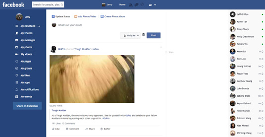
Every time you consider adding new elements to your UI, ask yourself, does the user really need it?
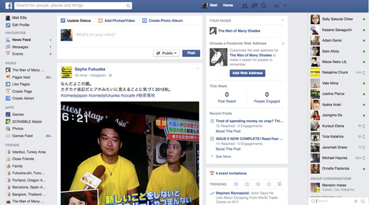
For Facebook, the user's main goals are about finding the content they care about most. To facilitate this, I removed the right-side stats listings like 'Recent posts' and 'Trending': these are secondary functions that distract from the primary one. As a result, the new interface makes it easier for users to sift through their feed to find what they care about.
02. Updated labels
One of the most confusing aspects of Facebook has always been the left menu. For some reason, the elements are listed so incomprehensibly. Just compare the UI in 2004 and 2015:
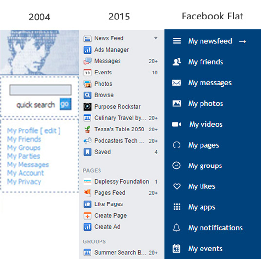
The original design was actually an improvement on the current one, though they didn't have as much to worry about. In order the manage the current Facebook's content load, I needed a more efficient label system.
I simply took what worked about the original menu – including the 'my this, my that' format, which adds a nice personal touch – and expanded it to cover the additions from the las decade. Facebook Flat's labels are logical, self-evident, and consistent.
03. Reducing page-to-page friction
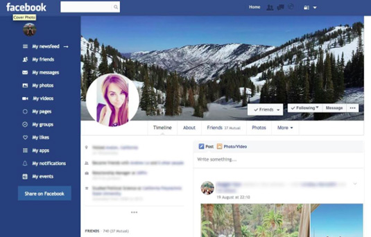
Good designs reduce the amount of clicking (friction) to a minimum. In Facebook now, leaving the main page makes the menu disappear, forcing the user into extra clicks. The solution was a simple 'sticky' menu that never leaves – even on your own profile page.
04. Streamlining the typeface
When it comes to typography, form is function. As Web Design Trends 2015 & 2016 explains: "Flat typography encourages designers to think more carefully about every type selection. Even serif typefaces have evolved with simpler letterforms becoming the norm, allowing the content itself to shine through."
For a site that relies so much on textual content, Facebook's current Helvetica typography is thin and unassuming. In its current busy interface, this pushes the text even deeper into the background, but anything stronger would be just another element competing for user attention.
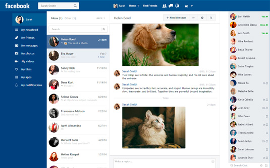
Facebook Flat's simplified interface, however, opened up a lot of doors for typography with the freedom to be seen. I chose Trebuchet for my typeface because it's legible but still friendly, and the curvature helps populate the space.
Maybe it's not as sleek or sexy as some of today's more popular flat typefaces, but that's not what Facebook needs. A social network typeface needs to be clear and inviting to users. As is the case with all design, it's not about the best choice – it's about the right choice.
05. Bold strokes of colour
Colours are no longer just decoration – they create an instantly understood emotional language. Any successful update to Facebook would require a new coat of paint.
In the content-focused design philosophy, less gradients leads to less visual noise, another way to make navigation and searches easier for the user. Continuing the overall simplification, I used CSS styles to completely flatten the colour palette.

No bevels, no shadows, and no gradients. For backgrounds and menus, bold and bright colours create a natural contrast, drawing the viewer towards the content and navigation.
06. Embracing white space
Often underrated, white space impacts the visuals of a site just as much as colour or typography. And because white space improves comprehension, it was the perfect medicine for a site like Facebook that suffers from overcrowding.
By increasing the white space around every element – menus, buttons, blocks with posts, private messages etc – the content became more scannable and legible, heightening the UX.

There was another concern with this, though: to keep up with constantly increasing resolutions, I had to stretch each content card to get rid of the awkward extra space. Luckily, without the right-hand stats column, there was plenty of room to play around with.
Final considerations
The current structure of Facebook's design isn't the problem, only its presentation. Unlike some more radical redesigns (like this Windows-inspired reimagining), I didn't want to alter the interface in such a way that users would need to relearn Facebook entirely. Such a drastic change on such a popular system risks business suicide, no matter how beautiful the new visual design might look.
The MAYA principle (Most Advanced Yet Acceptable) comes to mind here. The redesign needed to be better, but also familiar.
With the Facebook Flat chrome extension, my goal was to return Facebook to a more content-focused (and therefore user-focused) design by applying the usability principles of flat design. Aesthetic improvements like crisp typography, clear contrast, and a minimalist elements all contributed to a more lightweight interface with faster loading, searching, and navigation.
Considering the vast amount of content Facebook must support, the best design really is no design at all.
Going further
For a deeper analysis on recent design techniques like flat design, modern typography, white space, colours, and more, I recommend checking out Web UI Design Trends 2015 & 2016.
This helpful reference guide describes the best practices for 10 techniques, with examples from 166 successful sites.
Words: Rof Tentik
Rof Tentik is a developer and UI designer who created the Facebook Flat Chrome extension.
Liked this? Read these!

Thank you for reading 5 articles this month* Join now for unlimited access
Enjoy your first month for just £1 / $1 / €1
*Read 5 free articles per month without a subscription

Join now for unlimited access
Try first month for just £1 / $1 / €1

The Creative Bloq team is made up of a group of design fans, and has changed and evolved since Creative Bloq began back in 2012. The current website team consists of eight full-time members of staff: Editor Georgia Coggan, Deputy Editor Rosie Hilder, Ecommerce Editor Beren Neale, Senior News Editor Daniel Piper, Editor, Digital Art and 3D Ian Dean, Tech Reviews Editor Erlingur Einarsson, Ecommerce Writer Beth Nicholls and Staff Writer Natalie Fear, as well as a roster of freelancers from around the world. The ImagineFX magazine team also pitch in, ensuring that content from leading digital art publication ImagineFX is represented on Creative Bloq.
