20 tips for faster and cleaner mockups
Steven Snell offers practical tips based on his own experience as a web designer and blogger.
11. Photoshop layer comps
Designers using Photoshop should be familiar with the layer comp panel. Its sole purpose is to save various "snapshots" of a PSD file where certain groups/layers are hidden or visible. This allows a designer to display multi-page mockups in a single PSD file.
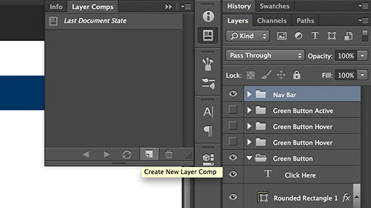
The idea is to maintain as few separate files as possible to keep organization clear. Unfortunately Sketch doesn't have anything similar in the way of layer comps, although artboards are a current working alternative.
12. Try limiting the number of elements
The difference between lo-fi and hi-fi wireframing is in the detail. But either of these methods can still function with a minimalist strategy.
When first starting a new design, try to limit the number of elements down to a minimum. Remember that users care most about your content, so your interface should feel invisible as possible.Focus solely on which elements are necessary to the user experience and how they interact with each other.
As recommended in The Guide to Interactive Wireframing, try the following process for a more user-focused design that prioritizes content:
- Create a content inventory of everything you need to include on the page
- Assign priorities for an outline of your visual hierarchy
- Start by drawing “blocks” that represent each category content
- Subtract your blocks until the design breaks, then slowly add them based on the priorities
- With each iteration, sculpt your design until the blocks start resembling interface objects
13. Find your software and stick with It
The two most prominent mockup design programs are Adobe's Photoshop and Bohemian Coding's Sketch (OS X only). This battle has been raging between designers in debate over which is the best choice for industry standards.
From my perspective, the best choice is the one you feel most comfortable using. Sketch has many best practices which deviate from Photoshop, yet they can both get the job done. So give them both a test to see how they function, but ultimately it's worth choosing one program and sticking to it.
Learn the GUI, find your routine, and master keyboard shortcuts to seriously improve your mockup design velocity.
14. Mobile-first UI design
Responsive mobile-first design is more of a creative strategy than a direct mockup technique, but this strategy can be directly applied to mockup design work. Considering today's web design landscape, reading up on responsive design is mandatory for any designer.
The mobile first concept asserts that it's easier to start with a slimmed-down design focusing only on the required elements. This way you can build up to larger screen sizes and include the "extra" elements only when they'd fit into a visitor's larger viewport. In doing so, you create a much more consistent experience that doesn't strip everything down for mobile users.
Read up on mobile-first design and see if this strategy could work for you.
15. Version control
Almost every professional developer knows about version control management, yet it seems very few designers are interested in Git for design projects. Raw Git management can be tough to set up, but thankfully there are alternatives like Pixelapse.
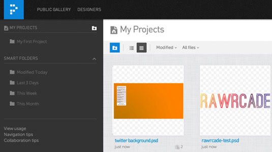
The benefits include large file management and control over changes/versions with easy access to revert back to previous save states. Much cleaner than renaming your files v1.psd, v2.psd, etc.
16. Clean file management
When you're working in a team, it's vital to maintain consistent file management. You can better manage files with an intranet but also with a cloud-based application like Dropbox.
On the other hand, a freelancer or single designer may not find file syncing to be as important. Nonetheless, you still want to maintain a clean folder structure so you're able to find the most recent assets and mockup files with ease.
17. Solve your own problems
In this era of information overload, it's easy to get lost in the shuffle. But it's also just as easy to find exact answers to your questions with a little online sleuthing.
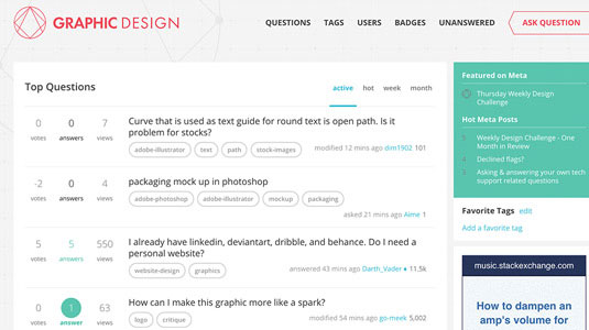
Google has a treasure trove of information if you know which keywords to hit. But not every question has been answered online, so you'll often have to reach out and ask for help.
Thankfully there are many great resources to help with all types of design-related questions.
18. Streamline constructive feedback
While it does take time to gather feedback, that feedback can sometimes offer invaluable bits of insight. When working on a project for weeks or months, you tend to become desensitized.
If possible, try to get some eyes on your work from people outside your team before finalizing the design. Ask other colleagues if they see anything that looks out of place or anything that could be improved, functionally or otherwise.

Once you've gathered feedback, don't forget to iterate any mockup into a prototype to test with real users. You'll find that usability testing is the proving grounds for any design, serving as the strongest evidence for or against design decisions.
19. Preview designs on live devices
Live previews can offer a more realistic view of how your work will function once it's been coded. You can either export full images or use something like Skala Preview to test on a wide range of devices.
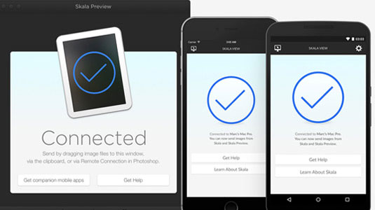
I wouldn't call this a mandatory process, but there is a lot to glean from seeing how your design would look in a real-world situation.
20. Study professional work
Clients and employers primarily hire based on quality of work. A great personality and some intellectual competence are both good traits, but if you have skill, you're on the right track.
The best way to improve your mockup workflow is to study and replicate techniques beyond your current skillset. Study work from other designers, and try reverse-engineering their creations.
Dribbble search is a great place to start with so much quality work being posted every day. Other favorite galleries include:
Additionally, I've found these free e-books to be great sources of inspiration and instruction for web design:
That being said, the only tried-and-true method for building faster & cleaner mockups is practice. But you only get out what you put in, so you'll want to be doing the right kind of practice to glean the greatest results. These 20 tips should put you on the right path, so the only other advice I could offer is practice, practice, practice!
Words: Steven Snell
Steven Snell is a web designer and blogger. In addition to maintaining his own blog and writing for a number of other top design blogs like Smashing Magazine, he also manages an online shop offering premium graphic design resources.
Liked this? Read these!

Thank you for reading 5 articles this month* Join now for unlimited access
Enjoy your first month for just £1 / $1 / €1
*Read 5 free articles per month without a subscription

Join now for unlimited access
Try first month for just £1 / $1 / €1
Get the Creative Bloq Newsletter
Daily design news, reviews, how-tos and more, as picked by the editors.
The Creative Bloq team is made up of a group of design fans, and has changed and evolved since Creative Bloq began back in 2012. The current website team consists of eight full-time members of staff: Editor Georgia Coggan, Deputy Editor Rosie Hilder, Ecommerce Editor Beren Neale, Senior News Editor Daniel Piper, Editor, Digital Art and 3D Ian Dean, Tech Reviews Editor Erlingur Einarsson, Ecommerce Writer Beth Nicholls and Staff Writer Natalie Fear, as well as a roster of freelancers from around the world. The ImagineFX magazine team also pitch in, ensuring that content from leading digital art publication ImagineFX is represented on Creative Bloq.
