Discover how to design fantastic ecommerce product lists
Christian Holst shares some insights to get your users on the right path to finding the product they’re looking for.
Without the right tools, finding just the right product on an ecommerce site can be an almost impossible task for the user. Product lists and their filtering and sorting tools determine how easy it is for users to browse the potentially thousands of products in categories and search results.
At Baymard Institute we've spent the past nine months conducting a large-scale study of how users browse, filter and evaluate products in ecommerce search- and category-based product lists. This has led to a number of usability findings on how to design high-performing product lists, and a benchmark database with more than 4,500 data points on ecommerce product list performance.
During the test sessions, the sites with mediocre product list usability saw abandonment rates of 67-90 per cent, while sites with even a slightly optimised toolset saw just 17-33 per cent abandonments for the very same product-finding tasks. In this article we'll take a closer look at some of the study's key findings.
Promote the most important filters
Some categories have certain filters that are highly important and beneficial for the user to consider. However, simply displaying these as traditional filters in a filtering sidebar runs the risk of users either overlooking these options or not understanding the importance of making the selection.
While testing the ecommerce sites, we generally saw that users would approach categories as something the site was encouraging them to select, whereas the traditional filtering options in the sidebar were perceived as purely optional choices by most users.
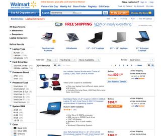
Most sites have a number of categories that need to promote certain filters or filter combinations. For example, if a user navigates to a 'Digital Cameras' category, 'Camera type' would be a highly important filter to consider, with filtering values such as 'Point & shoot' , 'DSLR' , 'Mirrorless' and 'Bridge'.
As promoted filters will encourage users to apply them, they should be used intelligently and sparingly, to avoid luring users into overly narrow filtered lists. For example, the technique shouldn't simply be used site-wide for whatever is the most popular filter in each category. In practice, this will often mean there needs to be a manual curation of which filters the vast majority of users will either have interest in or gain significant benefits from applying.
Get the Creative Bloq Newsletter
Daily design news, reviews, how-tos and more, as picked by the editors.
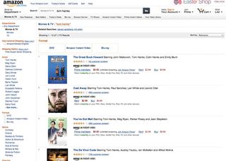
These promoted filters don't necessarily all need to be of the same type – they can simply be a combination of the most important product filters that users can make before spending further time investigating the actual product list. Finally, the filter promoted above the product list should still be kept in the filtering sidebar, to enable shoppers to use the sidebar in the conventional way if they wish.
Key takeaway
For select categories where an initial filter selection will be highly relevant and benefit the vast majority of users, consider promoting those few filtering values above the product list (for example, by using buttons, text links or thumbnails). Our benchmark of the 50 top grossing US ecommerce sites reveals that only 16 per cent of the sites currently utilise this highly effective technique.
Include complete ratings information
Product ratings can be incredibly helpful to users. During our research studies we've observed how the test subjects rely on ratings to gauge a product's quality or value – especially in verticals where they lack domain knowledge or have little prior product experience.
However, both our qualitative and quantitative research clearly show that if users are to be able to use product ratings this way, two key pieces of information must be present: the average rating score (obviously) and the number of ratings that average is based on.
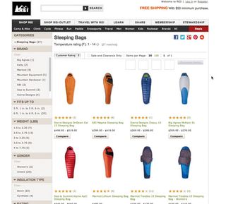
Unfortunately, some sites leave out the number of ratings in the product list and only display the rating average, much to the detriment of their users. When users don't know how many ratings an average is based on, they can't tell if a perfectly rated product has one single 5-star rating, or if the rating average is actually based on hundreds of reviews.
Our product list benchmark reveals that 68 per cent of sites display both the rating average and the number of ratings, 14 per cent neglect to display the number of ratings next to their rating averages, and 10 per cent don't show ratings in their product list at all, despite collecting them (the final 8 per cent don't collect user ratings in the first place).
Users often show greater disposition towards some products with 4.5-star averages than some with perfect 5-star ratings, due to the number of votes these averages are based on. For instance, most test subjects would select a sleeping bag with a 4.5-star rating average based on the average of 50 reviews, over other sleeping bags with a perfect 5-star rating that was only based on a few reviews. They simply didn't find the latter to be trustworthy enough.
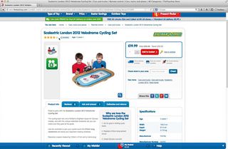
To further investigate the user rating bias, we tested three different rating averages against 2,250 people. The results showed that for two otherwise identical products, where one product has a 5-star average based on two ratings, and the other has a 4.5-star average based on 12 ratings, 62 per cent will pick the one with the higher number of ratings – despite its lower average.
The quantitative test also found this to be true with a higher number of ratings. When presented with a 5-star average based on four ratings against a 4.5-star average based on 57 ratings, 61 per cent would pick the option with the higher number of ratings and lower average (see here).
Key takeaway
A user rating average should always be followed by the number of ratings – especially considering the negligible amount of space it takes up. Without the number of ratings, users will be unable to determine whether they find the rating average trustworthy or not, and unable to gauge which products are actually to be considered the 'best rated'. In our study, 24 per cent of sites neglected to include this information.
Keep product specs out of the title
While simply making the title of each product a grab-bag of product name, type, brand, and other product specifications may be convenient for site owners when adding products, the usability testing showed that it sure isn't convenient for users – the test subjects had difficulties scanning product lists. However, 50 per cent of sites still include product attributes in the product title, impeding readability and making product comparison difficult.
When all these product specifications are mixed together rather than presented as separate entities, users will have to read the entire title and mentally break it down into its various components. They'll need to do this for each and every product in the product list.
In practice, the test subjects didn't bother, and instead scanned only five to 10 products (missing out on numerous relevant products) or briefly skimmed more products but without properly deconstructing their titles, consequently rejecting and investigating products based on inaccurate assumptions.
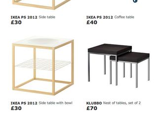
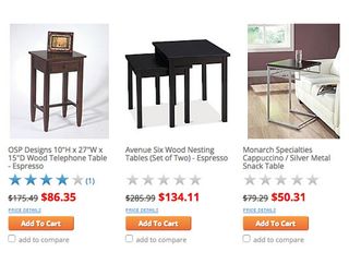
Note that when I say information should be listed as separate entities, this doesn't necessarily mean they need to be presented in separate columns or rows (which can take up additional screen real estate). If it is aesthetically desirable or if space efficiency is important, it is still possible to keep everything on a single line of text, as long as the product specifications are styled differently.
Key takeaway
In product lists, add vital product attributes as separate entities (i.e. with a separate style) rather than including them in the product title. This vastly improves how scannable the list is, and aids product comparison.
Truncate lists (the right way)
When displaying long lists of more than 10 filtering values, sites tend to either simply display all values in one long list, use an inline scrollable area, or truncate the additional values behind a 'show more' link. All three methods can cause severe usability issues. The two first performed the worst during testing, while the truncation method proved to be the better performing option.
However, the superior performance of truncation was only observed when the risk of users overlooking the truncation link was actively dealt with in the user interface – otherwise it runs the risk of some users assuming the truncated list represents be all the filter values available.
For a sufficiently clear truncation link, three design patterns in particular emerged during testing:
01. Don't truncate your list too soon
Display up to 10 filtering values before truncating the extras. Sites with fewer than six filtering values before truncating caused confusion about the necessity of the truncation. And if many more than 10 values were displayed, the subjects began to lose the overview of their options.
02. Prioritise based on popularity
The filtering values that aren't truncated should be listed in order of popularity, rather than alphabetically or by number of matches. Users will often scan the product list for filter value keywords – so, for example, they will scan a page of laptop chargers for 'Lenovo filter' rather than a filter type named 'Compatible with'. Consequently the un-truncated values should be those users are most likely to recognise when glancing at the page.
03. Differentiate your truncation link
The truncation link needs to be styled so it is clearly distinguished from the filtering values directly above it. Approaches that performed well included marking up truncation links using the site's default link styling (colour and/or underline), adding spatial indicators such as a '+' or an arrow icon, including the number of matches in the name of the link ('View 23 more'), not using the same indentation as the filtering values and visually fading the last value in the truncated list.
Key takeaway
Long lists of filtering values should be truncated rather than displaying all values or using inline scrollable areas. Display seven to 10 values before the truncation link, display the most popular values, and make the truncation link styling distinct.
Improve product lists
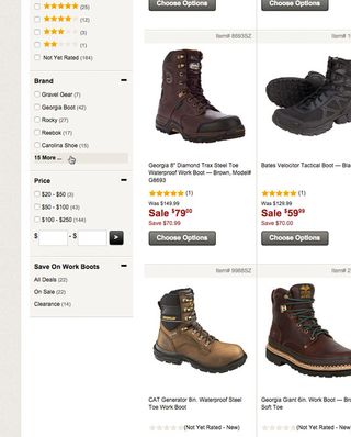
The study found that seemingly small details in the product list design can make users' product discovery up to four times more effective. However, the study also revealed the vast majority of sites have a lacklustre product list and filtering design, limiting their users' ability to evaluate the product selection.
When designing product lists and filtering, employing techniques such as promoting relevant filtering values, including the number of ratings alongside the ratings average, keeping product attributes separate and truncating long filter lists (with care!) can make a huge difference. Help your users find the product they're looking for easily by paying attention to these details.
Words: Christian Holst
Christian is the co-founder of Baymard Institute, where he conducts large-scale usability studies of leading ecommerce sites, and consults for several Fortune 500 companies. This article originally appeared in issue 269 of net magazine.
Liked this? Read these!
- 5 essential ecommerce upsells for web designers
- How to build an app: try these great tutorials
- Free graphic design software available to you right now!

Thank you for reading 5 articles this month* Join now for unlimited access
Enjoy your first month for just £1 / $1 / €1
*Read 5 free articles per month without a subscription

Join now for unlimited access
Try first month for just £1 / $1 / €1
The Creative Bloq team is made up of a group of design fans, and has changed and evolved since Creative Bloq began back in 2012. The current website team consists of eight full-time members of staff: Editor Georgia Coggan, Deputy Editor Rosie Hilder, Ecommerce Editor Beren Neale, Senior News Editor Daniel Piper, Editor, Digital Art and 3D Ian Dean, Tech Reviews Editor Erlingur Einarsson, Ecommerce Writer Beth Nicholls and Staff Writer Natalie Fear, as well as a roster of freelancers from around the world. The ImagineFX magazine team also pitch in, ensuring that content from leading digital art publication ImagineFX is represented on Creative Bloq.
