17 top email newsletters
These brands have all crafted awesome email newsletters you'll actually want to read.
When it comes to getting a product out there or building awareness for your brand identity, a carefully crafted, well-designed newsletter can be invaluable. Here are some brands that managed to create email newsletter designs that don’t have recipients searching for the unsubscribe button.
If you fancy creating your own newsletter, don't miss our post on newsletter templates.
01. Beardbrand
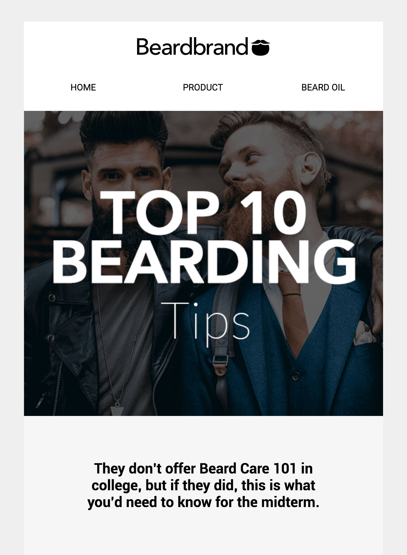
Beardbrand is a US-based company that sells beard grooming products. But more than that, it aims to change the way society views 'beardsmen' (according to its mission statement). The brand's newsletter fully embraces this commitment, with imaginative newsletters that offer beard care advice and community news as well as promoting its products. It also strikes a great balance between humour and professionalism.
02. Startup Framework
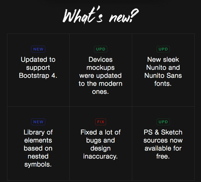
Startup Framework is a tool that gives startups a platform to easily build their first site. Emails detailing product updates can easily become dry or uninspiring – especially when the product is quite technical. So kudos to Startup Framework for putting in a bit of legwork to create an engaging, image-led design, and taking the time to edit the information into bitesize, easy to scan chunks. There's also a clear CTA for people whose interest has been piqued.
03. Warby Parker
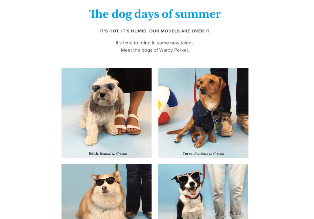
Warby Parker is known for its sunglasses. Like any fashion retailer, its newsletter design focuses on photography, showing models sporting fashionable eyewear. However, in this instance, Warby subverts this trend by introducing a new type of model. The newsletter deliberately uses the company’s typical framework – a templated two-column grid – in order to play off users’ expectations and cause a double take, a good-natured chuckle, and guaranteed deeper engagement.
We’d be curious to hear whether the ‘See more dogs’ button got more clicks than ‘See more sunglasses’. We found the former puzzling and intriguing in all the right ways. And if you’re thinking it’s a distraction from the main CTA (i.e. BUY STUFF), think again: it links to the @WarbyBarker Instagram account, run by Warby Parker, which is genius way to show up in your feed twice as often.
04. Harry’s Five O’Clock News
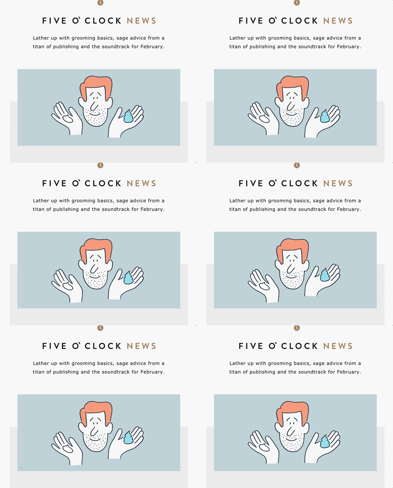
Harry's, one of several – ahem – cheeky shaving companies you've probably heard of, here with a digest from its blog: The Five O'Clock. The GIF game is simple and strong, and not just in the eye-catching hero image. The sound wave animation in the playlist section is a nice, subtle bit of attention to detail that keeps readers engaged with every little part of this email newsletter.
Get the Creative Bloq Newsletter
Daily design news, reviews, how-tos and more, as picked by the editors.
Mobile collapses this to a single-column layout while managing to preserve some of the depth of field via the interplay of images over offset grey backgrounds.
05. Uber
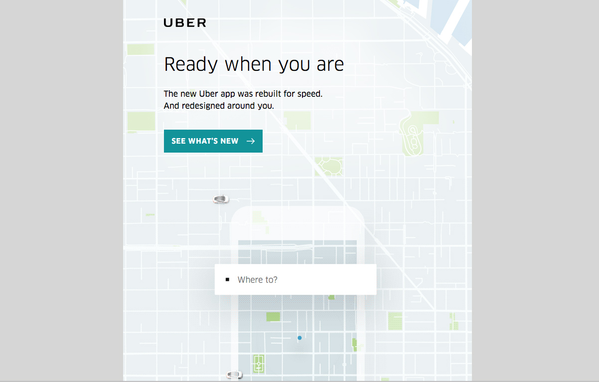
Uber has long stood out for having a versatile set of consistent base templates for emails heading to both customers and drivers. That doesn’t mean it isn’t taking exciting chances – for example with this fantastic app announcement campaign. Pretty much everything in the design is a GIF, but they’re all so seamlessly integrated, it feels like magic.
Everything in this email is geared toward showing off new features and giving a preview of how the Uber app looks, functions and feels. The use of brand web fonts makes the email feel consistent with the app and web experience, all of which helps build familiarity and comfort with the changes that have been made, before you’ve even tried the app.
Naturally, it all looks just as good on mobile, and there’s some really good CSS wizardry that changes the CTA button to a link to open the app (you know, since you’re already on your phone). A super-smart application of responsive email design.
06. The Beat by Premium Beat
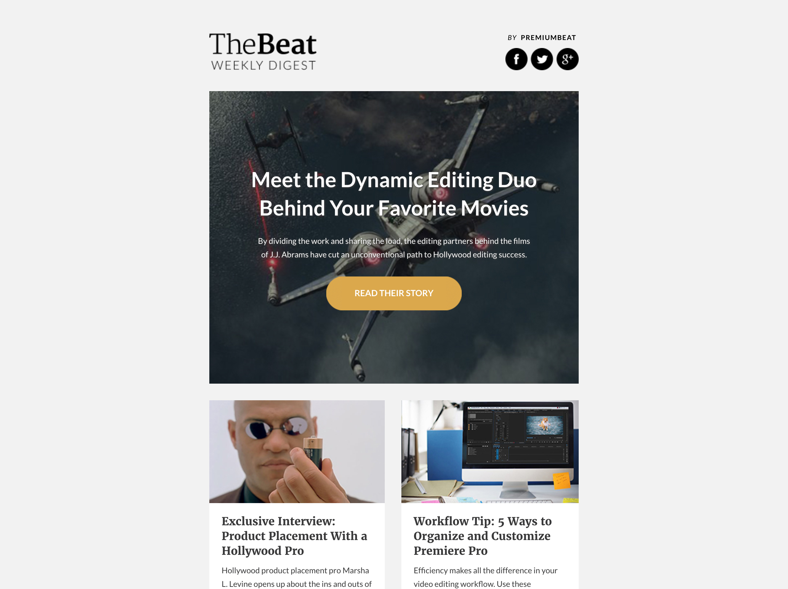
Right off the bat, let’s talk about that killer hero image. Not the image itself but the excellent HTML typography and the real button superimposed on that image. We’ll take this over image-based text any day of the week.
It allows so much more control over how your email comes across in different contexts. All of that copy adapts nicely in the mobile-responsive view, and even if a subscriber has their images turned off, the layout and typography still preserve some semblance of dignity.
The sections in this email feel really neatly ordered and separated, and the content mix is diverse and well-targeted to individuals who are familiar with the web experience.
07. Duolingo
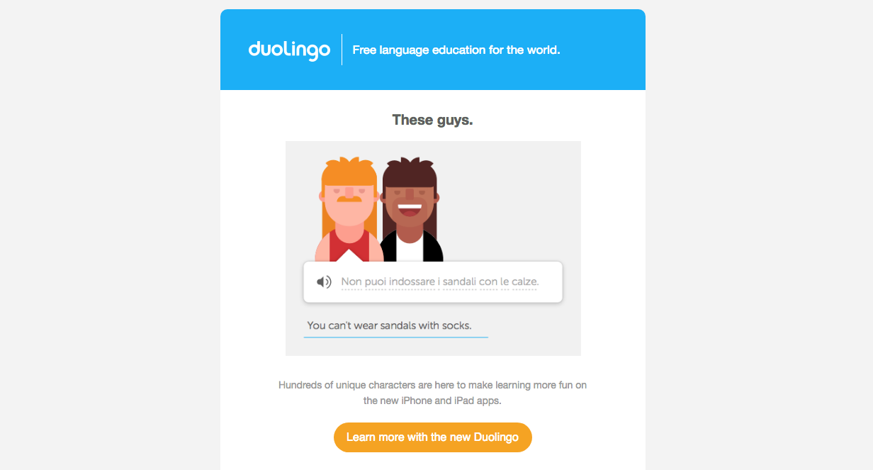
These guys... are we right? We love the way this email communicates that learning a foreign language can actually be really fun. This email announces the new Duolingo mobile app, and the hero image gives you a quick snapshot into how the app looks and feels, demystifying how the whole thing might work for any subscribers who have a hard time visualising themselves using it.
‘Click a flag to start learning’ feels so easy, and while the grid of language options feels aspirational without being overwhelming; the real message here is that whatever language you’re interested in, Duolingo’s got it.
08. Airbnb
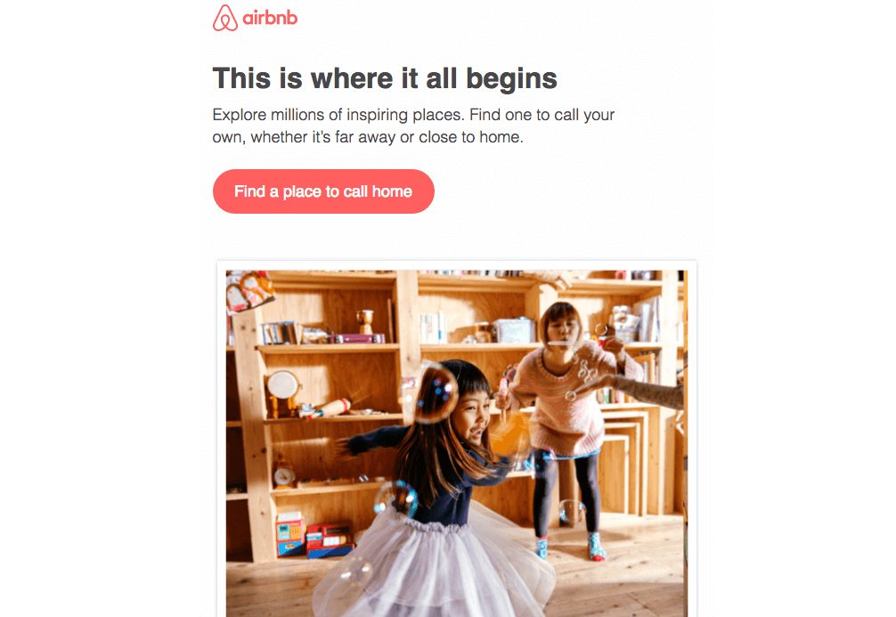
Airbnb has over 70 million users across hundreds of devices. At that size you can’t afford to push wild new code to your whole audience. What you can do is push the boundaries of the existing technology to see what gets users engaged.
“How do you tell your story when you have five seconds of attention? That’s the idea behind this email,” says Lucas Chevillard, engagement marketing manager. “We believe that Airbnb can bring you on a great journey no matter how far you travel – and we have the right place for every guest.” This email was also the first to use Airbnb’s unique Design Language System.
Search bars in email aren’t currently mainstream tech, though some experimentation with forms in email is happening. In this email, it’s just an image that links to the search page. Airbnb has one tiny toe in a dark pattern with this bit of trickery not being quite what it says it is, but we give it the green flag because ultimately it gets the customer moving right where they intend.
Bonus fun fact: the picture of the family playing is a host that Chevillard stayed with in Tokyo.
09. Trello

If you know Trello, then you know its emails (and the blog they link to) are all about improving teams on and off its task boards. There’s some great visual narrative tie-in going on between the building block dividers and the consistently whimsical porthole illustrations accompanying each piece of content.
The descriptions of each piece are succinct and enticing – they're easy to scan, with just enough information to let you know if you’re going to be interested in one of the posts. It’s like window shopping for great content.
10. MailChimp

Everybody’s favourite podcast commercial – we mean email service – really nails this long read. There’s a strong correlation between the value of the content you’re providing readers and the time they’ll be willing to invest, and this email has everything a long read needs to in order to pass that test.
The header offers a clear value proposition (you’ll learn some stuff about how to take your copy game to the next level – sounds valuable!), it’s highly scannable so folks on the go can still get a sense of whether the piece is for them, and the layout is simple and familiar – super familiar if you read MailChimp’s blog – which gets out of the way of the content.
11. Nest
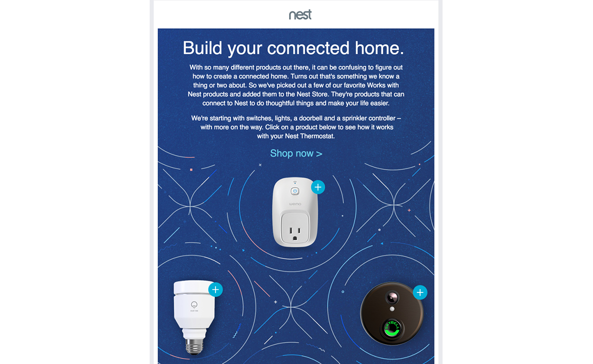
Nest is something of a thought leader in Wi-Fi-enabled home gadgetry, and this email is no less forward-thinking. Like a siren of the sea, the pulsing beacons around the featured products are powerful enough to entice you to click on them, but subtle enough not to go overboard.
Click on one and instead of directing you to a specific landing page, information about the product pops up in the email itself. This is particularly useful when trying to engage customers with multiple products.
“The first draft of this email featured a card in the middle of the screen, which explained how to interact with the email, but it was not intuitive enough,” says Eric Lepetit, email engineering manager. “Ultimately, I found some inspiration in a Bobbi Brown email coded by Rebelmail, and used the pulsing buttons instead.” There’s also a 1x static fallback version in the code that deploys to email clients like Outlook that can’t handle the tech.
In the mobile version of the email, those pulsing ‘+’s turn into grey pulsing ‘x’s to close/fold the card. It isn’t a new button, but the same asset repositioned and rotated with CSS3. “It saves a lot of extra code to achieve that closing functionality, compared to using a new asset and additional checkboxes,” adds Lepetit.
12. Recurly
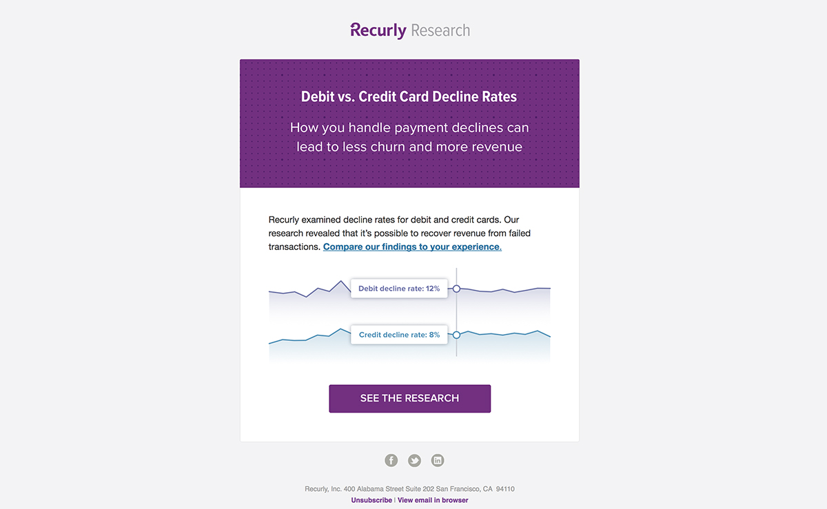
Whereas MailChimp’s long read newsletter seeks to provide users with a full piece of content in the email, Recurly hopes to whet the appetite for a full article on its website with one simple pull-stat, prominently rendered and engagingly visualised.
But the real secret weapon in this email is the word ‘you’. Recurly offers solutions for handling automatic subscription payments, so while you might have yawned when you scanned this one, its customers probably care quite a lot about reducing churn. Placing the subscriber's business at the centre of the significance helps this research feel like actionable data worth digging into deeper.
The interactive research report that the CTA takes you to is full of similarly digestible, meaningful big-picture data, which is key. You gotta follow an email like this with the goods!
13. InVision
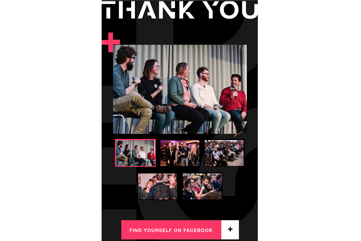
For this post-event email following the glitter bomb-inspired invitation in the link above, instead of a plain text message with a link to a photo album, InVision took a chance to showcase some of the progressive enchantments of email development.
InVision breaks open the whole toolbox here, with an interactive carousel module, CSS animations, Google web fonts and hover effects. The degree of functionality in the email alone made us forget for a second that we weren’t simply clicking around a really beautiful landing page. That’s the kind of design delight we’re junkies for.
All other bells and whistles aside, it’s the smart carousel execution that really makes the campaign stand out. It’s a great example of cool tech put toward the concrete goal of customer engagement (‘Oooh, I wonder if I made it into any of these photos?!’), encouraging some solid social sharing if you were at the event, and some serious FOMO reactions if you weren’t.
14. The Gig List
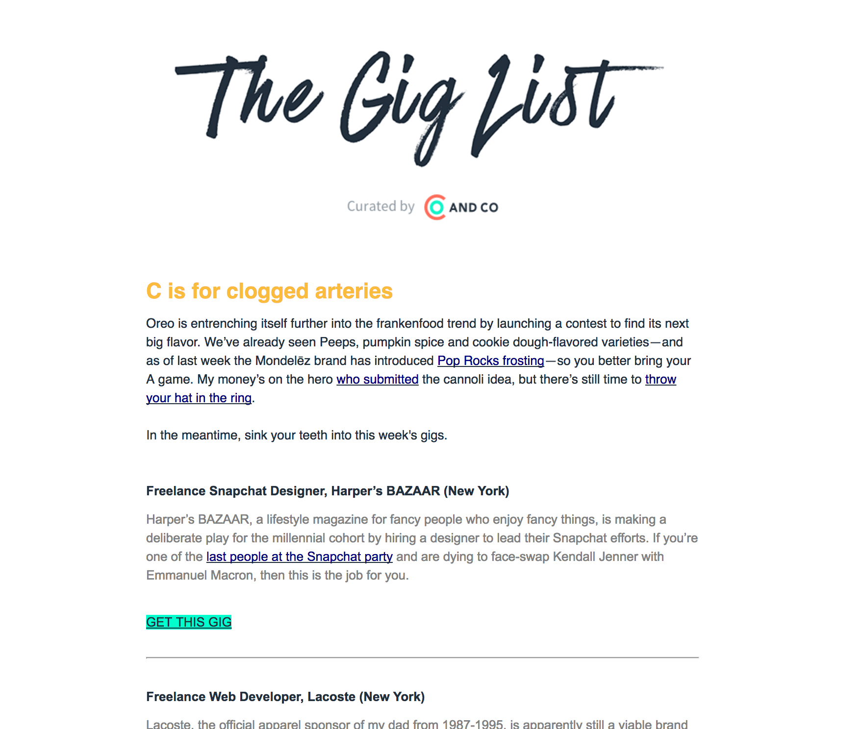
And Co offers tools for freelancers, and The Gig List is its weekly email of freelance opportunities from around the web. The tone is superbly snarky, poking some good-natured fun at pretty much every company and job posting listed, and at you for maybe fitting any one of these roles. The approach is carefully pitched, though, and never tips over the line.
We love the simplicity of the nearly all rich-text format, which keeps the content safe across pretty much any email client, and makes for a quick scan. There’s always a little pitch for And Co nestled into the list somewhere, which is well earned after curating such a carefully targeted email, and unlikely to annoy, especially if you’re reading this email for the jokes (a totally valid reason to do anything!).
15. Spotify
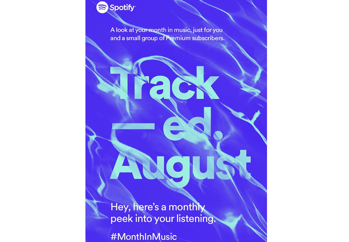
Looking for a new way to connect with customers at the end of the year, many companies showcase what was achieved in the past 12 months. These recap digest emails are a good way to show usage and growth, but recently Spotify took this concept a step further by focusing on the individual’s personal listening stats, tying them specifically to how they have used the service in the past month and reminding them of good tunes.
“Deeply personalised monthly summary emails are a huge trend. Tons of customers are getting these emails, but Spotify’s personalisation makes it feel like it’s one-to-one,” notes Chad White, research director at email analytics firm Litmus.
This beautiful email is the perfect excuse to pop up in a customer’s inbox 12 times a year. The no-fuss, text-first newsletter design is colourful, inviting and relevant. It’s a good bet you’re going to have an ‘Oh yeah – that song!’ moment while scanning this email, and click through for a quick listen.
16. Sprout Social
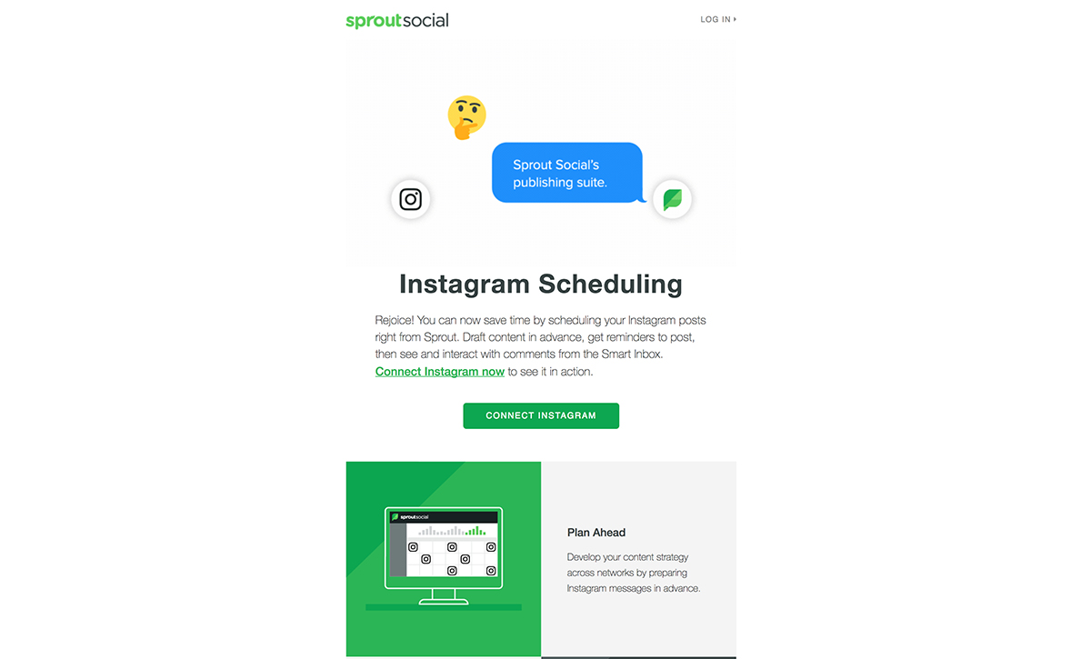
The Sprout Social email newsletter design features a long animated GIF at the top. This used to be a bit of a gamble in emails for the simple fact of load time, and while that might affect some, Sprout Social’s demographic of social media wizards probably have good enough internet hookup.
We love the long GIF, as it offers a chance to tell a visual story right at the top of an email, and this little flirt session between Instagram and Sprout’s new scheduling engine is pitch-perfect.
This email is cleverly prepared to target a couple different potential responses to this new feature: the CTA button is strategically placed before the tutorial for the subscribers who are already stoked about this new feature and are ready to start messing around with it.
For subscribers needing a bit more explanation before they jump in, the tutorial’s alternating two-column layout provides a visually pleasing and easy-to-follow walkthrough.
17. Casper
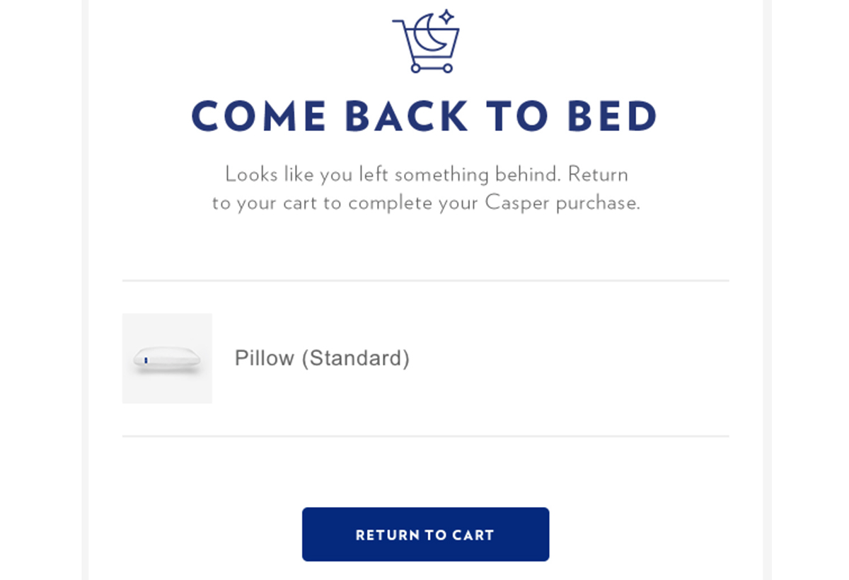
Cart abandonment emails are becoming a necessity for e-commerce. With more sales happening online, it’s important for retail brands to capture potential sales. A timely triggered email with personalised imagery and messaging can lead to high CTRs and conversions.
This campaign from Casper is doing everything right. Clean design, killer icon, clever copy (as in ‘wish I’d thought of it’ levels of awesome), and actionable CTAs. There are two buttons: one for returning to the cart, and one for reading reviews. Priority one, of course, is getting the customer back to the cart to check out.
Customers abandon carts for a variety of reasons, and this first button is aimed at customers who maybe just got distracted and only need a little nudge to go back to finish what they started. These folks are most likely to convert, so their pitch comes first.
Then there are the folks who got cold feet about their purchase and deliberately chose to, well, sleep on it. Cue the reviews, which might be just the ticket to rekindle your excitement about that pillow.
Liked this? Then read these:

Thank you for reading 5 articles this month* Join now for unlimited access
Enjoy your first month for just £1 / $1 / €1
*Read 5 free articles per month without a subscription

Join now for unlimited access
Try first month for just £1 / $1 / €1
