Inspiring ecommerce website designs in 2019
These awesome ecommerce website designs prove buying can be beautiful.
Ecommerce website design is big business, and as more brands shift their focus away from the high street and onto the internet, the pressure is on to stand out with your site. As a result, we're seeing some impressively innovative, immersive and beautiful ecommerce website designs appearing (to create your own use a top website builder, and get your web hosting right). These sites don't just provide somewhere to buy a product, they offer a complete brand experience.
Read on for our pick of the best ecommerce website designs – these are the sites that make online shopping a joy.
For more inspiration, explore our roundups of the best-in-class WordPress websites, and beautifully minimalist site designs.
01. Leader Bag Co
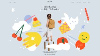
Lest we forget sometimes, ‘nice’ and ‘comfortable’ can, when done well enough, actually be very effective in web design. It’s also not a bad trait to look for in backpacks and satchels either, which segues seamlessly into the charm of Leader Bag Co.
This Shopify-powered ecommerce website design provides a lovely reminder that the virtues of clean simplicity aren’t a lost art, while adding just enough dynamism and quirkiness to excite. It also communicates brand messages of practicality and child-friendly appeal by applying Lotta Nieminen’s playful illustrations to brochure photography. Got a lot of media? Store it in the best cloud storage.
Very subtle dashes of parallax scrolling add enough motion to the clusters of colour, contrasting well against the template’s largely white and grey palette. Rollover tiles, badges and buttons offer links through to large, beautifully shot products that do a top job of putting each bag into big or littler hands. A zoom feature offers enough resolution to examine weave-level detail, while chunky UI controls make adding selections to the cart thoughtfully painless.
While the site is entirely framed by such Leader Bag ‘values’ of love, kindness and wisdom, the latter becomes truly apparent thanks to its consistent smartphone and tablet experience. Developer PRAESENS has acknowledged that “buying but busy” is a thing for millennial mothers and bagged a blinder in the process.
02. Adidas Futurecraft.Loop
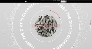
Being aware of plastic waste and the implications for our environment is critical, with change dependent on two drivers. It either needs to be commercially lucrative or so trendy that it becomes, erm, commercially lucrative. This Adidas site hopes to leap both hurdles and spread awareness of its Futurecraft.Loop initiative by showcasing the eco-friendly shoe.
Constructed to be 100 per cent recyclable and using thermoplastic polyurethane, the trainers are rendered here in browser-busting 3D. Hovering and rotating in virtual space, the 360-degree product tour offers hotspots detailing each innovation. Infinite scroll and circular animations communicate the ‘loop’ metaphor, while literally framing the recycling process perfectly. Here we get a clickable element illustrating how the shoes are cleaned, ground up, melted and reformed.
Dab hands at GLSL, the shading work never feels gratuitous. This extends to a mighty impressive mobile version, which is lightweight to deliver an experience consistent enough to reach everyone.
03. Edie Parker Flower
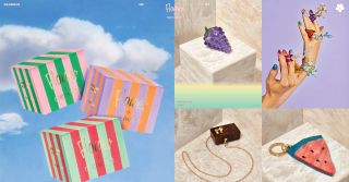
When it comes to fashion in web design, big fonts, small fonts or monochrome palettes will perhaps hit the popular style charts – all proving great aesthetic choices for frontend elegance. This is something Flower by Edie Parker – the fashion label’s new ecommerce site design for smoking accessories – exhibits in spades.
The technical execution is straightforward enough but it looks gorgeous. Much of the credit goes to how the featured products are photographed identically on marble plinths. But the tightly packed arrangement within rollover grids is already a feast, even before the splashes of enthusiastic colour work.
Developed by Richmond agency Camp Quiet, the designers have produced a sparkling Shopify theme that adds some neat CSS highlights for extra pop. Notably the use of powdery linear-gradient backgrounds applied to <div> layers provides an effective thematic touch that fits the vibe and ties everything together.
04. POGG
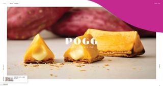
POGG, from Bake Inc, is a sweet potato pie brand operating out of three snack kiosks in Tokyo, selling triangular treats and ice cream. Quite simply, the product looks delicious and this site does a sumptuous job of conveying a real sense of texture. A clean white template is cut through by POGG’s palette of pinks, creams and golds, beautifully complementing a stack of food hero shots to drool for.
Designed by Kenichi Tanaka at the Super Crowds Inc agency from Tokyo, the front end engineering work is also credited to Miki Sumino and Yuma Iwakata. The trio profess to combine “contradictory values” to juxtapose a tangible magazine-like structure with softer interactive touches, contrasting the static with the dynamic. Sackers Gothic and Noto Sans CJK fonts provide a fitting style for header and paragraph copy, while YouTube video clips nestle seamlessly within a floating fluid grid oozing with creamy class.
05. Unleash the Beast
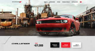
Anyone old enough to have a fondness for 1980s television will doubtless recall The Dukes of Hazzard. It followed the madcap exploits of the Duke brothers and their customised ‘General Lee’ that made a generation fall in love with the Dodge Charger. Fast-forward 40 years and Dodge is still going strong, with modern models of its iconic Charger and Challenger muscle cars available to nostalgic petrol heads.
Unleash the Beast is a Mexican brochure site from agency GrupoW that offers a digital tour of both cars. A brief intro sequence transitions to dark frontal shots of each, with headlight animations and ignition audio triggered on mouse rollover. Glitching text effects encourage visitors to swipe left or right, while selecting a car loads stylised video clips followed by an interactive tour.
Dragging the viewport swings the camera around the sleek bodywork to find clickable hotspots detailing core features and stats. Animation and roaring sound clips add bursts of immersion, while the looping electronica soundtrack makes Unleash The Beast a snarling multimedia blast best enjoyed with headphones.
06. Hi Fly
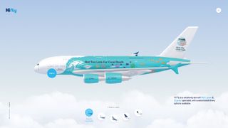
A ‘wet lease’ is a term within the aeronautical industry for a proxy service. So effectively one airline provides another airline or travel broker with a plane, crew and everything to resell. This is one strand of the business offered by Hi Fly, a worldwide wet lease and charter flight specialist boasting an enviable fleet for hire.
This first-class ecommerce site is primarily an introduction to its roster of planes, including Airbus A320, 330, 340 and 380 models. The designers at Portugal’s Büro have modelled them too, rendering each in glorious 3D. Most impressive is the render on the opening screen, hovering above animated clouds with simulated turbulence and whirring engine turbines.
This 3D experience is also switchable between high or low quality, if not toggled off completely where necessary. The mobile versions may omit such glitz for economy-grade performance but still make good use of imagery and photography to describe the specifications of each aircraft.
Swooping back to the full site, of note is the Services page, complete with a preview of available livery. Signage designs come in four variations, with custom branding also possible, so it’s nice to see the 3D employed here to convey the options.
07. The Parfait Stand
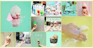
This fantastic site for The Parfait Stand, a small parfait shop near Tokyo, looks simple at first glance, but on closer inspection it's a deceptively complex one-page design that uses subtle motion to turn a flat design into a unique and surprisingly dimensional affair.
Looped video is also used in a clever way, cropped into circles, showing the making of a luxurious chocolate dessert. Free floating buttons orbit the parfaits and link to masterfully-built, full-screen animations that transition to modal detail views. Ultra-stylised photos of the restaurant and food complete the experience, with overlapping layers of visuals animated in staggered timing. It's a fun and inspiring treat.
08. PRESS
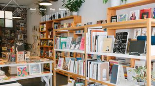
Those who love bookshops but can't always make it to the high street can get a taste of a bricks-and-mortar bookstore on PRESS' website.
The 'Books and things' shop has a website that makes use of beautiful photography to mimic the atmosphere in a tranquil bookshop. Scroll down and the products appear in a striking black and white chequered grid. Huge product shots let you get a feel for each book.
09. Bellroy
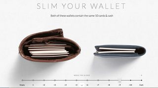
Land on the homepage of wallet maker Bellroy and you'll be greeted with a relatively simple layout. Delve a little deeper into this ecommerce website and you'll find a wide variety of very different designed pages highlighting individual products. Incorporating fun demonstration videos, the Bellroy site is a great example of how flexible Shopify can be when presenting your products online.
The Slim your wallet tutorial is a fun and interesting guide to 'losing the wallet bulge', culminating in some rather nice photographs of the product and links to all its products.

These examples were originally showcased in net magazine. Subscribe now.
Read more:

Thank you for reading 5 articles this month* Join now for unlimited access
Enjoy your first month for just £1 / $1 / €1
*Read 5 free articles per month without a subscription

Join now for unlimited access
Try first month for just £1 / $1 / €1
Get the Creative Bloq Newsletter
Daily design news, reviews, how-tos and more, as picked by the editors.
The Creative Bloq team is made up of a group of design fans, and has changed and evolved since Creative Bloq began back in 2012. The current website team consists of eight full-time members of staff: Editor Georgia Coggan, Deputy Editor Rosie Hilder, Ecommerce Editor Beren Neale, Senior News Editor Daniel Piper, Editor, Digital Art and 3D Ian Dean, Tech Reviews Editor Erlingur Einarsson and Ecommerce Writer Beth Nicholls and Staff Writer Natalie Fear, as well as a roster of freelancers from around the world. The 3D World and ImagineFX magazine teams also pitch in, ensuring that content from 3D World and ImagineFX is represented on Creative Bloq.
