How to design websites for children
When building websites for under-12s, there are a number of challenges to consider. Follow these expert tips to win over your audience.
Every site needs to be designed with an audience in mind, and designing for children is no exception. The first thing you need to consider is age and gender. For example, one of the bigger challenges in designing a website for seven to 12-year-olds is ensuring that the youngest boys, who don't like to read, are as enthralled by the site as tween girls, who are probably already using Twitter.
Here are some tips for creating a site that win over a younger audience.
01. Don't try and be clever

In general, when creating online content for under-12s, keep it simple – this age group doesn't always get wordplay and they don't like 'hidden' content or websites trying to be clever.
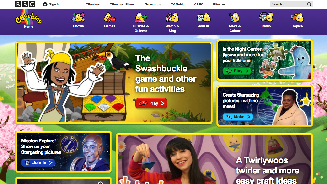
The main driver to go online is playing games and they like lots of them, readily available. The under-nines are often character and TV-show led – favourite cartoons or TV characters are their 'way in' for navigation.
02. Consider reading ability

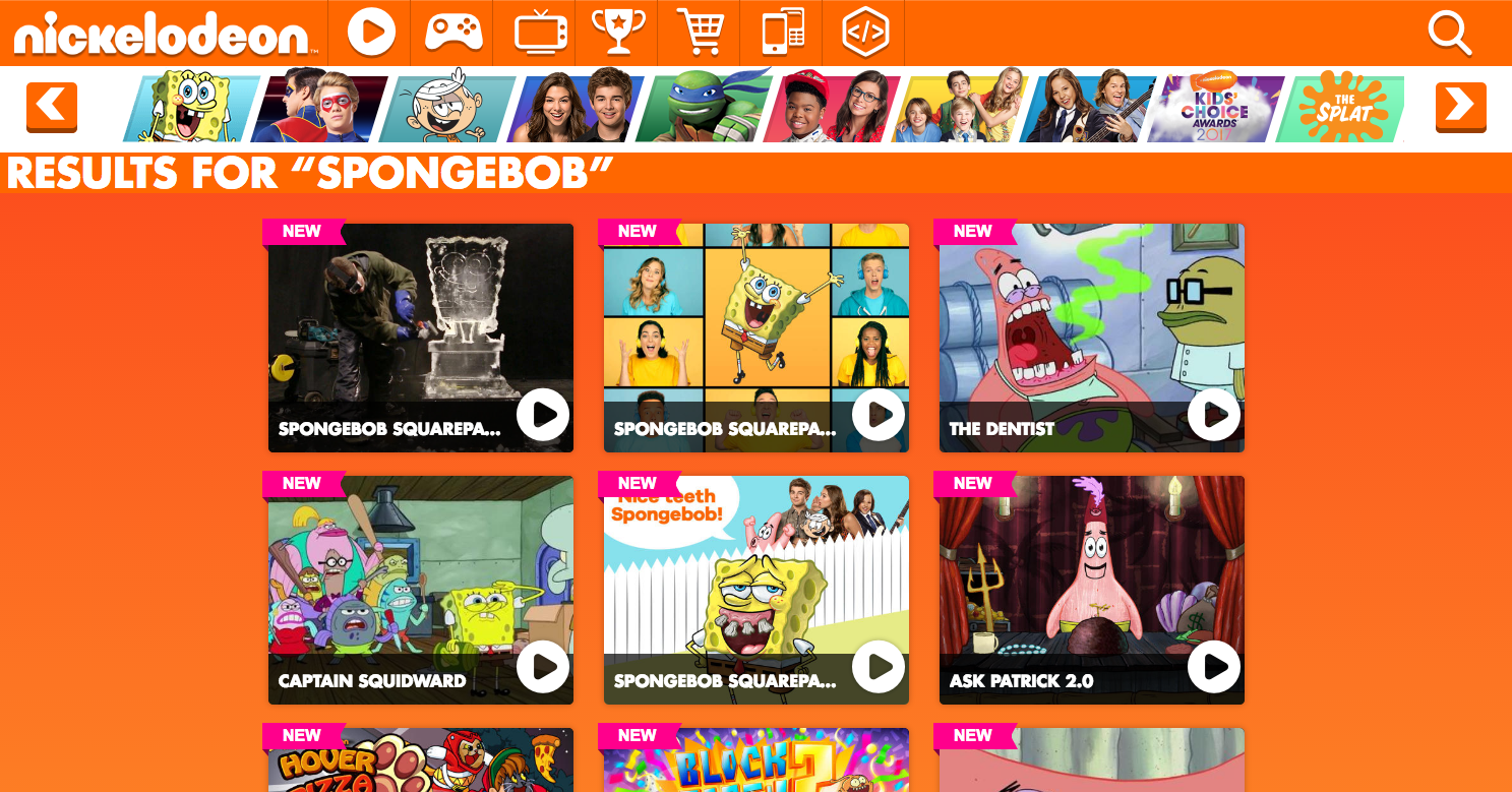
When designing for children, you need to think deeply about usability. When we relaunched the Nickelodeon website, all of the usability solutions were reached through user-centred design, regular user testing and our existing knowledge of the audience.
One big issue is reading and writing. A seven-year-old boy has very different skills to an 11-year-old girl. The lack of literacy confidence with under-nines meant that when we introduced a search function, we knew they'd only use it if it had an auto-complete function, lots of misspelling options and images for each successful search result.
03. Make navigation obvious
There's no consensus on how children predominantly find content, so many kids' sites offer a variety of ways to navigate. Younger kids generally prefer image and character-based navigation. Some like to scroll immediately to the bottom; others go straight for the word 'game' or 'games' on the navigation bar or anywhere on the homepage. When we introduced search, that became the main way that older kids in particular found content.

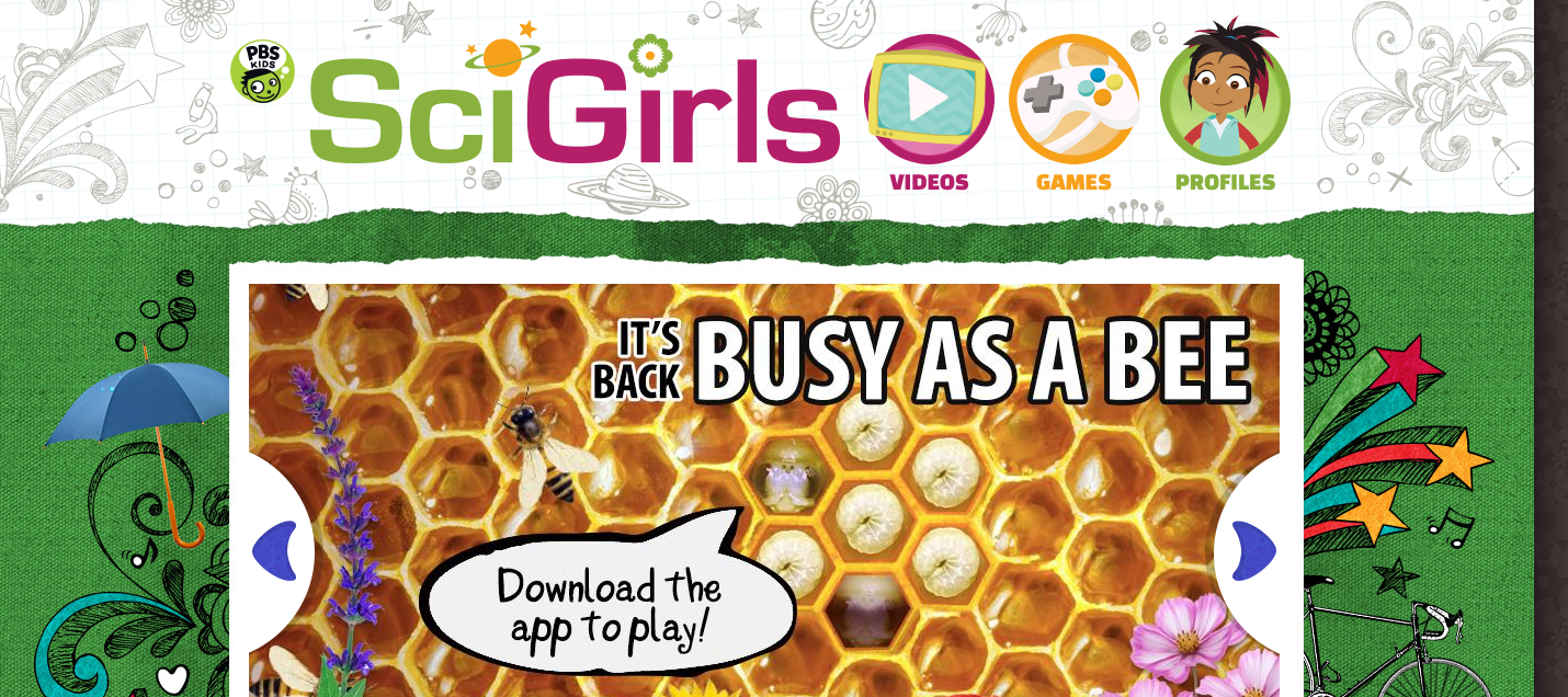
Remember the 'keep it simple' adage for promotional spaces on the homepage and main index pages. Don't use rotating, slideshow images: children frequently don't understand how to click through to find other images and content.
Children aged seven and over may be adept with their mouse skills, but it's still best to make navigation arrows chunky and clear. While pre-schoolers need arrows large enough to be easily clickable, over-sevens need them to be large in order to understand their function. Many kids are web-savvy enough to happily use the Back button on the browser, but when they have multiple tabs open they can get confused.
04. Use video

And remember, kids use Google and YouTube just as much as teenagers and adults. So, for example, YouTube's intuitive 'related content' links are easily understood and used. Using that model on nick.co.uk, it's introduced 'related content' links across the Shows, Games and Clips section.
Related posts:

Thank you for reading 5 articles this month* Join now for unlimited access
Enjoy your first month for just £1 / $1 / €1
*Read 5 free articles per month without a subscription

Join now for unlimited access
Try first month for just £1 / $1 / €1
Get the Creative Bloq Newsletter
Daily design news, reviews, how-tos and more, as picked by the editors.
