How to design social buttons for your website
Want the content on your website to go viral? Then you need to design your social buttons in the right way. Here's how to go about it.
With billions now connected via Facebook, as well as Twitter, Pinterest and other services, social marketing is become an integral part of more and more companies' strategies. Consequently, any website worth its salt these days sports at least a couple of social buttons to enable visitors to share their content quickly and easily.
Social buttons give companies big and small the power to turn their most socially proactive consumers into their very own marketeers. But as a designer there's a wrong way and a right way to implement social buttons on your website. Here are some important things you need think about...
01. Make them easy to find
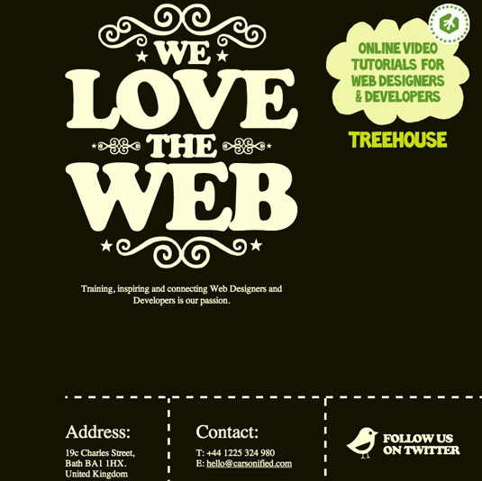
People won't go looking for social buttons on your site, so don't hide them away. Put them in what you think is the most obvious place on the page - and then test your mockups on friends and colleagues to find out whether you're right.
02. Make them easily recognizable
Your social buttons need to be instantly recognizable as an interactive element. In other words, merging your designs too deeply within your site may work against their effectiveness.
Indeed, to get people using them, your social buttons may need to be created in contrast to your design. Either way, make them as visible as possible, either through size, shape or surrounding white space.
03. Consider adding text
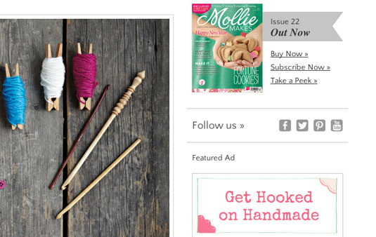
Adding text to describe what your social icons do - eg "Follow us on Twitter" - may seem unnecessary. But take into account the context and the type of user your site is likely to attract. The minimal design approach may not always be appropriate, so consider whether your visitors would benefit from this extra prompt.
04. Make them the right size
Creating your social buttons at the right size shouldn’t be your last consideration - ie, dictated by the amount of space you’ve left yourself in your design. Smaller buttons will be less intrusive, but there’s a point at which active space becomes awkward on a tablet.
Get the Creative Bloq Newsletter
Daily design news, reviews, how-tos and more, as picked by the editors.
Equally, making social buttons bigger may certainly bring them to the attention of visitor, but too big and they become intrusive and almost off-putting for the user.
Note that Apple has clear guidelines for buttons based on a comfortable tapping size of 44px x 44px.
05. Keep the style consistent
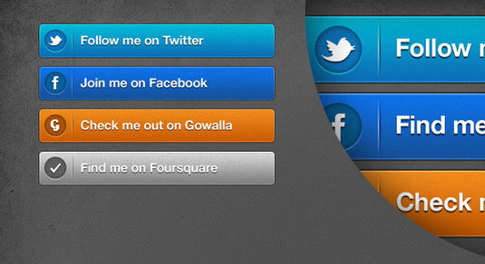
Skeuomorphism - the design of interface elements to look and work like their real-world counterparts - is a hot topic; many hate the practice. But beveled buttons have been around for years and are a familiar interface element. So put aside any design snobbery and make the right decision for your site based on its content. In other words, whether you personally prefer beveled buttons or a more graphic approach, keeping your site consistent is the key.
06. Use appropriate colours
Get to know the standard branding of the social platform you’re designing for and try to understand what makes it familiar. The safest thing to do is to use the social brand's own colour for your social button.
Any other colour combination is likely confuse the visitor about the button's function. That's not to say you should never do so - just make sure you've got a good reason, and make sure it works better than the original colour would.
07. Resist the urge to redesign

It might be tempting to embellish or rework the Twitter bird design on your button. But you should resist the urge to dilute the power of this instantly recognisable global brand (the same goes for other social brands such as Facebook and LinkedIn). As with the previous point, we're not saying you should never do this - just that you'll have to create something pretty special to justify messing with the classics...
08. How many buttons?
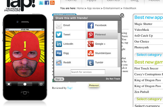
Social buttons can be a double-edged sword: whilst they encourage users to share information, they also allow visitors to click away from your site - users may read an article, share it, then they’re gone.
When considering how many social buttons to include, there's also the obvious issue of clutter. If you include every social media service going, there'll be little room left on the page for anything else.
One possible solution could be to design your social buttons to be modal – ie open in a pop-up to share, before closing. This could make it more likely your visitor will stick around.
09. Design with interactivity in mind
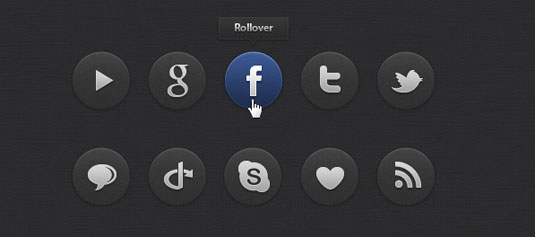
Think carefully about how your social buttons will work and how that will inform your design. Will they come in at the side of your page, sit as static images at the top or bottom of a post, open a new window, or offer another level of interactivity? Maybe clicking or tapping a single button will animate out a number of social icons, or they'll change or zoom slightly on hover.
The important thing is to allow the function to inform the design - never the opposite - and always allow this function to be transparent to the user. Having a solid understanding of the way things will work on the page before you design always pays off.
10. Further reading
To learn more about adding social buttons to your site, check out these superb articles on netmagazine.com:
- Create a set of beautiful social media buttons
- What social sharing widget is right for you?
- Should we drop social media buttons?
Words: David Montrose
Have you spotted a great use of social buttons on your travels around the web? Let us know about it in the comments!
Liked this? Then read these!
- 20 ways to boost your design career with social media
- 7 ways to boost your design career using Pinterest
- 5 alternative Twitter clients for designers

Thank you for reading 5 articles this month* Join now for unlimited access
Enjoy your first month for just £1 / $1 / €1
*Read 5 free articles per month without a subscription

Join now for unlimited access
Try first month for just £1 / $1 / €1

The Creative Bloq team is made up of a group of art and design enthusiasts, and has changed and evolved since Creative Bloq began back in 2012. The current website team consists of eight full-time members of staff: Editor Georgia Coggan, Deputy Editor Rosie Hilder, Ecommerce Editor Beren Neale, Senior News Editor Daniel Piper, Editor, Digital Art and 3D Ian Dean, Tech Reviews Editor Erlingur Einarsson, Ecommerce Writer Beth Nicholls and Staff Writer Natalie Fear, as well as a roster of freelancers from around the world. The ImagineFX magazine team also pitch in, ensuring that content from leading digital art publication ImagineFX is represented on Creative Bloq.
