Design your own UI kit with Adobe Fireworks
Employing simple, effective techniques that can be used in other designs, Alex Brooke demonstrates how to best use Adobe Fireworks to create a UI kit for your website.
A visually appealing user interface is an extremely important part of any website or application. Without it, a user is highly likely to feel disengaged, and therefore not interact with a product or website to the fullest possible extent.
Developing a style guide or a UI kit for reference is a highly effective way of maintaining a consistent approach throughout a design. It's also a very useful thing for a designer to be able to provide a developer with for a reference, or to simply use as a sprite in the later development stages of a project.
In this tutorial I'm going to be walking you through the steps necessary for designing a useful UI kit in Adobe Fireworks - and going over some of the basic features and panels that you will encounter when using Fireworks.
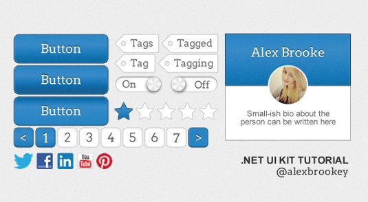
Although this UI kit probably won't be perfect for every single design that you'll ever want it for, it will show you a method of putting one together that you can customise and adapt for future projects or uses.
Since you're going to be working in vector format in Fireworks, it will also be very easy for you to adapt this UI kit into all shapes and sizes for ongoing usage - including for Retina designs. This is one of the main reasons that I absolutely love working in Adobe Fireworks - simply because it's so versatile.
- Download the support files for this tutorial
01. Set up a new document
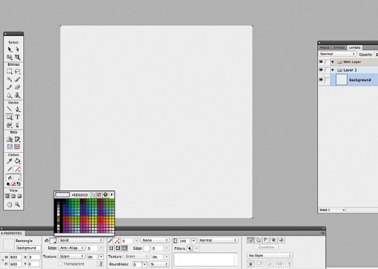
Open Fireworks, go to File>New, set height to 280px and width to 600px. Leave resolution at 72dpi. You should see your new document. Press U for the Shape tool; draw a 600px square; set colour to #EDEDED in the Preferences panel (PP).
02. Default button
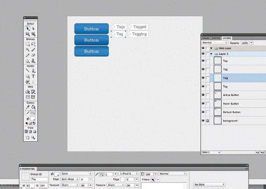
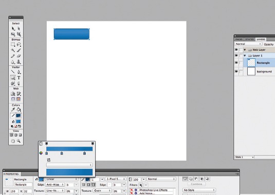
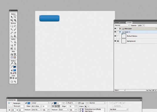
Buttons are key, so let's start there to define our style. Press U and draw a 150x45px rectangle. In the PP, go to Gradient>Linear, and add three colour points: #2685C9, #268EDE and #1F6EA7 (left to right). Set the roundness to 35% and border colour to 1px #14466B.
Get the Creative Bloq Newsletter
Daily design news, reviews, how-tos and more, as picked by the editors.
03. Add detail
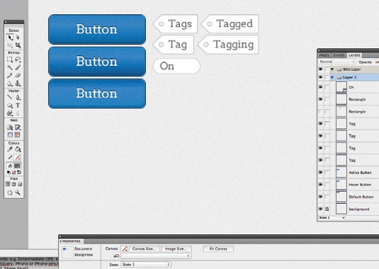
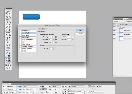
Head to Filters, click +, go to Noise>Add Noise>Amount: 2, uncheck the box and press OK. Then go to Filters>Photoshop Live Effects, tick Inner Shadow and set the properties as: opacity: 43, distance: 3, angle: -90°, size: 5 and all others to 0.
04. Add some more detail
Copy the rectangle that you have just drawn and paste it on top of the other one. Change the width of this rectangle to 148x43px and move it 1px to the left and 1px down. Remove all fill colours and effects and only add a 1px border colour of #2B93E3.
05. Add some text
Now, we need to add some text. Using the Arvo font provided, type your text and align to the button centre. Set the font colour to #FFFFFF and size to 20px. Then copy and paste the text, select the text that is underneath and move it 1px up. Set the colour to #0D2C42.
06. Organise the layers
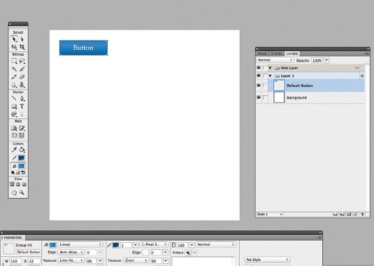
File organisation is an important consideration, and it's easier to organise files as we design. Select all of the layers for this button and press Ctrl+G: this will group your layers. Name this layer Default Button.
07. Hover button
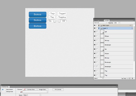
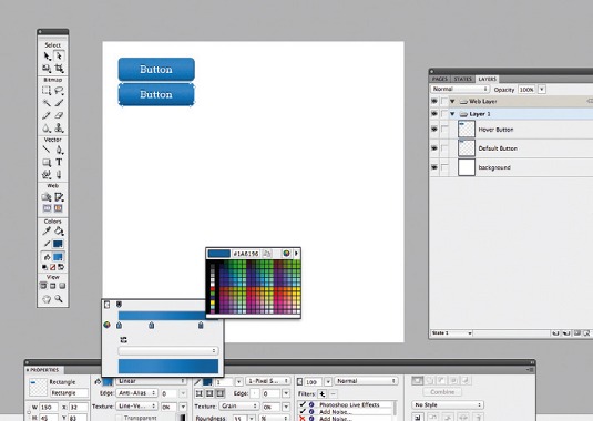
We need to create a hover state. Copy and paste the group we made, rename it Hover Button and move below the other button. Hit A for the Subselection tool; pick the rectangle with the gradient in it. Change the third colour on the right-hand side to #1A6196.
08. Active button
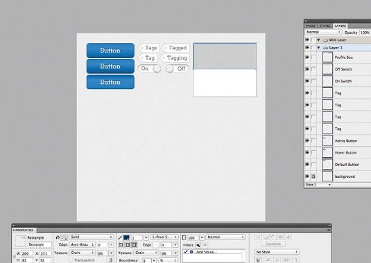
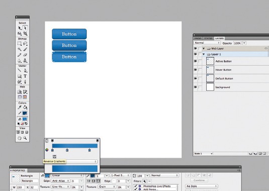
Now we need an active button. Copy and paste the hover button group, move underneath the other button and rename to Active Button. Use the Subselection tool to select the gradient and then click on the little Reverse Gradients button to reverse the gradient.
09. Tags
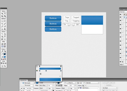
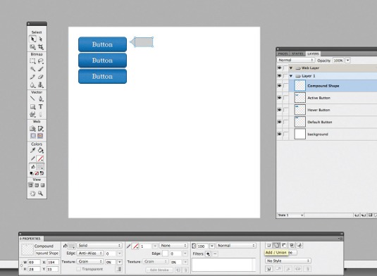
Now we've set a style and created buttons, we'll make some tags. Draw a 55x28px rectangle. Press P for the Pen tool and, on the left of the rectangle, draw a triangle. Hold Shift and select both shapes, then click on the Add/Union button in the PP to form a combined shape.
10. Tag detailing
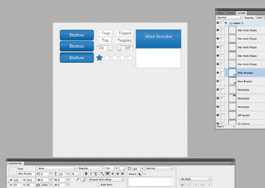
Select the shape and set colour to #FFFFFF and border colour to 1px #BFBFBF. Tap U twice for the Ellipse tool and hold Shift while drawing an 8x8px circle in the left of the tag. Select the two shapes and press Subtract/Punch. Add text in #666666 size 16 Arvo font.
11. ON switch
We're going to make the ON state of the ON/OFF switch. Draw a 72x23px rectangle and set the roundness to 100%. Set the solid fill to #FFFFFF and border to #C8C8C8 to match the tags. Add size 16px text that says ON to the left of the switch and set the colour to #666666.
12. ON switch detail 1
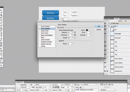
We need to add a little bit of detail, so our switch doesn't look flat when we add the final pieces of detail. Go to Filters>Photoshop Live Effects>Inner Shadow and set the following properties - opacity: 31, distance: 3, angle: 90°, size: 5. Press OK.
13. ON switch detail 2
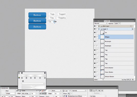
Draw a 23x23px circle and place it on the right-hand side of the switch. Add a 1px #B6B6B6 border. Now, go to Gradients>Cone and add six evenly spaced colour points that alternate between #FFFFFF and #DDDDDD for the metallic effect.
14. ON switch detail 3
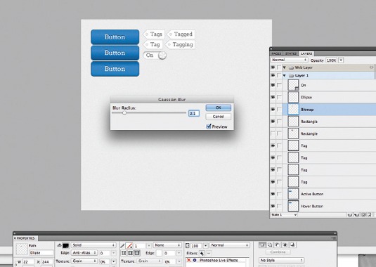
Copy the circle we've just made and paste it underneath. Change the fill colour to #000000 and remove all styles. Now, go to Filters>Blur>Gaussian Blur and set the Blur radius to 2.1. Press OK and move the circle 2px down and 2px left. Set the opacity to 50%.
15. OFF switch
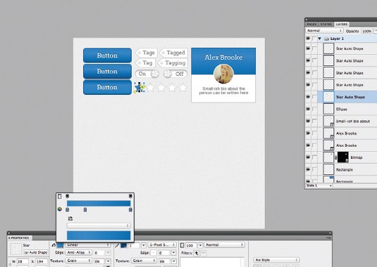
Group the ON switch and then copy this group and move it to the right of the previous group. Change the text that says ON to OFF and move it to the right of the switch. Now, move the two circles over to the left of the switch and move the shadow 4px right.
16. Profile box
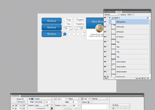
Draw a 200x170px rectangle, making sure it's aligned with the rest of the kit to keep the file neat and tidy. Fill the colour with #FFFFFF and set a 1px border of #999999. Now, at the top of this box draw a 200x82px rectangle with a 1px border of #0F3756.
17. Profile box detail
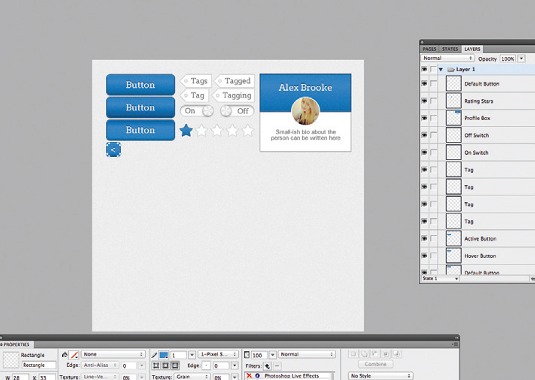
In the PP, go to Gradient>Linear and add three colour points: #2685C9, #268EDE, #1F6EA7, spaced as on the screengrab. Copy the rectangle and paste it on top of the other one. Reduce the width and height by 2px and add a 1px border colour of #2B93E3.
18. Profile box detail 2
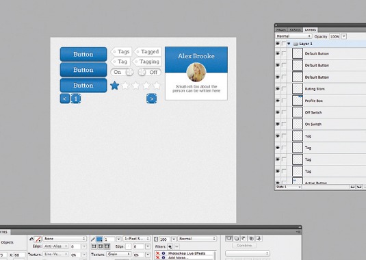
In Arvo font, size 20, colour #0D2C42, type the profile name you wish to appear in your profile box and then centre it in the top of the blue box. Copy and paste this text, change the colour to #FFFFFF and move it 1px down.
19. Profile box picture
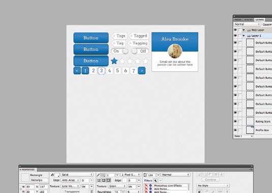
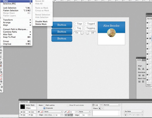
Paste in your profile picture and resize it to 60x60px. Draw a circle right over the picture, make sure it has no fill and no border. Then select the circle and the picture, go to Modify>Mask>Group as mask. Re-copy this circle and add a 2px #FFFFFF border.
20. Alignments panel
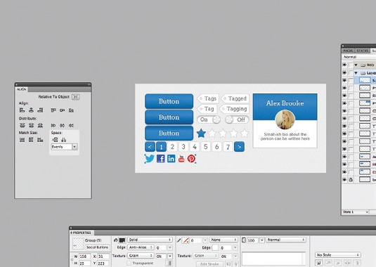
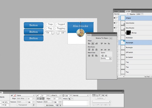
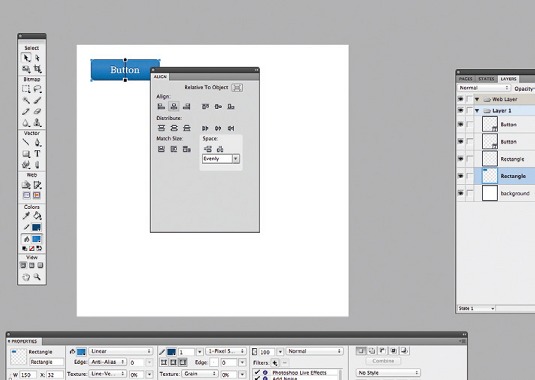
The easiest way for us to centre the profile picture in the middle of the box is to use the Alignments panel. Go to Window>Align to display it. Now, click on the profile picture, and click on the box you wish to centre it in, then click Align horizontal centre.
21. Profile box bio text
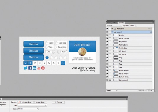
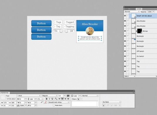
We need to add some bio text to our profile box so users can find out more about the person. We're going to use Arial in 13px #666666 for this text. Press T for the Type tool and simply align your text to the centre of the box.
22. Rating stars
Hold down the Shapes button and you will see a star. Draw one 28x26px star and duplicate five times, each time moving it next to the previous one. On the first star, apply the same style we used in step two, and leave the rest with a #FFFFFF fill and #BFBFBF border.
23. Organise!
If you haven't already organised your file as you've been following this tutorial through, be sure to do that now. Use Ctrl+G to group each element and name accordingly. This is important, especially if you intend on editing this UI kit for future use.
24. Add pagination
Copy the Normal Button group we made earlier and move it to another section of the canvas. Use the Direct Selection tool and resize both rectangles to 30x30px and change the text so that it's an arrow < and centre it in the square.
25. Copy the group
Copy this group that you've just made, and move it to the right. Leave everything the same but change the text to 1. Then do the same again, but move the group even further to the right and change the text to >.
26. Copy again
Copy one of these pagination groups again. Fill the space in between with six more duplicates. Change the numbers so they run from 2 to 7. Then use the Direct Selection tool to select each of these boxes, change the fill colour to #FFFFFF and the border colour to #BFBFBF
27. Social buttons
Having social buttons to hand in a UI kit is always handy. Download the social icons provided and add them into your UI kit for ease of use when they're needed. If you're feeling crafty you can always personalise them and make them more interesting.
28. Do a final organise!
The most important thing to check at the end of a design is that you've organised the file properly. If you haven't, then you'll come back in the future and wonder where things are. So, do a final check and make sure everything is grouped and named accordingly.
Words: Alex Brooke
Liked this? Read these!
- How to build an app: try these great tutorials
- The ultimate guide to logo design
- Photoshop tips, tricks and fixes to try today
Any questions? Ask away in the comments!

Thank you for reading 5 articles this month* Join now for unlimited access
Enjoy your first month for just £1 / $1 / €1
*Read 5 free articles per month without a subscription

Join now for unlimited access
Try first month for just £1 / $1 / €1

The Creative Bloq team is made up of a group of art and design enthusiasts, and has changed and evolved since Creative Bloq began back in 2012. The current website team consists of eight full-time members of staff: Editor Georgia Coggan, Deputy Editor Rosie Hilder, Ecommerce Editor Beren Neale, Senior News Editor Daniel Piper, Editor, Digital Art and 3D Ian Dean, Tech Reviews Editor Erlingur Einarsson, Ecommerce Writer Beth Nicholls and Staff Writer Natalie Fear, as well as a roster of freelancers from around the world. The ImagineFX magazine team also pitch in, ensuring that content from leading digital art publication ImagineFX is represented on Creative Bloq.
