Design prototypes that feel real with Proto.io
Proto.io’s Todd Siegel explains how to use this prototyping tool to create an interactive product concept – no coding required!
Learning how to build an app is a process that requires carefully planning, with many things needing to be considered. Designing touchscreen apps ultimately demands prototypes that feel real. Despite this, when aiming for a gesture-driven app with interactive animation, we often couch our design thinking in static design tools. Shouldn't we base our explorations in an interactive animation tool?
Similar to the way language filters our perception, our tool filters how we think through solutions. We want to stay in the flow, and not constantly switch between tools to explore design solutions. We rarely need to prototype with vector perfection, but we do need good enough prototyping assets.
Proto.io serves as several visual prototyping tools in one. You can import comps to link into flows, and asset layers to animate. But you can also author assets in high enough fidelity on the fly, and customise native component libraries for iOS, watchOS and Material Design.
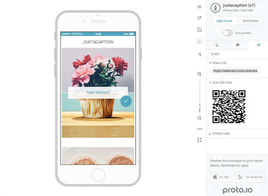
In this tutorial, we'll prototype a product concept for juxtaposing two photos and typing a caption about the connection between them. It should look like this.
We'll start by bringing in a range of external assets. Then we'll design assets and customise native components within the tool. Interactions will be triggered by gestures, keyboard input, and automatically as the prototype loads, then choreographed along an animation timeline.
Step 01
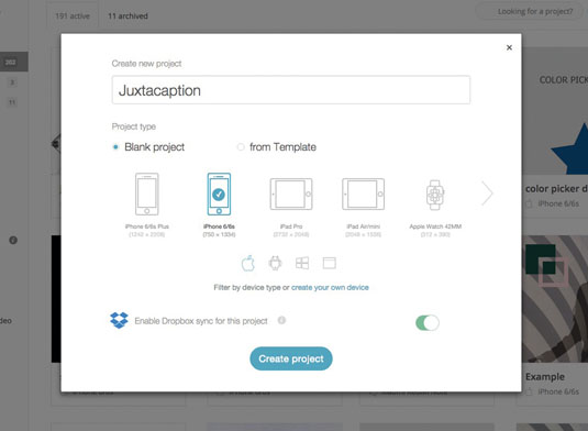
First, you'll need to go over to Proto.io and sign up for a trial. Start a new project and name it 'Juxtacaption'. Select the iPhone 6 screen size (750x1334), and hit Create project. Roll over the project thumbnail and click Edit project to open the editor.
Step 02
I've created a folder of assets for this project. In the bottom-right of the editor, you'll find your options to add these to the project. Alternatively, you can drag them directly onto the canvas.
Get the Creative Bloq Newsletter
Daily design news, reviews, how-tos and more, as picked by the editors.
Step 03
Double-click 'opening-photo-bottom.jpg' (the tree trunk cross-section) to add it to canvas. Drag it to the bottom until it snaps to the edge. Next drag 'opening-photo-top.jpg' (ferris wheel) on to the canvas, and position it so it sits just above the tree image. Now add 'logo.png' to the canvas. Under Size & Pos., set its left margin to 140 and top margin to 120.
Step 04
Let's create a native asset. On your canvas bring up the Type tool (T), then click below the header at the left edge. Type 'Caption the connection between two photos', and position this at the horizontal centre of the canvas.
Step 05
We're going to add a web font. Go to Properties > Text > Manage project webfonts. Search for 'Catamaran', and hit return. Click Add all. Now, back in the text drop-down, select Catamaran 300, and set the size to 34. Centre-align the text.
Step 06
Let's add the button asset. Drag 'button.png' on to the canvas towards the bottom, and position it at left 175, top 1070. If at any time you want to preview the project, you can just click Preview in the top right.
Step 07
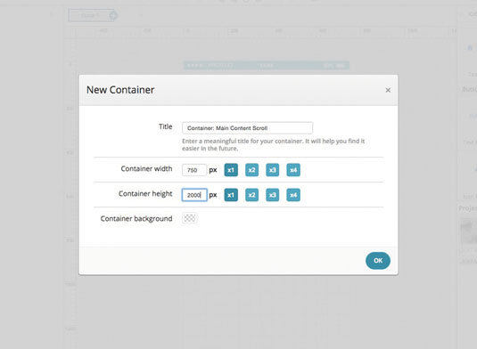
Roll over the Screens drop-down in the top left, and select Add new screen. Title it 'Screen: Main', and hit OK. This will form our second screen, which will contain the photo and caption content for the prototype.
Step 08
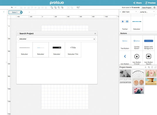
On the canvas, use shortcut cmd+F to bring up the search function. Type 'statusbar' to search for assets. Double-click the standard iOS bar to add it. Under Properties we can change the background colour (I've gone for blue). Drag your chosen shade into the saved colours area to use later.
Step 09
In Proto.io, if the content needs to scroll beyond the length of the screen, it needs to be placed in a container. To do this, go to Containers > Add new container and name it 'Container: Main Content Scroll'. Change the container height to 2000.
Step 10
Let's add the photos to this second view. Double-click 'juxtaphoto_1.jpg' (flowers) and centre it horizontally along the top edge of canvas. You can zoom in and out using cmd+1 (to zoom to 100 per cent) and cmd+0 (to return to the zoomed-out view).
Step 11
Drag 'juxtaphoto_2.jpg' (cupcake) directly below the top photo. This wants to have a top margin of 455, so it sits 5px below the flower image. Drag out 'juxtaphoto_3.jpg' (pancakes) below this (left margin 11, top margin 1000), and 'juxtaphoto_4.jpg' (face), at the bottom (left margin 11, top margin 1455).
Step 12
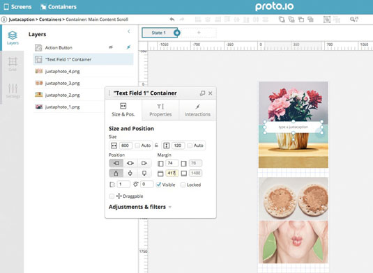
In the Components area, scroll down to Forms and drag out the Text Field so it is under the top photo. Adjust its size to 600x120px, and position it over the join between the top two images. Under Properties, adjust the styling. I've chosen a white background and border radius of 10.
Step 13
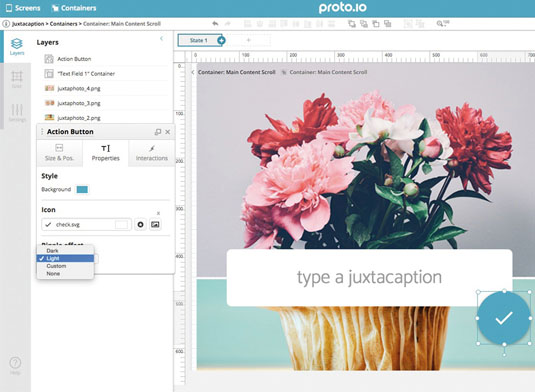
While you're still in the Properties tab, adjust your text. We're using Catamaran 300, size 40, blue and centre-aligned. Set the placeholder text field to 'type a juxtacaption'.
Step 14
We want this text input field to have two states, the first for inputting the text, and the second for displaying what's been typed. Right-click the text input field and select Convert to container. On the Layers panel, double-click 'Text Field 1' and rename the layer text input.
Step 15
At the top of the container canvas, click the + symbol next to State 1 to add a new state. While on State 2, click to select the text input field, and delete it.
Step 16
Hit R and add a rectangle 600x120px. Make the background blue and border radius 10. Type T and click to insert text. Change the text style so it matches the text on State 1, but this time it wants to be white instead of blue. Adjust the line height to 50.
Step 17
Size the text box 570x100, and centre it horizontally and vertically. Change text to 'your juxtacaption'. Navigate back to Container > Main Content Scroll.
Step 18
Now we're going to include some Material Design elements in our design. At the top of the component panel, go to Material Design > Buttons and drag the round Action Button onto the bottom-right of the text input field container. Change the background colour of the Action Button to the saved blue. In the icon field, type 'check' and choose the first tick button. In the ripple effect drop-down, select Light.
Step 19
Now we'll do something a bit more advanced (it's still simple, I promise). In order to use the typed in caption, we need to set a variable that changes the resulting text box to show this caption. Select the Action Button, and go to Interactions > Add Interactions. Set the trigger to Tap and the action to Set variable.
Step 20
Let's set a variable that grabs what is typed into the text input field. Select New Variable and name it 'juxtacaption`. Then select Text, check Evaluate variable, Set value from item property, Current container. Under item, select text input, and for property select Value. Check Callback to chain another action.
Step 21
A new window should appear for Callback 1. Here, we will chain another action that reads the variable to change the text box to what has been typed in. For the action, select Change property (under Logic), then choose Current container, yourjuxtacaption, Text, Read from variable, juxtacaption. Now save your interaction.
Step 22
Now, let's add the main content container and make it scrollable. Go to Screens > Screen: Main. Once selected, roll-over Containers > Container: Main Content Scroll, and click Add to Canvas.
Step 23
Set a horizontal guide to 160, and move down the container so it snaps to the guide. Go to the bottom of the screen and drag up the centre container handle so it snaps to the bottom edge of the screen canvas.
Step 24
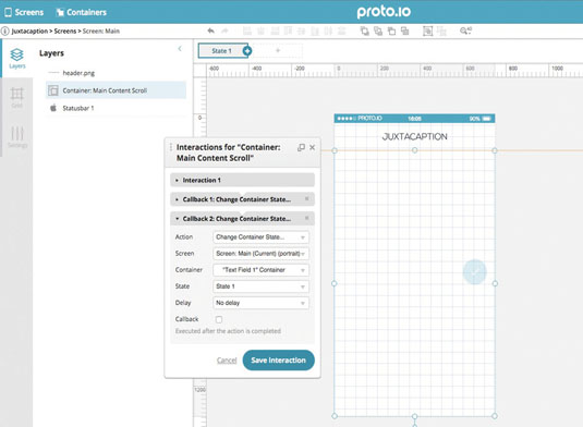
Let's set the main container to scroll vertically. Select the container, go to Properties and choose Vertically from the Scroll properties drop-down. Now, double-click the 'header.png' asset to add it. Position this left 225 and top 85.
Step 25
Double-click the container and select the Action Button. Under Interactions, select Add interaction, Tap, Change Container State, Current container, Text Field 1 Container, State 2.
Step 26
Let's stagger the timing of the main content so it appears step by step, suggesting what to do with the prototype. Select the Text Field 1 container and move it down 25px to 417px from the top.
Step 27
Now we need to add a new state (to Containers > Main Content Scroll). Move the 'Text Field 1' container back up 25px to 392, and change its opacity to 0.9. Go back to State 1 and select all the content on the canvas (cmd+A). Change the opacity to 0 and hit return. Go back to State 2. The timeline at the bottom of canvas shows all the layers with changed properties between States 1 and 2.
Step 28
Select both 'juxtaphoto_1.jpg' and 'juxtaphoto_2.jpg' in the timeline and drag one of their animation sliders to 0.5 duration. Click the 'juxtaphoto_2.jpg' animation slider and change the delay to 0.4. Drag the animation slider for 'Text Field 1 Container' to 0.6, and change the delay to 0.7.
Step 29
Drag the animation slider for 'juxtaphoto_3.jpg' to 0.5 duration, with a 1.3 delay. Keep the default ease-out quad curves. Drag the Action Button animation slider to 1s duration, with a delay of 1.3s.
Step 30
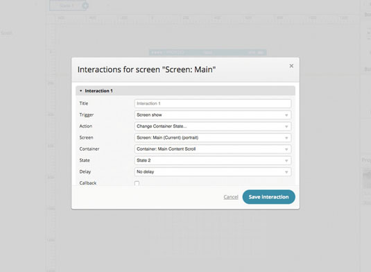
So the container automatically advances to State 2, you need to set a screen interaction. Go to Screens > Screen: Main > Interactions > Add interaction. Set trigger to Screen show, action to Change Container State, screen Main, container Main Container Scroll, State 2. Save your interaction.
Step 31
Now let's add a transition between the two screens. First, go to Screen 1. Select 'button.png', go to the Interactions tab and Add interaction. Select Tap, Go to Screen, Main and Slide left.
Step 32
In order to transition back, go to 'Screen: Main', select the transparent 'Container: Main Content Scroll' and add an interaction. Select Swipe right, Go to screen: Screen 1, Slide right.
Step 33
Let's see the prototype! Save the project, then preview it. To share the project, go back to the Editor, Share > Publish > Share with Everyone > Publish. Hit Continue > View > share icon tab – this will give you the link, so you can share your prototype with anyone you like. Enjoy!
Words: Todd Siegel
Todd Siegel is a UX designer and product evangelist at Proto.io. This article was originally published in issue 276 of net magazine.
Like this? Read these:
- Top Chrome extensions for designers and devs
- Free WordPress themes for creating blogs, portfolios and more!
- Choose a website builder with these top tools
- Behold the very best in website templates
- These free WordPress theme are better than beer

Thank you for reading 5 articles this month* Join now for unlimited access
Enjoy your first month for just £1 / $1 / €1
*Read 5 free articles per month without a subscription

Join now for unlimited access
Try first month for just £1 / $1 / €1

The Creative Bloq team is made up of a group of art and design enthusiasts, and has changed and evolved since Creative Bloq began back in 2012. The current website team consists of eight full-time members of staff: Editor Georgia Coggan, Deputy Editor Rosie Hilder, Ecommerce Editor Beren Neale, Senior News Editor Daniel Piper, Editor, Digital Art and 3D Ian Dean, Tech Reviews Editor Erlingur Einarsson, Ecommerce Writer Beth Nicholls and Staff Writer Natalie Fear, as well as a roster of freelancers from around the world. The ImagineFX magazine team also pitch in, ensuring that content from leading digital art publication ImagineFX is represented on Creative Bloq.
