Design jargon explained: the Z-Pattern
Visitors read websites in predictable ways. We explain what the Z-pattern is and showcase some real-world examples on the web.
In Design jargon explained: the F-Pattern, we talked about how eye tracking studies show that users scan screens in similar, and predictable ways.
To a UI designer, these scanning patterns reveal the optimal layout of elements for certain types of sites. This cold, hard science, when applied properly, creates in the user a magical feeling of familiarity. The interface seems intuitive and personal, with everything in its right place.
Our previous article focused on one of these scanning patterns, the F-pattern, and this one will explore another, equally important one: the Z-pattern.
Below, we'll explain what this is, how to apply it, and then show some real examples of how it's done well.
For more details on the Z-pattern, the F-pattern, and many other visual web design techniques, check out the free ebooks Web Design for the Human Eye and Web UI Best Practices.
Deconstructing the Z-pattern
While the F-pattern is ideal for text- or content-heavy sites, the Z-pattern works better for looser, more sparse sites.
Minimalist sites, or sites centering mostly around one or two main elements, can implement the Z-pattern to anticipate, and encourage users to follow this natural method.
Get the Creative Bloq Newsletter
Daily design news, reviews, how-tos and more, as picked by the editors.
That way designers can ensure, or at least increase the likelihood, that the most important elements are seen.
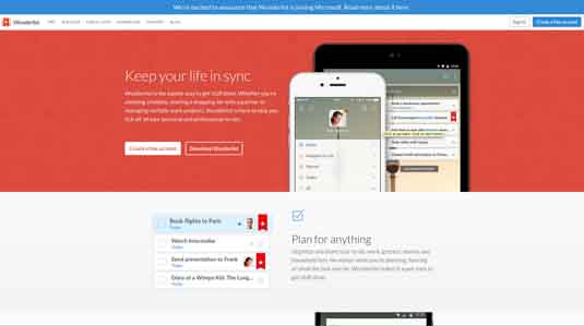
As with the F-pattern, in Western cultures that read left-to-right and up-to-down, the user almost always starts in the upper left corner and scans across the top. The distinguishing feature of the Z-pattern is the "Z" shape it follows next. Instead of returning to the left and then going down, the user's sight goes left and down at the same time, and then again scans a horizontal line left-to-right.
The interesting – and useful – thing to know about the Z-pattern is that it repeats, sometimes ad infinitum if the content is engaging enough.
This creates an endless zig-zag structure that extends downward for as long as you can hold the user's attention, making this pattern perfect for creating visual narratives with long scrolling, infinite scrolling, and parallax scrolling.
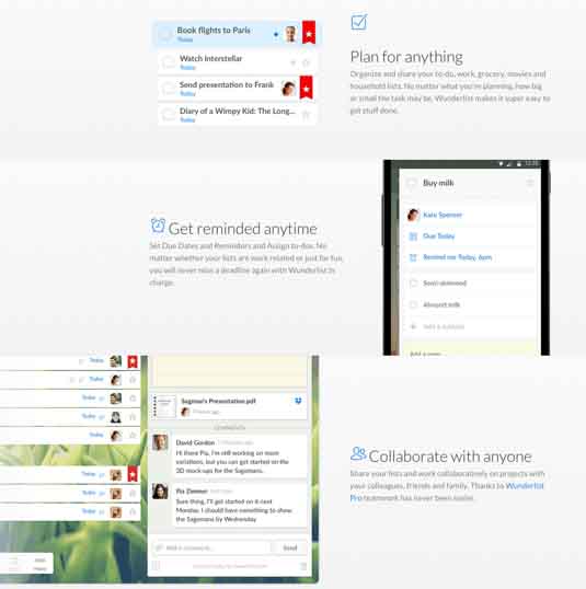
Unlike the F-pattern, which works well for sites that require organizing a mix of visual and text content, the Z-pattern works well for sites with a clear and direct agenda (for example, a landing page with one main call-to-action).
The Z-pattern creates a clear structure and hierarchy, and if done right, builds momentum culminating at a final call-to-action.
The downside is that it can be disorienting for sites with a lot of content.
Applying the Z-pattern
The Z-pattern usually consists of rows of light content, interspersed with large graphics or other attention-grabbing content.
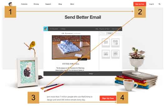
The Z-pattern starts just like the F-pattern, so your most important spot is the upper left corner (point #1). This is one of the few spots on the screen your user is almost sure to look at, and as such usually holds the company's logo.
Again like the F-pattern, the user will then most likely scan from left-to-right across the top of the page (point #2). This means two things to the designer.
- First, that top row is prime real estate, which is why it's usually filled with a horizontal navigation bar. Almost immediately after landing on your site, your users know what pages are available, and where to find them.
- Second, it means that the upper right corner is a great place for a call-to-action, since the user's sight will pause for a moment before moving on.
Follow the eye
The user's eye then falls downward to the middle. This is where you'll find a big graphic or sometimes a notification. Another strategy is to keep this area relatively empty: an empty space here will move the user onward faster and encourage a repetitive trance.
In either strategy, the important part about the middle is that it does not distract the user or deviate them from the Z-pattern path. That means heavy or visually complicated placeholders are not recommended.
The user's sight then goes to the bottom left corner (point #3), and scans to the right again (point #4). At the bottom of the screen, you typically find horizontally oriented content, sometimes even a bar menu mirroring the one at the top.
You'll notice also that the points at the end of the line on the right, points #2 and #4, are the best for calls-to-action, such as the "Sign Up Free" buttons in the example. Think of these points like the finish lines, where the eye pauses before moving on.
Repeating the pattern
After point #4, the pattern continues to repeat. You can extend the Z-pattern as long as you want, repeating or introducing new calls-to-action at each of the right-side points.
In general, the Z-pattern is more relaxed than the F-pattern. It allows breathing room, and versatility – both in how long it can hold user attention, and in how wide you can make the gaps in the middle. This makes it conducive to storytelling or sales pitches, but ineffective in organizing diverse content.
Because of its emphasis on calls-to-action, the Z-pattern is not uncommon for home pages and landing pages, subtly influencing the user on where they should go next. It's a popular layout across various industries, and you can often recognize it from its top and bottom navigational bars. Here are some examples...
01. AirBnB's Map page

As described in Web Design for the Human Eye (Book 2), the pattern starts at the traditional company logo in the upper right hand corner. Because there is no top navigation bar, the eye likely will shoot straight to the upper right corner, with calls-to-action back to the original site and sharing options, plus a sound control option.
The eye then scans the map – the actual content of the page, but for now only a background – before settling in the bottom left corner. The user's sight then follows the bottom navigation menu to the bottom right corner, where one of the most important controls is located: the zoom.
While the relevant content is in the center, users will likely scan the entire page before interacting. By laying out everything in a Z-pattern, AirBnB helps to ensure that the user will see the page's controls and their locations in the first few moments, allowing them to best interact with the page. The Z-pattern layout simply streamlines this process.
02. British Airways
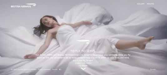
Another large company to take advantage of the Z-pattern is British Airways's site for showcasing their new planes. Predictably, the company logo rests at the starting point, and like Airbnb, the lack of an upper navigation menu means the eye quickly goes to the right corner. Here the company chose to promote only its most important links for the Gallery and Routes pages.
The eye then goes across the large image – gorgeous to look at, but ultimately meaningless to the interface outside of aesthetics. The user can read or ignore the greeting, depending on their timeframe or if they know where they landed.
Because point 3 is the least significant, British Airways (and many other companies) chose to put its legal requirement here. But this is actually a strategic decision – the horizontal line of text here encourages the user's site to move right along the same plane.
As explained in Web UI Design for the Human Eye (Book 1), the Gestalt principle of lines shows that the user's site will travel along clear lines, and gain momentum as it does so. This placement of the legal line actually supports the Z-pattern, and directs the eye to more relevant content… culminating in the Share button in point 4.
03. Irregulart
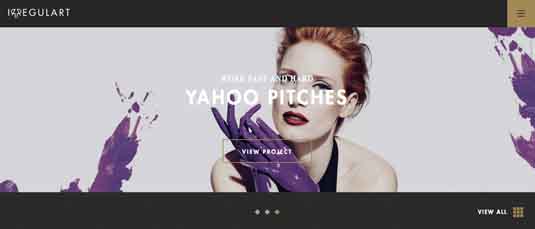
Irregulart uses the Z-pattern as well, but demonstrates an important variation that we'd like to point out.
As we mentioned in the previous example, point 3 is the least important location on the page. That's why some designers choose to omit it completely from Z-pattern (like the team at Irregulart did). The Z-pattern is still effective, however, the lower/middle becomes the new point 3. This makes that vital first glance just a hair quicker, and attunes the site for a more simplistic and minimalistic feel.
Remember that like most design principles, the Z-Pattern is just a guideline. You don't need to follow every point, but definitely keep the fundamentals in mind and tweak as needed.
Conclusion
The important takeaway with the Z-pattern is its structure.
It may enhance simplistic sites, but the few structural points are vital to its effectiveness, so don't underestimate them. Structure is the Z-pattern's greatest strength, but it's also its weakness; a distracting element out of place will derail the user's pathway, and defeat the entire purpose of the layout.
Words: Jerry Cao
Jerry Cao is a content strategist at UXPin — the wireframing and prototyping app — where he develops in-app and online content for the wireframing and prototyping platform. To learn how to use mockups of all types and fidelities, check out The Guide to Mockups.
Like this? Read these!
- 5 rules for visual direction in interaction design
- How to build an app: try these great tutorials
- Free graphic design software available to you right now!

Thank you for reading 5 articles this month* Join now for unlimited access
Enjoy your first month for just £1 / $1 / €1
*Read 5 free articles per month without a subscription

Join now for unlimited access
Try first month for just £1 / $1 / €1

The Creative Bloq team is made up of a group of art and design enthusiasts, and has changed and evolved since Creative Bloq began back in 2012. The current website team consists of eight full-time members of staff: Editor Georgia Coggan, Deputy Editor Rosie Hilder, Ecommerce Editor Beren Neale, Senior News Editor Daniel Piper, Editor, Digital Art and 3D Ian Dean, Tech Reviews Editor Erlingur Einarsson, Ecommerce Writer Beth Nicholls and Staff Writer Natalie Fear, as well as a roster of freelancers from around the world. The ImagineFX magazine team also pitch in, ensuring that content from leading digital art publication ImagineFX is represented on Creative Bloq.
