Design jargon explained: 6 colour schemes
Know the difference between analogous, triadic and split-complementary colour schemes? Jerry Cao explains all.
You're free to combine colours any way you'd like… but so is the guy on the street that everyone stares at because his outfit looks like a Christmas tree. Our point is that, some colour combinations are better than others, and knowing what works won't inhibit your artistic license, but enhance it.
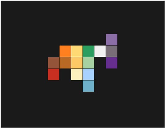
Like we described in the free ebook Web Design for the Human Eye, the right colour choice calls attention to prime content on the screen while also balancing against the size and spatial relationships of elements.
Below we've listed some of the most common – and most successful – colour schemes to make sure your website is dressed in its best.
01. Monochromatic
The most basic colour scheme is nonetheless effective.
A monochromatic scheme uses only one dominant colour, or different shades of the same colour, which complement each other well. Monochromatic schemes look visually pleasing and intensify the emotional responses of the colour involved, however, there can be some difficulty in setting certain elements apart.
Monochromatic colour schemes are quite common in minimalist design since they naturally emphasize the content and make even the simplest of typefaces appear bold and dramatic.
In fact, minimal and monochromatic designs feed into each other well: both emphasis one or two singular elements, both inherently suggest a theme of elegance, and both create an easy, less-distracting interface.
Get the Creative Bloq Newsletter
Daily design news, reviews, how-tos and more, as picked by the editors.

Wake uses a blue monochromatic scheme with white flourishes. Their dominant blue background – with a middle shade that's representative of the properties of both light and dark blue – emphasizes the colour's relations to both friendliness and professionalism, a perfect choice for a company that aids business communications and collaborations.
Adding another rival colour would only dilute this message, so a monochromatic scheme highlights the one central impression they wish to make.
Notice the variant shades of blue in the above navigation bar and "Play Video" button, to help separate these elements without deviating from the colour theme.
02. Analogous
Analogous colour schemes rely on colours next to each other on the colour scheme. This creates a more attractive design that's easy on the eyes.
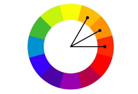
Analogous themes present more diversity than monochromatic themes, making it easier to differentiate elements, though they don't grab as much attention as sites that rely heavily on complementary colours.
Instead, sites with analogous colour schemes feel more calming and harmonious, and it's no surprise that this colour combination is often found in nature.
When using an analogous colour scheme for web design, designers often choose one colour to be the most dominant. This colour's emotional connections will be the most powerful, and overshadow the others. A second colour is just that: secondary. It's used to differentiate certain elements, or for typeface. If a third colour is used, it is often only for accenting.
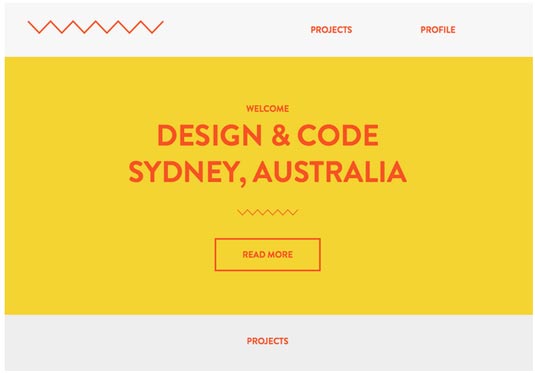
In the example above, the dominant colour is clearly a slightly dark shade of yellow, which gives off an energizing and friendly tone. The secondary colour, a red-orange hybrid, continues this theme, though it's distinct enough so that users can read the text clearly.
Notice how, if the red and the yellow were switched, the site would take a far more aggressive and stimulating tone, as the red would dominate the emotional connection.
03. Complementary
A complementary colour scheme takes advantage of opposite colours, creating a dynamic and emotionally stimulating page. The advantage to this scheme is that elements are clearly distinct from one another, creating an instantly comprehensible layout. However, its intense nature can work against you if you're aiming for a more relaxed atmosphere.
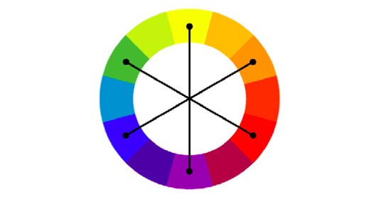
Just as with analogous colour schemes, one colour is dominant while another secondary, with the dominant colour setting the majority of the tone. When using complements, avoid desaturated colours, as they will weaken the potency.
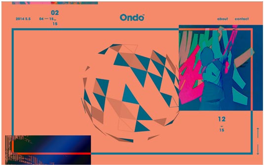
Ondo plays heavily on contrast for their site. A red-orange background dominates, setting a playful and energetic tone, while the blue-green secondary colour marks the clickable navigation options, brand name, and graphical flourishes.
As explained in Web Design for the Human Eye, the eye ends up dancing around the screen, from element to element, never quite settling one place for long.
This effect is heightened by the moving images, which slide up the screen bottom-to-top, creating even more eye candy. Notice how the border switches colour when the image passes through it.
04. Triadic
The triadic is the safest of the colour schemes, implementing three perfectly balanced colours joined by an equilateral triangle on the wheel.
While more diverse than the one- or two-coloured themes, the triadic scheme is still the most basic of the colour schemes with three or more colours. Triadic schemes take no risks in creating a visually secure site look, but offer no outstanding reward except security and some diversity.
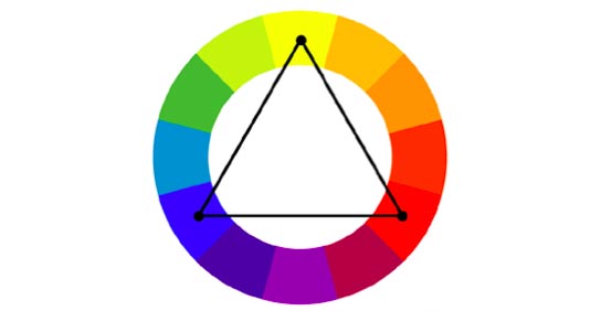
Many designers consider this to be the best colour scheme, although it really depends on the project. The triadic scheme is an excellent choice for sites appealing to a broad range of users: its safety makes it a "crowd pleaser," but with enough diversity and creativity to keep it from appearing dull.
However, lacking direct opposites makes it harder to draw attention to one single element over others (like a call-to-action), and likewise the stability means it's difficult to make it "edgy," a style which lends itself to sites in fashion, music, etc.

As a site that helps calm people before doctor's visits, the security and stability of a triadic scheme work perfectly for DocReady. The use of pastels also furthers this theme of safety.
The choices of red, yellow, and turquoise are common in the triadic scheme, although on this page the turquoise is dominant, encouraging a calmer vibe than the more stimulating red or yellow.
Notice the use of red for the "About Us" button, which signals clickability in comparison to the white etchings around it.
05. Split-complementary
The split-complementary colour scheme has the attention-drawing power of the basic complementary scheme, but with the added diversity of an extra colour.
This creates a more grounded site than if you were to use intense complement, while still allowing for more creative use of colour. The flexibility of the third colour, too, opens up a lot of new design options.
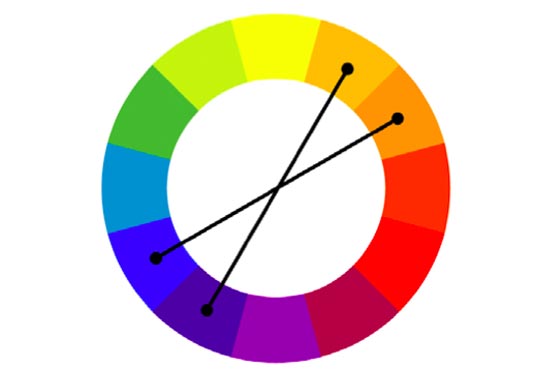
Browsing the web nowadays, you see a lot of the split-complementary theme. Most common is a site using dominant blacks and whites, with a splash of a third colour used sparingly to highlight an individual element (usually an attention-grabbing red or green).
This works fine, but tends to be simplistic. For a more stylized look, three primary colours can add more depth both visually and emotionally, though are more difficult to apply.

At first glance, Shopify's 2014 Commerce Report may not appear colourful – which is a sign of its clever application of colour. The text and graphics are really a dark blue, but they appear almost black thanks to the complementary yellowish cream in the background.
(The yellow background makes the dark blue appear even darker – and since it's already fairly dark, it has no where else to go in our perception except closer to black.)
To break up what would be an otherwise dualistic scene, the green in the main title acts as a visual centerpiece, tying the two complementary colours together and creating a unified image.
This illustrates the difference between split-complementary and basic complementary – an extra element to take some of the "sting" out and stabilize the whole screen.
06. Rectangular Tetradic (Compound Complementary)
One of the more complicated colour schemes, the rectangular tetradic scheme is nonetheless rewarding if done right.
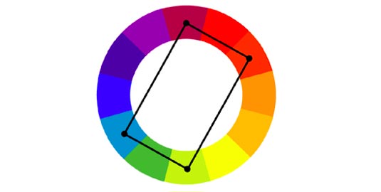
It consists of two complementary pairs of colours, allowing for the stimulating visuals from the opposites, while enjoying the diversity of four main colours. The design appears grounded and stable, but with certain areas more enticing than others – the complexity is why this scheme can also be somewhat difficult to apply well.
Extra care must be taken when choosing colours. As a general rule, try to balance the use of warm colours (red, orange, and yellow) and cool colours (blue and purple).
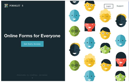
The home page for Formlets has a veritable rainbow of colours – two shades apiece for red, yellow, green, blue, and black, plus a heavy dose of white – though through proper application it seems rather simple.
While there is a lot of colour usage at play here at an expert level, for now we'll just point out the colours of the faces on the right: red, yellow, green, blue, and black. These colour choices are not random, but play off both the red-green and yellow-blue natural complements.
The distribution itself is done skillfully – there are only two each of the red and black faces, as these two colours are more powerful than the others, and would dominate the scene if there were more.
Conclusion
Colour schemes run the gamut of simple to complex, so you're free to choose the one you're most comfortable building, or that suits your site. If you're experimenting with flat design, one- or two-colour schemes can work very well, such as monochromatic, analogous, or complementary.
But if you have a lot of elements that you want to differentiate, try four, five, or more colours: this will allow you associate a single colour with a each individual element, establishing a pattern that will make a big impact on user learnability.
To learn more about how to master colour theory (and other disciplines) to make the strongest first impression on users, check out our free 85-page e-book Web UI Design for the Human Eye. Examples are analyzed from 33 companies including Tumblr, Etsy, Google, Facebook, Twitter, Medium, Intercom, and Bose.
Words: Jerry Cao
Jerry Cao is a content strategist at UXPin — the wireframing and prototyping app — where he develops in-app and online content for the wireframing and prototyping platform.
Like this? Read these!
- Design jargon explained
- How to choose a colour scheme for your logo design
- Free graphic design software available to you right now!

Thank you for reading 5 articles this month* Join now for unlimited access
Enjoy your first month for just £1 / $1 / €1
*Read 5 free articles per month without a subscription

Join now for unlimited access
Try first month for just £1 / $1 / €1

The Creative Bloq team is made up of a group of art and design enthusiasts, and has changed and evolved since Creative Bloq began back in 2012. The current website team consists of eight full-time members of staff: Editor Georgia Coggan, Deputy Editor Rosie Hilder, Ecommerce Editor Beren Neale, Senior News Editor Daniel Piper, Editor, Digital Art and 3D Ian Dean, Tech Reviews Editor Erlingur Einarsson, Ecommerce Writer Beth Nicholls and Staff Writer Natalie Fear, as well as a roster of freelancers from around the world. The ImagineFX magazine team also pitch in, ensuring that content from leading digital art publication ImagineFX is represented on Creative Bloq.
