Design interactive prototypes in Framer
Prototyping with code doesn't have to be tricky. Jarrod Drysdale shows you how to create a moving mockup with the help of Framer.

The reasoning behind design prototyping isn't new – it's the same as all the buzz about designing in the browser. When you see a design in its real context, it's totally different. You make better decisions when you don't have to make assumptions about how an interface will function and feel. This may sound like extra work, but the insights you can gain by seeing your design working are invaluable.
Framer is a new code-based prototyping tool. You can create mockups in Sketch (or Photoshop) just as you usually would, and import them into Framer. Then, write a little CoffeeScript and you can accomplish a lot.
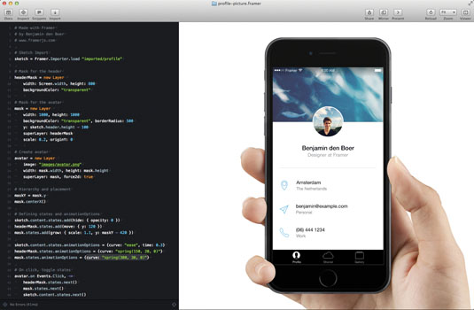
I'm going to teach you the basics of prototyping in Framer, using the example of an iOS app prototype with two views: a profile view and a zoomed-in view of the user's avatar image. We'll prototype how the expanded photo view will open and close, and we'll also animate it. View the online demo here (to see the source code, just click the icon in the top-left corner). You'll also need the free trial of Framer, which you can get at framerjs.com.
Import from Sketch
The first step is to import layers from Sketch into Framer. Simply click the Import button in Framer while the design is open in Sketch, and choose the correct file in the dialog that follows. Framer will automatically import images from each layer and make them accessible via code like this:
sketch = Framer.Importer.load "imported/profile"Use that variable to access the imported layers. For example, to reference the layer named 'content' in the Sketch file, you'd type sketch.content in Framer.
Create mask and avatar layers
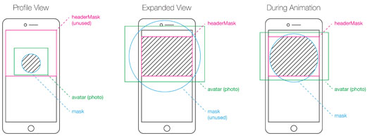
The core function of this prototype is to expand the avatar image when it's tapped, and then to close it when it's tapped again. First, we'll create two mask layers – a nested mask, or a mask inside another mask. We'll animate both masks at once to create a nice, subtle opening and closing effect. The headerMask layer will crop the avatar photo to a rectangle when it's expanded, and the mask layer will crop it to a small circle on the profile view.
Create the headerMask layer like this:
Get the Creative Bloq Newsletter
Daily design news, reviews, how-tos and more, as picked by the editors.
headerMask = new Layer
width: Screen.width, height: 800
backgroundColor: "transparent"
The first line of code creates and names the new layer. Then, using CoffeeScript's indentation syntax, we set the width, height and background properties. We'll use a transparent background so the layers beneath show when the avatar photo is expanded.
Next, create the mask layer:
mask = new Layer
width: 1000, height: 1000
backgroundColor: "transparent", borderRadius: 500
y: sketch.header.height - 100
superLayer: headerMask
scale: 0.2, originY: 0
We create a new layer and set properties in the same way. The large borderRadius makes this layer a circle. We position the mask layer so it overlaps the header layer, which was imported from Sketch. We'll also scale down to 20 per cent, or 0.2. An originY of zero sets the anchor point or registration of the image to the top edge.

The remaining property, superLayer, sets the headerMask layer we created as this new layer's parent. This is how masking works in Framer. Simply set the superLayer property, and the parent layer will mask the child.
Next, we need to create the avatar graphic and place it inside those new masks. To zoom and animate the cropping boundaries, we'll manually create the avatar layer. Copy a photo into the 'images' subfolder of the project folder. Then create a layer using that image:
avatar = new Layer
image: "images/avatar.png"
width: mask.width, height: mask.height
superLayer: mask, force2d: true
Notice that we set the superLayer of the avatar to be the mask layer. Both are now nested within headerMask. We also set the width and height so the image fills the masked area completely.
Last, we'll create a variable to store the Y position of the mask we'll use for the animation. We'll centre it horizontally, as it's larger than the screen.
maskY = mask.y
mask.centerX()
Define states
The first step in creating an animation is to define the beginning and end states. In Framer, states are like keyframes written out in code. A state is just a collection of properties. Every layer has a default state. For this prototype, that default will serve as the beginning point for the animation, so we only need to set a second state for each layer.
The syntax for states is very simple. Reference the layer, use the layer.states.add() method, and then list the properties to be included.
sketch.content.states.add(hide: { opacity: 0 })
headerMask.states.add(move: { y: 120 })
mask.states.add(grow: { scale: 1.1, y: maskY - 420 })
The second state for the content layer, which was imported from Sketch and contains all the other profile screen elements, should be completely transparent. This way, when the avatar is expanded, we'll have a black background and the remaining imported icons and elements will show through.

The second line of code creates a state for headerMask, which will simply move it down to a Y position of 120. This will allow the title and close button to show at the top of the screen when the avatar photo is enlarged. It will also animate the cropping boundaries of the avatar photo.
Lastly, a new state for the mask layer will both scale it up and move it up, using the maskY variable we created earlier. Because the originY (or anchor point) of the mask layer is its top edge, we need to move it up by 420 pixels so that the centre of the image is visible.
Animate between states
To animate between the default states and the new ones we just created, we only need four more lines of code. We'll set a click handler on the avatar layer. When a user taps it on the profile screen, we'll transition to the expanded view by cycling states. When it's tapped again, we'll cycle back to the default states so it returns to a small circle.The same lines of code handle both interactions:
avatar.on Events.Click, ->
headerMask.states.next()
mask.states.next()
sketch.content.states.next()
The first line of this block sets up the click handler on the avatar layer. Any time it is tapped, no matter how it is cropped or what size it is, the statements that follow will run.
Then we simply reference each layer, and use the layer.states.next() method to toggle states. When you use layer.states.next(), Framer will use its internal default animation settings. This is extremely convenient, but you can craft even better animations by finessing the animation curves.
When using states like we are here, you can easily change each animation curve separately by using the layer.states.animationOptions property. With just three slight adjustments, the animation feels completely different:
sketch.content.states.animationOptions = curve: "ease", time: 0.3
headerMask.states.animationOptions = curve: "spring(150, 20, 0)"
mask.states.animationOptions = curve: "spring(300, 30, 0)"
For the content layer that's fading out and in, we'll choose a simple curve preset, ease, and set animation duration to 0.3 so that it's very quick.

For the headerMask and mask layers, use a spring curve. For our purposes, you just need to know that the spring curve values change the speed and bounce of the animation. The values for the mask layer will make its animation much faster than headerMask and content. For more details on the spring curve settings, refer to the Framer documentation at framerjs.com/docs.
Try it on a real mobile device
Seeing the design on a real device is so much more effective than using emulators, and you will see the benefits in your work. Framer includes a mirror feature, which is a built-in server that offers a URL to your prototype over your local network. Simply visit the URL using your device.
You've learned everything you need to know to prototype your own designs in Framer. What are you waiting for?
Words: Jarrod Drysdale
Jarrod Drysdale is an author, design consultant, digital product maker. This article was originally published in issue 270 of net magazine.
Liked this? Read these!

Thank you for reading 5 articles this month* Join now for unlimited access
Enjoy your first month for just £1 / $1 / €1
*Read 5 free articles per month without a subscription

Join now for unlimited access
Try first month for just £1 / $1 / €1

The Creative Bloq team is made up of a group of art and design enthusiasts, and has changed and evolved since Creative Bloq began back in 2012. The current website team consists of eight full-time members of staff: Editor Georgia Coggan, Deputy Editor Rosie Hilder, Ecommerce Editor Beren Neale, Senior News Editor Daniel Piper, Editor, Digital Art and 3D Ian Dean, Tech Reviews Editor Erlingur Einarsson, Ecommerce Writer Beth Nicholls and Staff Writer Natalie Fear, as well as a roster of freelancers from around the world. The ImagineFX magazine team also pitch in, ensuring that content from leading digital art publication ImagineFX is represented on Creative Bloq.
