Design a contact page: 7 pro tips
Catalin Zorzini of Motash.com offers tips on creating contact pages your vistors will love.
What's the ultimate goal of a contact page? Is it to keep your customers happy? To give them a way to complain? To show that you are actually interested in hearing their feedback? To solve major problems in your products that you otherwise wouldn't know about? What about to increase your sales?
The answer to the question is all of the above, which gives you a new perspective as to how important that trusty contact page actually is.
For most designers the contact page is merely a few fields and a submission button, without much more thought put into it. It's time for that to change, considering customer service is a huge part in improving your sales and making your customers feel good. How many people do you think get ticked at companies because they either can't find a contact form, or the form isn't all that functional?
01. Ask the right questions
Designing a great web form requires you to ask various questions, such as "what information do we need to collect?" and "how will the information be used?"
The contact form is more than a basic form, so it's essential to ask other questions to discover what's required in your design.
Questions like:
- Who do the messages get relayed to?
- What's the main goal of having a contact form?
- Is the form accessible at any point of the shopping process?
- Is the information enough to solve a customer issue with just one email?
02. Allow access at all times
Imagine going to an ecommerce website to buy a pair of sneakers. You've been waiting around for months, since they're a new brand that are perfect for holding up to icy conditions, while also acting as sporty and stylish shoes.
The release day comes along, so you go to the website. You add the shoes to your shopping cart and try to punch in contact and payment information. Something goes wrong! The checkout system is not accepting your address.
You scan around for a contact page button in order to resolve this, but you can't find a thing.
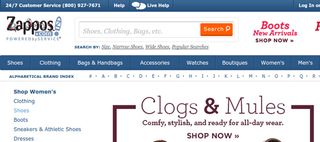
Poorly designed websites don't provide direct access to a contact page at all times. Templates with contact form buttons are often provided through some of the top ecommerce website building platforms, but you still have to keep an eye out to make sure that's always the case.
However, a link to a contact page should always be available in the primary navigation and the footer. Even better, include a sidebar that provides a small contact form embedded into the sidebar. This way, you take out a step and let people submit without leaving a certain page.
03. Skip the nonessentials
Does your company actually need customer addresses and phone numbers? Then why are they on your contact forms?
A contact form is one of the more basic forms you'll ever make, so why not try to make your customers happy instead of forcing them to take a bunch of time to fill them out?
It's interesting, because a long contact form ticks people off more than most items on your website, and it's not because the form takes too long to fill out. In fact, many folks simply don't like giving up that much personal information just to send your company an email. Therefore, it's best to stick to the essentials like name, email, subject and message.
04. Show your company has a personality
Many online companies have trouble showing off their personality. It's intimidating to act anything besides professional, yet every business, regardless of niche, should figure out how they can make their contact form unique.
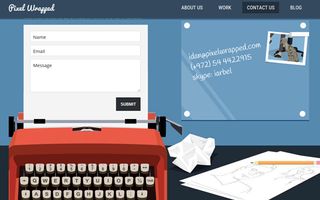
Even a law firm could add some personality by putting the fields on top of a law book, or including images of a courtroom, and placing the contact fields on top of a piece of paper that the judge is looking at.
The point is, don't let the contact form be another boring page. Let your brand shine so that people think of you again and want to come back to buy from your store.
05. Incorporate team images to instil a sense of trust
Tying into the fact that people don't like giving up their personal information, think about what a blank contact page looks like to a consumer.
Who are they sending this information to? It's almost as if a robot is sitting somewhere and just collecting all the information.
Build trust on a contact page by inserting team member pictures and even links to more personal information like social media pages and personal email addresses. This develops trust and shows that your company is more than a bunch of robots.
06. Link to additional contact options from the same page
Where are the rest of your contact items located? Are social media buttons on a completely different widget or page? What about a phone number or address?
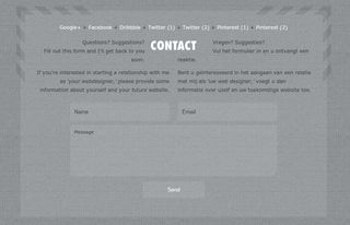
Don't forget that every other piece of contact information should complement the email form that's most commonly thought of when talking about contact forms. The same goes for support links. Why not include links to your forums, resources, FAQs and knowledge bases?
07. Consider mobile
Have you ever checked what your contact forms look like on a tablet or phone? Unfortunately, many responsive designs hide contact page links and widgets.
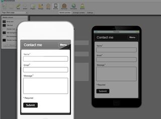
Make sure this is not the case, or modify it so that contact information comes up at the top of the mobile page. This way, people can click on quick links to make calls or send emails without leaving their phone.
Over to you…
Okay, designing a contact form isn't the most difficult part of an online store creation. However, this page is often forgotten about and left to rot without much maintenance. The problem being that a contact page truly helps your website convert, while also keeping customers happy.
Do yourself a favor and put more focus on contact form design. Heck, there's inspiration everywhere! Also, let us know in the comments section below if you have any suggestions for people working on their contact forms.
Words: Catalin Zorzini
Catalin is the founder of Matcha Tea (a daily blog about matcha tea, meditation and Japanese culture) and Mostash (a digital marketing studio).
Like this? Read these!

Thank you for reading 5 articles this month* Join now for unlimited access
Enjoy your first month for just £1 / $1 / €1
*Read 5 free articles per month without a subscription

Join now for unlimited access
Try first month for just £1 / $1 / €1
Get the Creative Bloq Newsletter
Daily design news, reviews, how-tos and more, as picked by the editors.
The Creative Bloq team is made up of a group of design fans, and has changed and evolved since Creative Bloq began back in 2012. The current website team consists of eight full-time members of staff: Editor Georgia Coggan, Deputy Editor Rosie Hilder, Ecommerce Editor Beren Neale, Senior News Editor Daniel Piper, Editor, Digital Art and 3D Ian Dean, Tech Reviews Editor Erlingur Einarsson and Ecommerce Writer Beth Nicholls and Staff Writer Natalie Fear, as well as a roster of freelancers from around the world. The 3D World and ImagineFX magazine teams also pitch in, ensuring that content from 3D World and ImagineFX is represented on Creative Bloq.
