How a 'Coming Soon' website should be done
How do you get people to sign up for a service you can't tell them about? We explore how Sillk squares the circle.

If you want to know how to design a "Coming Soon" page - particularly one for a new service you don't want to tell people too much about - you could do worse than check out Sillk for inspiration.
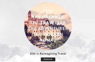
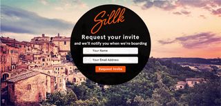
The idea behind this new travel service, to be launched in Spring, can't be revealed yet - but its creators wanted to drum up interest and email signups. The approach they've taken is to combine gorgeous imagery with a vague yet compelling teaser slogan and a simple call to action.

What's impressive is how the site's been built with basic psychology in mind. People are going to be intrigued, but with no real information on offer they're not going to hang around for long. Hence, the sign-up process is quick, easy and made to feel fun with some subtle, bouncy CSS3 effects.
Making it responsive
The designer behind it, Adarsh Pallian, used html5boilerplate as the base and media queries in CSS to design for various screen sizes. "Since the design involved a circle, I had to design for both large screens and laptop screens differently," he explains. "So that eventually forced me make iPad and iPhone friendly sizes as well.
Designing for Retina
Designing for retina was a pain point, he admits. "I'll be the first to admit that the site will break for retina displays. I tried adding a @2x logo, but it's still broken. My Christmas gift to myself is a retina display MacBook Pro so I can test and build for retina displays by default.
Analysing the data
Equally interesting is the approach Pallian has taken to dealing with the data he gets from the site. "I created a funnel system and used MixPanel to monitor where people drop off," he says. "For example, the first page has an 'Explore' button - I monitor how many people will actually click on that button.

"The next page has a destination form field - again, this is to see if I can keep user attention and emotion high. If they have gone through those two steps, I know they will give me an email address - and sure enough, according to my MixPanel analytics, they have."
Data informs design
Now he's using the data he's gathered to update the design. "Most people actually drop out before they click on 'Explore' on page one," he explains. "So I'm working on a new version of the landing page to fix that problem.
"I'm also starting a A/B testing campaign on Visual Website Optimizer that lets me swap out the background image for images of beaches, mountains, snow etc that I'm testing with various ad campaigns to see if it converts better."
Now read:
- Where to find textures for 3D work
- Create the perfect design portfolio: 30 pro tips
- The top 15 designer resumé tips

Thank you for reading 5 articles this month* Join now for unlimited access
Enjoy your first month for just £1 / $1 / €1
*Read 5 free articles per month without a subscription

Join now for unlimited access
Try first month for just £1 / $1 / €1
Get the Creative Bloq Newsletter
Daily design news, reviews, how-tos and more, as picked by the editors.
The Creative Bloq team is made up of a group of design fans, and has changed and evolved since Creative Bloq began back in 2012. The current website team consists of eight full-time members of staff: Editor Georgia Coggan, Deputy Editor Rosie Hilder, Ecommerce Editor Beren Neale, Senior News Editor Daniel Piper, Editor, Digital Art and 3D Ian Dean, Tech Reviews Editor Erlingur Einarsson and Ecommerce Writer Beth Nicholls and Staff Writer Natalie Fear, as well as a roster of freelancers from around the world. The 3D World and ImagineFX magazine teams also pitch in, ensuring that content from 3D World and ImagineFX is represented on Creative Bloq.
