Create storyboards for web animations
How to use storyboards to plan and communicate the animation on your next web project.
When it comes to animating user interfaces on a project, communication between designers and developers tends to break down if they aren't working side by side. In companies where animation deliverables are 'thrown over the fence' to developers, sometimes designs are handed down as animated GIFs or videos, with little else to guide the developers when recreating them.

Storyboards can help designers and developers communicate this very visual topic using its lowest common denominators: words and pictures. They require very little training to make and read, and you can create and edit them without the need for specialised software.
Storyboards are great for sketching out quick UI animation ideas during a team meeting and gathering immediate feedback. For rapid prototyping teams, wireframes can be a great way to document the patterns used, so successful patterns can be applied consistently as the project continues. And as design artefacts, they fit perfectly with style guides and design systems for documenting reusable animation patterns.
Storyboards can be created with software or sketched by hand. There is a halfway point: drawing on storyboarding templates. I use a handy printout for project meetings, which you can download here.
Collaborative storyboards
On their own, wireframes can help break down communication barriers between developers and designers by giving them a common, collaborative medium. But they are even more powerful when coupled with video and prototypes.
Often motion designers create and polish animations in a program that's not designed for web development, like After Effects CC or Keynote. Indeed, it makes sense to experiment with animations using visual tools. But alone, video is a poor deliverable for developers. A developer might spend hours trying to recreate a subtle bounce effect that could have taken seconds if they had only known the easing value used by the designer in their animation program.
Delivering storyboards alongside videos lets developers know exactly what steps to follow to recreate an animation. This is less intimidating than having to make many inferences (which might also frustrate their coworkers). The difference between a cubic and quintic curve is nigh-on impossible for a harried developer to spot in a 500 millisecond GIF. But for a sharp-eyed designer, the difference in production is glaring.
Sign up to Creative Bloq's daily newsletter, which brings you the latest news and inspiration from the worlds of art, design and technology.
The storyboarding process
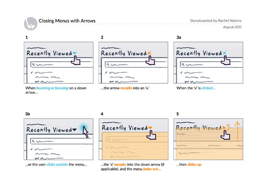
Modern storyboards at the office are quite a bit smaller than the large cork boards of the 1930s – they look more like a comic book page than a billboard. Just like a comic page, each panel illustrates and details a different snapshot in time. Underneath each panel is text detailing what's happening, how and why.
In web design, each of those panels could contain a screenshot, a wireframe, even a sketched micro-interaction, supported by notes expanding on what interactions trigger the animations, and over what period of time they occur.
Storyboards can be as macro or as micro, as polished or as rough, as you please. Do what makes sense for you and your team. I have created storyboards with index cards, Photoshop, and even Keynote. It's important to pick tools that everyone on your team can use and read, even if often that ends up being pencils and paper!
For UI animation, storyboarding should start alongside wireframing; right after user research and information architecture. If your workflow is more vigorous, you might start storyboarding alongside design. As long as you're thinking about animation early, you will be in good shape.
Colour-coded storyboards

In addition to the black and grey of wireframing, storyboarding benefits from reserving two special colours to indicate action and animation. I use blue and orange respectively, partly because they are discernible for people with various kinds of colour blindness. Blue subconsciously registers as an actionable 'link' colour, and orange is very active and stands out. Use these colours to indicate what user interactions cause which things to animate.
Get those digits
A picture is worth a thousand words, but in animation the right numbers can be worth even more. Be sure to include the duration of each part of the animation. Even adverbs like 'quickly' or 'slowly' will help paint a mental picture for those who need to implement the animations.
Spell out what properties are being changed: from colour and opacity to width or height. Use descriptive words like 'fade', 'shrink', 'slide', 'expand'. Phrases like 'pop, bounce and swoosh' have more subjective values, often affecting more than one property. Does a 'pop' involve expansion and contraction as well as a rise and fall? Save these words for naming your animation patterns once they emerge.
Stipulate the animation's exact easing. This value is supremely helpful to the people implementing the storyboard later on.
Number each panel
Numbering a storyboard's panels is a best practice sometimes discarded by cinema, but invaluable in web design. Starting from 1, they tell readers which way the action flows. Storyboards could come in vertical or horizontal layouts, and numbers quickly reinforce which mental model everyone should be using. Numbered panels allow quick feedback (for example, 'What about instead of panel 16, we use a nice fade?'), and let you index what animations and interactions happen and reference them accordingly.
Additionally, numerical panels let you add branching logic to your interactions or show several alternatives. For example, you could group several options for the fourth panel under 4a, 4b, 4c.
Use words
When adding notes to your storyboard, always detail why the animation is happening. Be sure you can justify the animation with sound reason. You may have to defend the animation to others, and if you can't explain why it's important to yourself, perhaps it's unnecessary for your users.
In my A List Apart post, Animation at Work, I list six different ways you can use animation to underscore relationships and hierarchy. Can you use two of these words to explain your animation?
Storyboard checklist
Each panel (or pair of panels for complex interactions) of your storyboard should demonstrate the following:
- What event or user interaction causes which things to animate
- How said things animate
- Why the animation improves the interaction
Often this breaks down into two panels:
- A clear indication of the trigger for the animations ('When the user clicks the button…')
- A description of the changes that follow ('...the button fades away to reveal…')
Colour-code your words, too, with interaction words (like 'click', 'hover' and 'focus') being underlined or written in your designated interaction colour, and descriptive works ('shrink', 'bounce', 'fade') using your animation colour.
Working with others on storyboards
The most common challenge we face when bringing animation to our projects is building a strong rapport with the people who design or code them. The second most common challenge is not standardising those animations we do implement. Both of these lead to inconsistent animation that gives our creations a sloppy, half-finished feel.
Storyboards address both of these challenges: communication and documentation. As such, they are powerful not just for their technical depth, but also for their ability to bring people closer together on a project. This is the spirit in which we must embrace storyboards: not as a tool to dictate but as a conversation to join.
This article contains information originally published in net and Web Designer magazines. Subscribe to net here; subscribe to Web Designer here.
Related articles:

