Create a grid that adapts to all screens
Develop grid systems that scale naturally across different devices and resolutions.
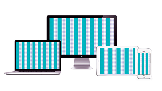
I guess you could say I'm a creature of habit. Every time I start a new responsive web design project, I duplicate the same exact grid into my working documents: a 20px column structure with a 20px baseline grid. I lovingly refer to this as the 'picnic blanket', as it reminds me of the red and white chequerboard blanket my mother used to put out on the lawn.
You might also recognise it as the pattern found on tablecloths in no-nonsense pizza joints. Instead of red I use cyan, but regardless, it serves the simple purpose of providing a foundation on which to build a well-organised design.
In the last couple of years, Google has led the trend for the use of an 8px grid, with other brands including Spotify quickly jumping on board.
Article continues belowAs consumers, our eyes have certain ways to quickly and easily comprehend the function of elements within a layout
While this makes absolute sense from the practical perspective of catering to mobile screens and using type sizes and leading counts that are multiples of four, the 8px standard doesn't leave any space for the layout to breathe.
With a grid that has a little more space, the elements can be more spread out, which is vital in adding perspective to the final design.
I'll spare you a long story about my early days of setting typographic grids in points and picas, but it was that approach that set me down this course within the digital realm.
As consumers, our eyes have certain ways to quickly and easily comprehend the function of elements within a layout: we first use scale to determine hierarchy, immediately followed by evaluating the negative space between those elements.
Sign up to Creative Bloq's daily newsletter, which brings you the latest news and inspiration from the worlds of art, design and technology.
Naturally, similar information types should be grouped closely, and maintain clear separation from unrelated types. Setting a grid with fewer delineations enables us to emphasise this spatial contrast because it allows for vast distances between elements, while still leaving plenty of breathing room between related content or functionality.
An 8px grid simply does not accomplish this until you get into multiples such as 16 or 24. While mathematically these sizes work, base 10 is far easier to deal with when using standard design tools such as Photoshop or Sketch, as it means you don't need to develop custom settings.
Grid rules
Join me as I walk through my typical process when setting up a grid. I'll start by running through some key rules to remember.
Consider all devices from the start
Often in our haste to get started we approach design with the idea that we will cover mobile later, or adapt to tablet from desktop. I know from experience that this simply does not work. If you don't plan for all content areas from day one, variations in content requirements between devices are likely to be neglected, as is user feedback.
Set your navigation first
'Workable area' is a bit of a misnomer because many designers assume it means the entire screen. In fact it does not. Side navigation, right rails and so on are allowed to fall outside the core grid area, and can be any width as long as they still allow for a uniformly sized content area.
Don't focus on screen size
Many designers get far too caught up in creating a grid that seamlessly fills 100 per cent of the content area they're targeting. This is a futile task, and means zero flexibility as layouts adapt to various screen sizes, both big and small.
Instead, focus on creating the appropriately sized structure for the content you need to contain, and allow this safe area to sit within the canvas size. This approach has similarities with book design, where the page size isn't the focus, but rather the workable area within it.
Keep column widths consistent
This is paramount to my approach of creating a unified grid system that will scale across all devices with as little design adjustment as possible.
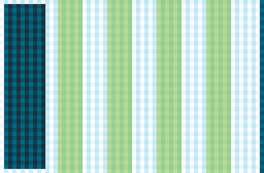
Rather than changing the column widths across devices, the width should remain the same, and the number of columns should vary depending on the viewport. The moment a viewport becomes too small to display a full column, that column removes itself from the layout and the position of the content area adjusts to account for its absence.
Take advantage of negative space
Keeping column widths standard means that you can maintain constant content area dimensions as well. Consider this: a comfortable width for reading body copy on a desktop computer is 720px. Within a 1,440px-wide layout this leaves 360px gutter on the left and right. You can use these rails for related content or advertisements, or even leave them open to focus your reader's attention. When adjusting for tablet, simply drop 208px off each side, leaving your content area with 152px on the left and right, with no additional design work required.
Plan column width with mobile in mind
If you're using the 'consistent columns' approach, it's helpful to remember mobile screens are simply a quarter to a third of the width of the desktop view. Consider this early on in your process, as you create content blocks for your larger viewports. If you use content blocks that already conform to this width limitation, there will be less adjustment required when designing the mobile view.
Think of TV as tablet
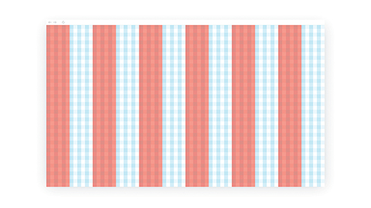
It's often exciting to think of TV as the largest medium available, but designing for a television screen is actually more akin to designing for tablet. This is because the elements need to be large enough to read from across the room. So despite having a large pixel density, TVs are better thought of as being 1,024px wide.
Stick to the grid, even when you break it
The term 'breaking the grid' should apply to the complexity of your visual system, not the positioning of elements in accordance with your initial 20px picnic blanket. When you turn the grid layer on you should see that every element has a home – either resting on a grid line or positioned exactly halfway between two gridlines.
Wave goodbye to gutters
If you plan your layout correctly, you won't need gutters (as you would in traditional print layouts). Instead, be sure that elements are sized so they fall short of the next column and allow the elements from that next column to align to the left. This will feel unnatural at first, but over time it will become something that you account for when conceptualising your layouts.
Advantages of a 20PX grid
There are cases where, depending on your type size selection, you might break the grid. An 8px grid conforms to typefaces and leading counts that occur in multiples of four. The 20px baseline doesn't hold as strongly to this approach, but can still function effectively. The key workaround is space.
In line with the principle that type should fall exactly on the baseline, this system allows for the inclusion of a bit more leading between lines. When working with odd type sizes, this helps increase legibility and adds more variety to the layout.
Constructing the grid
Everyone creates their grid layer differently. I prefer to set mine up as its own layer set in Photoshop, with one layer for the 'picnic blanket' and another for the columns. To create the picnic blanket I start with a 40px x 40px document and place a vertical 20px x 40px column on the left and a horizontal 40px x 20px row on the bottom.
I colour them both in near pure cyan (#00bff3) and give them 20 per cent opacity. This colour choice stands out over most documents. This layer is then tiled into a pattern that I can apply to a layer in the master PSD, so I can easily adjust its height.
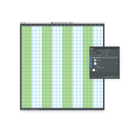
For the columns I typically create a grouping of vector shapes in the master PSD that are the appropriate column width. Depending on the colours of the design, these are either coloured in green (#00ff00) or red (#ff4040) and set to 50 per cent opacity.
I typically reserve guides for the ad hoc alignment of elements, and don't use them for things like grid structure. I don't want to risk confusing a temporary guide for the core grid system.
Some designers complain that this system disrupts their flow as they can't easily work underneath another layer in Photoshop. While this can be true (there are some workarounds, such as locking the layer) you'll eventually get a feel for the system, the distances will feel natural, and you'll turn on the grid less often.
Keep it consistent
Following this method of grid setup will allow you to quickly get to the exciting part of design: creation. You will start to think of your visual system as universal and naturally envision how your layout will adapt, before you even start. There will be less guesswork about the size of various elements such as navigation bars or buttons, and content blocks will feel grounded and consistent.
I enjoy sharing this method with others because it means we can divide work and still ensure a standard, high-quality outcome. I'd love to hear if this approach works for you too!
This article was originally published in net magazine issue 281. Buy it here.
