Create a Facebook banner that rocks: 10 expert tips
Stand out amongst the competition and showcase your creative skills. We show you how to utilise the Facebook banner size to the max.
In this article, we'll give you the Facebook banner size and other basic tips to help you to create a Facebook cover image that will wow your friends, clients and colleagues.
The option on Facebook to add a banner to brighten up your profile or fan page offers an excellent opportunity to creatives and agencies to showcase their design smarts and put a smile on people's faces.
However, Facebook banner size is fixed and there are strict guidelines as to what appears in a banner. So first we'll look at the most important guidelines you need to follow, and then we'll take a look at other design considerations to take into account when creating your banner.
Guidelines
01. Avoid copyright infringement
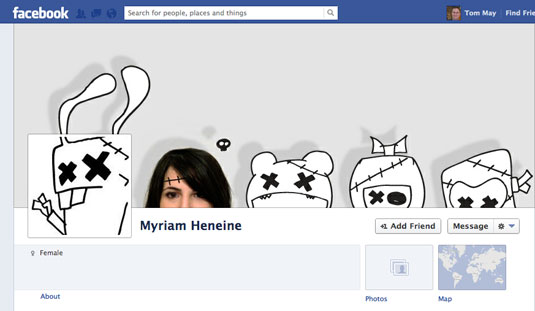
Facebook guidelines - as well as the law in general - dictates that you must avoid using images that are not yours when you create a Facebook banner.
If you think about it, this isn't the worst thing in the world: you want your Facebook page to be unique, so you might as well use a unique image. And you certainly don't want a public dispute erupting with the owner/creator of the original image.
02. No calls to action
You're not allowed to add a call to action on your banner (i.e. please click/like/share/buy/download/...). Adding an arrow directed towards the like button is similarly off limits.
03. No sales pitch
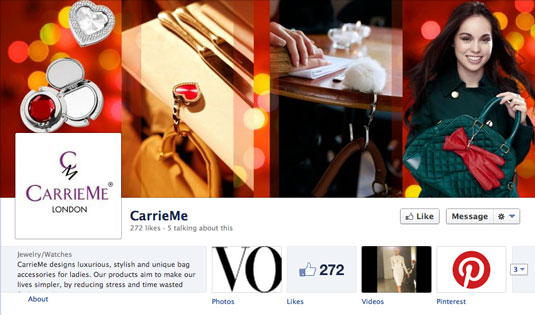
Officially, you're not allowed to mention a price, a promotion or a special offer on your banner. I've seen a lot of ecommerce websites flouting this rule and seemingly getting away with it, but it probably best to avoid anyway - after all, a picture is worth a thousand words...
Get the Creative Bloq Newsletter
Daily design news, reviews, how-tos and more, as picked by the editors.
04. No contact information
Facebook won't allow you to put your contact information - email, phone number, address and so on - on the banner. These must be mentioned in the About section of your page.
Design advice
Now that you know the dos and don'ts of creating a Facebook banner design, let's look at what you can do to make it great looking...
05. Facebook banner size
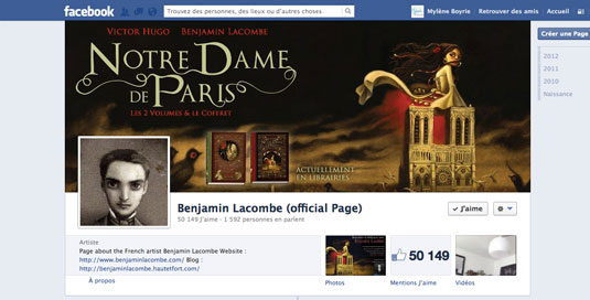
First of all, make sure you create a banner with the right size. Facebook banners are 851 x 315 pixels. If you don't create a banner with these exact dimensions, when you'll upload it, Facebook will ask you to adjust the picture to the page, and you may end up cropping an important part of the picture.
06. Watch out for image resolution
Facebook lowers the resolution of your images when you upload them. So if you want to avoid displaying a fuzzy banner, it's best to play around with different settings when exporting them for the web.
07. Write your page's name
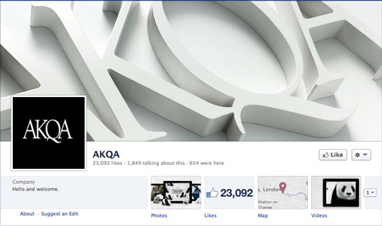
You may not be allowed to add marketing information when you create a Facebook banner, but you can add your name, or the name of your business. The first thing your fans will see is the banner, so writing your name distinctly will help make an instant impression.
08. Harmony
Don't just choose a generic photo that could fit for any activity: try to fit your banner to your page's theme. Too many companies settle for generic lifestyle shots, which is unlikely to make people remember your page. So if you run a cake shop, ask yourself whether your Facebook banner could fit the page of a gardening business. If the answer's yes, you might want to consider redesigning.
09. Be creative

If you're a great photographer or illustrator, showcase your best work. If you're a designer, don't hesitate to spend a little time on this design - it's worth it in the long run. Facebook banners are a great space to show skills and creativity. For some people it will be first, and possibly only time they connect with you or your brand online - you have to make the most of it!
10. Keep it fresh
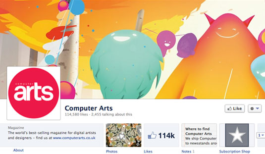
If people are likely to visit your Facebook page on a regular basis, consider varying the content of your banner often to keep things fresh.
For example, our sister titles .net magazine and Computer Arts both update their Facebook banners to incorporate the latest cover illustration every time a new issue comes out. Similarly, the Creative Bloq Facebook banner image changes every Monday, as we release a new free, downloadable wallpaper.
Contributed by: Mylène Boyrie. Mylène Boyrie is a freelancer from Bordeaux, France, specializing in print and digital design. Follow her on Twitter.
Do you or your design business have a creative Facebook banner? Tell us about it in the comments!

Thank you for reading 5 articles this month* Join now for unlimited access
Enjoy your first month for just £1 / $1 / €1
*Read 5 free articles per month without a subscription

Join now for unlimited access
Try first month for just £1 / $1 / €1

Craig Stewart is a writer, SEO strategist and content marketer, and is a former editor of Creative Bloq. Craig has written about design, typography, tech and football for publications including Creative Bloq, T3, FourFourTwo and DSG, and he has written a book on motoring for Haynes. When he's not writing, you'll usually find Craig under his old car learning about DIY repairs the hard way.
