How to create custom animations with Motion UI
Create custom animations for your design elements with Motion UI.
Sign up to Creative Bloq's daily newsletter, which brings you the latest news and inspiration from the worlds of art, design and technology.
You are now subscribed
Your newsletter sign-up was successful
Want to add more newsletters?

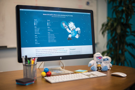
Motion UI is a Sass library from the folks at ZURB for creating custom CSS transitions and animations. A big focus of the library is using transitions to show a change in state – for example, sliding in and out a sidebar on click. In this tutorial, I'll show you how to use Motion UI with the recently-released Foundation for Sites 6 to animate elements of your designs.
Setup

Foundation's starter projects require Node.js and Git to be installed on your machine. You'll also need to download the Foundation CLI – a tool that sets up blank projects in all three Foundation frameworks.
Run the following command:
npm install foundation-cli --global
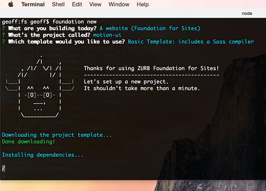
Once you have the CLI, you can use the foundation new command to set up new projects. We'll use a more specific command to get the project we want – in this case a basic Foundation for Sites project in a folder called motion-ui:
foundation new -f sites -t basic -d motion-uiWhen the CLI finishes installing the project, open the folder in your command line and run npm start to start the Sass compiler.
Next, open index.html in your browser. Now we can get started.
Animating with Toggler
Foundation 6 includes Toggler, a new JavaScript plugin for rapidly prototyping stateful plugins. To start with, we'll use Toggler with Motion UI to animate an element in and out on click.
Let's add the animations to the big panel below the title area. We're going to add the data-toggler and data-animate attributes. We'll also use a unique ID to the panel, so we can target it later.
Sign up to Creative Bloq's daily newsletter, which brings you the latest news and inspiration from the worlds of art, design and technology.
<div class="row">
<div class="large-12 columns">
<div class="callout" id="callout" data-toggler data-animate="fade-in fade-out">
We've given the callout an ID of callout, and the attribute data-animate includes two of Motion UI's built-in transition classes. Toggler will leverage them when the element animates in and out.
Next, we need to include a click trigger. Let's add a button above the callout, with the attribute data-toggle. The value of data-toggle is the same as the ID of the callout we want to open and close.
<button type="button" class="button" data-toggle="callout">Toggle Callout</button>Refresh your browser and click the button. The first time you click, the panel will fade out. Click again and it will fade in, and so on.
Motion UI includes over two dozen built-in transition classes. Try replacing the fade effects with hinge effects:
<div class="row">
<div class="large-12 columns">
<div class="callout" id="callout" data-toggler data-animate="hinge-in-from-top hinge-out-from-top">
Built-in Components

Some of Foundation's built-in plugins – such as Reveal and Orbit – also have Motion UI support. In this next example, we'll add a modal to the page and give it a custom animation.
First, let's add the modal and a trigger to cause it to open. Open up your index.html page, and add this code anywhere:
<p><a data-open="modal">Click me for a modal</a></p>
<div class="reveal" id="modal" data-reveal>
<h1>Awesome. I Have It.</h1>
<p>Your couch. It is mine.</p>
<button class="close-button" data-close aria-label="Close reveal" type="button">
<span aria-hidden="true">×</span>
</button>
</div>Our modal works, but it just blinks in and out when it opens and closes. Let's spice things up with a slide effect. You'll need to add two attributes to the modal: data-animation-in and data-animation-out. Let's use a scale animation this time:
<div class="reveal" id="modal" data-reveal data-animation-in="scale-in-up" data-animation-out="scale-out-down">
<!-- ... -->
</div>
Just as with Toggler, you can use any Motion UI class and the modal will animate.
Writing custom effects
Motion UI includes a number of built-in effects, but the real power in the library comes from writing your own using transition mixins. Let's swap out the scale effects for two custom hinge effects.
Open app.scss and add this CSS rule:
.hinge-in {
@include mui-hinge(
$state: in,
$from: top,
$fade: true,
$timing: map-get($motion-ui-easings, bounceInOut)
);
}
Let's break down what the parameters we're using here do:
- $state is either in (for transitions that play when the element is appearing) or out (for elements that are disappearing)
- $from is the origin point of the hinge: top, right, bottom or left
- $fade is either true or false, and allows you to play a fade effect with the transition
- $timing changes the timing of the effect. There are a few custom timing functions, including the bounce effect we're using here
We've added the in effect, but we also need to add the out effect. Add this code below .hinge-in:
.hinge-out {
@include mui-hinge(
$state: out,
$from: top,
$fade: true,
$timing: map-get($motion-ui-easings, bounceInOut)
);
}
Lastly, let's replace the modal's default hinge with our custom hinge.
<div class="reveal" id="modal" data-reveal data-animation-in="hinge-in" data-animation-out="hinge-out">
<!-- ... -->
</div>
Motion UI has five transition effects: slide, hinge, scale, spin and fade. These can be played forwards or backwards, for in or out transitions. All these effects have built-in CSS classes, but as you've seen, it's also possible to write custom versions of any of them, with custom CSS classes.
Working with animations

Motion UI supports CSS animations as well as transitions. The animation mixins create a set of CSS keyframes that can be dropped on to any element. The effect plays as soon as the class is added.
Let's start by building an effect and applying it to our existing content. In index.html, add a class to the 'Welcome to Foundation' text at the top.
<h1 class="welcome">Welcome to Foundation</h1>Next, in app.scss, we'll create a basic fade effect.
.welcome {
@include mui-animation(fade);
animation-duration: 1s;
}
Refresh the page and you'll see the text instantly fade in. But we can do more! Remember that list of five transitions from earlier? It's possible to use those same five transition effects in any animation, and you can also combine any number of them into one effect.
Let's augment the fade with a slide:
.welcome {
@include mui-animation(fade, slide);
animation-duration: 1s;
}
You may have noticed that we haven't configured any of these effects. Let's change slide to slide() and pass in a parameter to change the effect.
.welcome {
@include mui-animation(fade, slide($direction: up));
animation-duration: 1s;
}
Now the text will slide in from the bottom, instead of from the right, which is the default.
Let's add one more effect just for the sake of our example. ZURB does not endorse this gratuitous use of animation in UI design.
.welcome {
@include mui-animation(fade, spin, slide($direction: up));
animation-duration: 1s;
}
You've created a monstrosity! Instead of having the effect play automatically, you can set it to only trigger on click. Simply remove the class from the HTML, and add it using JavaScript in response to a click, or some other browser event.
And that's animation in Motion UI! But the library has one more trick up its sleeve with animation.
Animating elements in series
In the last section, we showed how to animate a single element with a custom effect. Motion UI also supports series animations, allowing you to set up multiple elements to animate in sequence. For each element, you can define a length for the effect, and optionally a delay before the next one plays.
First we need some elements to animate. How about those five link sections in the big callout? We can make them appear in series when the page loads. Open index.html and find those five sections – they're all .large-4 medium-4 columns. Add the class .column-1 to the first one, .column-2 to the second one, and so on. The code will look like this:
<div class="callout">
<!-- ... -->
<div class="row">
<div class="column-1 large-4 medium-4 columns"><!-- ... --></div>
<div class="column-2 large-4 medium-4 columns"><!-- ... --></div>
<div class="column-3 large-4 medium-4 columns"><!-- ... --></div>
</div>
<div class="row">
<div class="column-4 large-4 medium-4 medium-push-2 columns"><!-- ... --></div>
<div class="column-5 large-4 medium-4 medium-pull-2 columns"><!-- ... --></div>
</div>
</div>
We now have five classes (.column-1 through to .column-5), which we can apply effects to. Motion UI will time the effects for us, so they play one after another.
Open up app.scss. To set up our animation queue, we start with the mui-series() mixin. Note that this mixin doesn't go inside a CSS selector; it's just at the root of the document.
@include mui-series {
}
Inside mui-series(), we'll add CSS selectors for our five column classes. Inside each class we use the mui-queue() mixin to add a new item to the queue. The queue moves in the same order as our CSS, so we'll start with .column-1.
@include mui-series {
.column-1 {
@include mui-queue(0.5s, 0s, fade);
}
}
The first number in mui-queue() is the length of the effect, while the second number is the gap between this effect and the next one. In this example, the gap is 0s , which means the next effect will play instantly, as soon as the previous one is done.
The last parameter, fade, is the effect we want to use. However, like with mui-animation(), we aren't limited to just one effect. We can add more effects as additional parameters, and configure them exactly the same as with mui-animation().
@include mui-series {
.column-1 {
@include mui-queue(0.5s, 0s, fade, slide);
}
}
Now let's add the other four classes. To make things easy, we'll give them all the same effect – just cut and paste.
@include mui-series {
.column-1 {
@include mui-queue(0.5s, 0s, fade, slide);
}
.column-2 {
@include mui-queue(0.5s, 0s, fade, slide);
}
.column-3 {
@include mui-queue(0.5s, 0s, fade, slide);
}
.column-4 {
@include mui-queue(0.5s, 0s, fade, slide);
}
.column-5 {
@include mui-queue(0.5s, 0s, fade, slide);
}
}
Switch back to your browser, refresh the page, and ... nothing happens. That's because Motion UIs have to be manually triggered with a class. The class is called .is-animating, and it's used for all series animations.
To keep things simple, we'll add the .is-animating class to the HTML, so the effect plays automatically on page load. To keep things even more simple, we'll add the class to the body.
<body class="is-animating">Now when you refresh the page, your fancy animation queue will play. You'll see all of the callouts sections slide in one at a time.
Try changing the timing of the series by altering the durations and gaps of each effect! You can even set a negative gap, which will cause two effects to overlap.
The Future of Motion UI

Motion UI was originally bundled with Foundation for Apps, a framework for creating responsive, Angular-powered web apps, which launched in December 2014. Earlier this year, the ZURB team pulled out the Foundation for Apps motion model, souped it up with new effects and the animation queueing system, and released it as the standalone Motion UI library.
All blank Foundation 6 projects ship with Motion UI already installed, and a number of the framework's JavaScript plugins work seamlessly with Motion UI, as you've seen in this tutorial. Soon, the new Motion UI will be integrated back into Foundation for Apps, replacing the framework's existing motion module. In the future, Motion UI will also be expanded with new effects, and more robust ways to combine effects.
This article was originally published in issue 276 of net magazine.
Related articles:
- 3 animation techniques UX designers need to know
- The web designer's guide to responsive web design
- The very best WordPress tutorials
