Create clickable, live prototypes in Sketch
As builds evolve, so must our mockups. Clark Wimberly explains how to create a complex, moving mockup with Sketch and InVision.
Websites (and apps) ain't what they used to be. Gone are the days of delivering a single PSD and calling it a day. Modern designers are expected to deliver 'systems' – usually a complex series of design elements, styles and interactions.
Add a non-technical stakeholder or manager into the mix, and getting sign-off for a complex app can get pretty dang sticky, and quickly. We've got drawers that open and modals that pop up and forms that are dynamic and soon someone around the meeting table won't quite be able to picture it. The solution is to up your game. With a little wrangling, our mockups can move, show complete user paths, cover the ins and outs... they can come to life.
For building living prototypes, Sketch – the Mac graphic design application that's taking the world by storm – and browser-based design collaboration platform InVision, are a match made in heaven.
We use both full-time at The Zebra, an insurance startup where my team of designers, developers and product people use countless prototypes to envision new features, new pages, even entire redesigns. For this tutorial, we're going to build an imaginary status tracker, a tool for folks in our office to log words of praise for each other (sort of like an internal, super-positive Twitter). We'll build a home view with a generic social timeline, along with a menu that opens and closes.
01. Create a new Sketch document
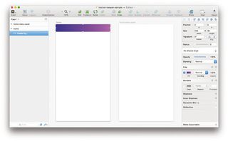
First, create a new Sketch document. Inside, we're going to make two artboards, one for the normal home view, and one for the open menu view. Press A to bring up the Artboard tool, which has popular screen resolutions built-in. Select iPhone Portrait.
02. Create a home view artboard
Click anywhere in your canvas to create a new artboard. Rename it 'home', either with cmd+R or by right-clicking and hitting Rename. This artboard will be the 'home view' of your app. Press cmd+D to duplicate the artboard, and change the newly created screen's name to 'home-menu-open'.
03. Make an app header

Inside the 'home' artboard, we're going to create a standard app header. Press R to select the Rectangle tool, and draw out a 640x90 rectangle at the top of the artboard. Rename this shape 'header-bg'.
Get the Creative Bloq Newsletter
Daily design news, reviews, how-tos and more, as picked by the editors.
04. Set a background colour
The tools palette on the right-hand side of Sketch is called the Inspector, and it's where you'll find all the properties of shapes, text, groups and more. With the 'header-bg' object selected, let's turn off the border and pick a fill. My app is flashy, so I've picked a neon gradient. While we're at it, let's set a background colour – white – for our artboards. Check the 'Include in export' option, which will ensure our app screens don't come out transparent.
05. Add menus and titles
For the rest of the header, let's add a menu icon, and app title, and an action button. I'm making my hamburger icon from scratch by drawing out three identical rectangles. I'll also group them for easy positioning (slightly off the left edge).
06. Tweak font size and spacing

Press T to enter some text, and key in the title of your app. I'm building an internal activity tracker, so I'm going with 'Tracker Keeper'. The font size, colour and spacing is located in the Inspector panel on the right.
07. Adding icons
On the right side of the header, I've added a 'plus' icon, which would be used to let the user add an activity to the stream. Again, I've drawn this icon myself.
08. Convert the header to a Symbol
Once our header is done, we're going to convert it into a Symbol, which means we'll be able to use it again and again around our document. By converting our header into a Symbol, we can apply it to the second screen, and any changes to either header will be reflected in the opposite header.
09. Group your items
To make a group, select the rectangle, icons and text we just created and press cmd+G. We want to rename this group to something clear, so press cmd+R and type 'header'. In the layers list, right-click your 'header' group and pick Create Symbol. A Symbol is denoted in the layers list by a purple-coloured folder. Keep an eye on all purple folders, as changing one will result in all others being updated. With great power comes great responsibility.
10. Builing an activity timeline

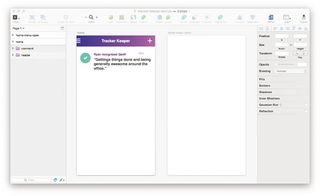
Still on the 'home' artboard, we can start to build our activity timeline. This example app will collect and display positive comments from one team member to another. Let's make a single comment. I'll make a circle using the Oval tool, and place an icon inside using Symbolset (one of my favourite font tools). I'll also add some text and a timestamp.
11. Make a grid
Like we did with the header, let's round up the elements we just created and turn them into a group (cmd+G). Rename the group 'comment', then turn it into a Symbol. With the 'comment' Symbol selected, choose Arrange > Make Grid. We're going to make a grid with five rows (with a 40px margin) and one column, giving us a single stack of comments, similar to Twitter.
12. Adding copy
For the sake of making an interesting mockup, let's change the comment text inside each instance of the Symbol. Simply select the text layer and find the 'Exclude Text Value From Symbol' checkbox in the Inspector palette. Move down the line and change each comment to something inspirational and more becoming of an awesome startup. At this point, I'll also change each time stamp and name.
13. Open your menu
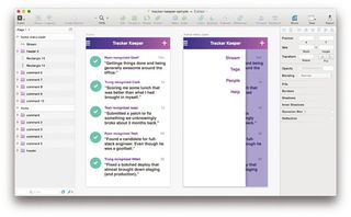
With your basic homescreen now complete, we're going to copy the entire screen into your other artboard, 'home-menu-open'. This artboard will capture what the homepage looks like with the menu open. Select our current elements and then duplicate them (cmd+D). Drag your new layers into the 'home-menu-open' artboard. Since everything we just duplicated is a Symbol, any changes you make on the 'home' artboard will be reflected on the 'home-menu-open' artboard.
14. Draw your menu

For our sample app, we're going to make a pretty simple menu. Using the rectangle tool, I'll draw two shapes: a white box on the left side of the screen, and a coloured box on the right, to act as the overlay. Using the Text tool, let's add some menu items to our fake app. We're getting close to making this thing come alive!
15. Exporting assets
With Sketch, exporting screens (and assets, slices and so on) is super easy. Simply select your artboards in the layers list, then find 'Export' over in the Inspector palette. As our artboards are already sized correctly, let's just go with 1x PNG files. If you were making real assets, here's where you would crank out all your varying sizes and formats. Handy!
Next page: more on how to create clickable, live prototypes in Sketch...

Thank you for reading 5 articles this month* Join now for unlimited access
Enjoy your first month for just £1 / $1 / €1
*Read 5 free articles per month without a subscription

Join now for unlimited access
Try first month for just £1 / $1 / €1
The Creative Bloq team is made up of a group of design fans, and has changed and evolved since Creative Bloq began back in 2012. The current website team consists of eight full-time members of staff: Editor Georgia Coggan, Deputy Editor Rosie Hilder, Ecommerce Editor Beren Neale, Senior News Editor Daniel Piper, Editor, Digital Art and 3D Ian Dean, Tech Reviews Editor Erlingur Einarsson and Ecommerce Writer Beth Nicholls and Staff Writer Natalie Fear, as well as a roster of freelancers from around the world. The 3D World and ImagineFX magazine teams also pitch in, ensuring that content from 3D World and ImagineFX is represented on Creative Bloq.
