Container-based RWD with element queries
Discover how element queries will change the way we create design systems and approach reusable components.
Jonathan Snook will be discussing responsive web apps with container queries at Generate Sydney on 5 September; book your ticket on Thursday to take advantage of our 24-hour flash sale and get 50 per cent off!
When RWD was invented, it completely changed how we thought about design and approached problems. Now, element queries are about to have a similar impact on how we approach design patterns, encouraging the creation of design systems. Element queries are RWD levelling up.
Media Query Limitations
Information about the browser window or device screen size is the most reliable way to determine changes to a website design. Although we can achieve quite a lot with media queries, we are unable to make design decisions for individual components based on anything other than the size of the viewport. A component is locked to a rigid set of requirements. Changes happen through media queries of the screen size, yet a component's location within the layout is an unknown variable. The results of these queries will modify the layout of the entire page, not the component alone.
For example, let's say we have a class of .image-container that makes up 20 per cent width on small screens. When its parent is 600 pixels or larger, .image-container should jump up to 35 per cent width. To make this scenario work, we set .image-container to width: 20%; and write a media query for when the parent reaches a width of 600px.
This won't take effect at a viewport width of 600px – the parent won't be that size until the viewport is at least 900px wide. The media query to target the width of the parent must be written with that viewport in mind.
@media (min-width: 900px) {
.image-container {
width: 35%;
}
}
Let's look at another scenario with that same media query. A 300px sidebar sits next to the parent of .image-container. What happens if we need to reuse the .image-container in that sidebar at a 900px viewport size?
The container gains 35 per cent width. However, as its parent is less than our 600px width, it would be better for the container to gain 20 per cent width. In order to modify the width at the correct media query, the CSS needs to be adjusted to include the new parent. Instead of the component size being conditional on its width, it is dependent on its parent's name and the size of the viewport.
What are Element Queries?
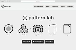
Problems like this are persistent when creating responsive sites. Efforts to componentise websites, like Pattern Lab, have latent potential. However, elements still need to be designed within the scope of a page layout. The next step in making RWD more fluid is to enable any site component to live anywhere in the page layout at any time.
Element queries are an attempt to bring responsive design to a component level, by setting breakpoints based on the conditions of elements instead of the viewport. This allows greater, granular control of an element, so it is capable of effectively adapting to the constraints of the layout, independent from the viewport shape.
Element Query polyfills
Since element queries are still in an early draft, we have to rely on JavaScript polyfill implementations for now. There are a handful of polyfill tools to choose from, and many will support browsers as far back as IE7 (which is better supported than even media queries). In this article, I'll be diving into eq.js by Sam Richard.
Let's say we are running a news site. With each article we have the same information: a photo, a headline, the date and the author's name. The article component can show up in any of three places: the main content area (<main>); a supplemental content area (<aside>), which is below the main content on small screens and in a smaller right-hand column on larger screens; and finally the footer (<footer>).
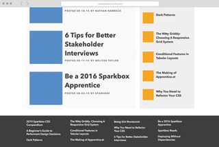
Each area has decreasing size constraints on the article component. main allows the component to grow to its largest possible size. aside keeps the component at a middling size. Whenever the aside is as wide as the main, the contents of the aside is broken into two columns. Meanwhile the footer will always remain in its smallest format. This will be enforced by increasing the number of columns using media queries.
To begin we need to define our component:
<article class="article">
<header class="article-header">
<h1 class="title">...</h1>
<p class="author">...</p>
<p class="date">...</p>
</header>
<div class="image">
<img src="{{article.link}}">
</div>
</article>
Data attributes and JavaScript
With eq.js we need to define our widths within our HTML with a data attribute. The JavaScript watches the width of the element with this data attribute, and when one of the specified widths is hit, it creates and updates another data attribute that is used in the CSS to modify the styles.
For our news items we have some very specific sizing events to meet, as well as some content priorities to consider. The most important element is the headline, followed by the date, the image, and finally the author name.
With this in mind, we can make informed design decisions based on the space available.
<article ... data-eq-pts="small: 300, medium: 400, large: 600">Working with the element alone on a page, we have been able to define the necessary breakpoints as 300px, 400px and 600px. Below 300px only the article title is displayed. At 300px we bring in the article's post date. At 400px we bring in the article image and author name. At 600px we can increase the size of the image.
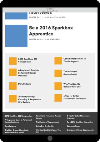
eq.js watches the width of each .article on the page, and will add data-eq-state="small" to the element when the first breakpoint is reached. As the element continues to grow, each additional key name will be added to a space-separated list in the attribute.
By the time .article hits a minimum width of 600px, the attribute will contain all three key names: data-eq-state="small medium large". These dynamic attribute values, paired with attribute selectors in our CSS, are the tools needed for our element queries.
Attribute selectors
We can scope our CSS to specific widths only by using an attribute selector with a dollar sign: .article[data-
eq-state$="medium"] {...}. Any styles applied in this manner will only display when the attribute value ends with medium.
We can also set more min-width-like styling using the tilde: .article[data-eq-state~="medium"] {...}. This type of attribute selector will apply styles wherever medium is within the data-eq-state attribute (here, the medium and large breakpoints).
We want to start off by hiding the article's date, image, and author at the smallest view of the module. As these are supplemental content to our article title, hiding these items does not diminish our content. To keep this simple we will just add a display: none; to .author, .date and .image, and bring them in with attribute selectors.
For our possible layouts and uses, this means our module will only display the article title when the module is less than 300px wide. Our first breakpoint adds in the post date of the article.
.article[data-eq-state~="small"] .date {
display: block;
}
At 400px wide we will pull in the article image and the author.
.article[data-eq-state~="medium"] .author,
.article[data-eq-state~="medium"] .image {
display: block.
}
Then, of course, we want to make sure our image makes the jump from 20 per cent to 35 per cent when the parent reaches a width of 600px.
.article[data-eq-state$="large"] .image {
width: 35%;
}
Now wherever this reusable component is placed on the page, it will format the content and the design to fit that space.
Contextual design
One of the wonderful things that element queries affords us is the ability to add contextual design if the space is available in an element. Furthermore, this can be an element query in and of itself.
There are two pieces of content within our component that could use some additional context when the space allows. The first is the author. It is nice to have the author listed, but, we can add 'By' or 'Written by'. A similar extra level of contextual information can enhance the date. A 'Posted on' can be added, or a shorthand date could be extended to a full-length version.
These types of enhancements are unpredictable with media queries. However, element queries give a new level of precision to not only design, but also contextual content.
Container queries
The RICG has carried the torch on element queries for a while, and prompted an upswing in conversation surrounding the proposed feature in the early half of this year. This, however, has led to the inevitable realisation that element queries, as proposed, present one fundamental issue: an infinite loop of style changes.
.article:media(min-width: 600px) {
  width: 599px;
}
You may be thinking, here I’ve written an elaborate explanation of element queries today, and now I’m saying it’s irrelevant? Not at all. Element query polyfills are still quite usable and viable today. What has happened is a slight shift in the conversation around making element queries a web standard.
The result is to change the rules around how an element query can be implemented. Instead of allowing an element to query itself, it must now rely on its containing element. Mat Marquis wrote at length about this shift. Fundamentally, this affects very few of the use cases for element queries; even the name isn’t in any real need of a change, as elements are still being queried.
When implementing element query polyfills keep this approach in mind, as there is a very real possibility of initiating an infinitely looping style block. Much of this tutorial follows a container query method; scoping styles to parent element queries instead of the elements themselves. Most of the polyfills do not account for this possibility, so use good judgement and test often when implementing element queries.
Future of Element Queries
There is still a long road ahead for the element query. Thankfully the Responsive Issues Community Group (RICG) has taken the lead to see element queries in some form or another become a web standard.
Native implementation aside, the abilities of element queries, and reasons for making the shift to using them today, are vast. The possibilities of what element queries can bring to the future of web design are quite exciting.
Words: Philip Zastrow
Philip Zastrow is a developer at Sparkbox.
Learn more about container queries at Generate Sydney, where Jonathan Snook will explain how Shopify used them to create a responsive web app. Book during our flash sale on 21 July and get 50 per cent off your ticket price!
This article was originally published in issue 275 of net magazine.

Thank you for reading 5 articles this month* Join now for unlimited access
Enjoy your first month for just £1 / $1 / €1
*Read 5 free articles per month without a subscription

Join now for unlimited access
Try first month for just £1 / $1 / €1
Get the Creative Bloq Newsletter
Daily design news, reviews, how-tos and more, as picked by the editors.
The Creative Bloq team is made up of a group of design fans, and has changed and evolved since Creative Bloq began back in 2012. The current website team consists of eight full-time members of staff: Editor Georgia Coggan, Deputy Editor Rosie Hilder, Ecommerce Editor Beren Neale, Senior News Editor Daniel Piper, Editor, Digital Art and 3D Ian Dean, Tech Reviews Editor Erlingur Einarsson, Ecommerce Writer Beth Nicholls and Staff Writer Natalie Fear, as well as a roster of freelancers from around the world. The ImagineFX magazine team also pitch in, ensuring that content from leading digital art publication ImagineFX is represented on Creative Bloq.
