Concept YouTube design finds beauty in simplicity
Roland Hivédgi's come up with a clean and simple concept for a YouTube facelift; could it be a video star?
We're used to seeing redesign concepts for popular sites where the designer's gone all out to impress and ended up with something that doesn't really bear much resemblance to the original. However Roland Hidvégi, who works as a lead UI designer at LogMeIn, has taken the opposite approach in putting together a redesign concept for YouTube.

Rather than throw everything out, he's come up with what he describes as a quick but feasible facelift for the video site; one that uses the current system as a starting point, keeps all the existing features and functionality, and works on the primary visual layer to create a more loveable experience. And if there's something we've all wished for at some point or another, it's that YouTube was more loveable.

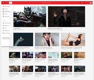
A quick glance and you might wonder what's changed, but there's a lot going on in Hidvégi's concept, starting with the header, which has been turned into a full-width colour header, complete with an application icon, a hamburger icon on the left, the user icon on the right and the smart search remaining in the centre.
The home page has been reworked so as to feature more images and less text. Hidvégi uses the entire browser width, with a modular grid system and three different thumbnail sizes to present plenty of video without the page being too visually dense.

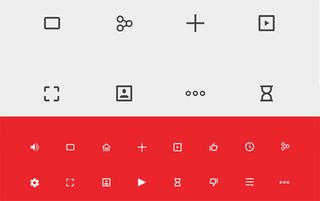
To get around the site there's a new slide-in navigation with lots of white space and new iconography. Hidvégi has come up with a whole new set of icons for his concept, inspired by Android icon designs.
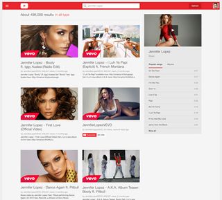
Custom user pages benefit from a new full-width hero image, the sort that you'd see on a Facebook page or a Twitter profile, and a highlighted video above the other, smaller videos, while the search results page now features two columns and reflects YouTube's popularity for music content by including playlist cards for any music-related search results.

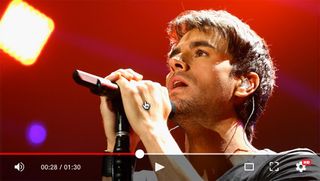
Finally, the bottom line: the video player. Recognising that if it ain't broke then don't fix it, Hidgévii has taken a restrained approach to the player. The controls are virtually identical; the main feature here is the smart interface which means that the controls only appear when you hover the mouse pointer over them; the rest of the time they reduce to a thin progress bar at the base of the player window.
It's refreshing to see such an understated and thoughtful redesign concept; you can see more of it over at Roland Hidvégi's Behance page, and be sure to let us know what you think in the comments!
Words: Jim McCauley
Jim McCauley is a writer, editor and occasional podcaster, and is available for children's parties.
Like this? Read these:
- 50 classic video game cover art redesigns
- A new icon for YouTube
- Free Photoshop brushes every creative must have

Thank you for reading 5 articles this month* Join now for unlimited access
Enjoy your first month for just £1 / $1 / €1
*Read 5 free articles per month without a subscription

Join now for unlimited access
Try first month for just £1 / $1 / €1
Get the Creative Bloq Newsletter
Daily design news, reviews, how-tos and more, as picked by the editors.
The Creative Bloq team is made up of a group of design fans, and has changed and evolved since Creative Bloq began back in 2012. The current website team consists of eight full-time members of staff: Editor Georgia Coggan, Deputy Editor Rosie Hilder, Ecommerce Editor Beren Neale, Senior News Editor Daniel Piper, Editor, Digital Art and 3D Ian Dean, Tech Reviews Editor Erlingur Einarsson, Ecommerce Writer Beth Nicholls and Staff Writer Natalie Fear, as well as a roster of freelancers from around the world. The ImagineFX magazine team also pitch in, ensuring that content from leading digital art publication ImagineFX is represented on Creative Bloq.
