Charity site uses web design smarts to raise more cash
We reveal how Blenderbox made arts charity website Mellon.org more usable.
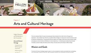
The Andrew W. Mellon Foundation supports humanities and the arts. Its redesigned site is nicely responsive, and although it could benefit from a little more image optimisation to improve load time, the layout and content is pleasingly simple and clear.
Build your own site with these brilliant WordPress tutorials
The Grants Database page searches 45 years of grants. Blenderbox's Jason Jefferies says, "To mitigate the performance issues, we cached popular queries and worked with the client to identify appropriate sets of years, to limit results."
This led to a very smart consideration of form: where desktop users are shown an interactive map displaying where the Foundation's money is spent globally, mobile users are redirected to the Advanced Search page, a more fitting method of input for smaller screens.
This redesign pays a lot of attention to usability. Text is nicely laid out with an emphasis on focus, and search is used cleverly to get users to what they’re looking for quickly. It’s a site that knows why its visitors are there, and gives them what they want with ease.

Words: Peter Gasston
Peter Gasston is a veteran web developer who now works as a technologist and frontend lead at rehabstudio. He’s the author of The Book of CSS3 and The Modern Web.
Like this? Read these!
- Funked-up flamingo shows what WebGL can do
- Brilliant Wordpress tutorial selection
- Download free textures: high resolution and ready to use now

Thank you for reading 5 articles this month* Join now for unlimited access
Enjoy your first month for just £1 / $1 / €1
*Read 5 free articles per month without a subscription

Join now for unlimited access
Try first month for just £1 / $1 / €1
Get the Creative Bloq Newsletter
Daily design news, reviews, how-tos and more, as picked by the editors.
The Creative Bloq team is made up of a group of design fans, and has changed and evolved since Creative Bloq began back in 2012. The current website team consists of eight full-time members of staff: Editor Georgia Coggan, Deputy Editor Rosie Hilder, Ecommerce Editor Beren Neale, Senior News Editor Daniel Piper, Editor, Digital Art and 3D Ian Dean, Tech Reviews Editor Erlingur Einarsson, Ecommerce Writer Beth Nicholls and Staff Writer Natalie Fear, as well as a roster of freelancers from around the world. The ImagineFX magazine team also pitch in, ensuring that content from leading digital art publication ImagineFX is represented on Creative Bloq.
